What good looks like
Eight renders of one template, the Market Stat, approved by Dave on 2026-09-01 and refreshed on 2026-09-08 to the rules the later rounds added: the kit mark in the theme color, the watermark on every card, a light interior inside the ring on the dark band. Layouts and copy unchanged. This is the taste every card in the library is being judged against. Not a spec sheet: a set of pictures to hold next to any card before it goes on the Done board. Published 2026-09-07 for Brett.
The seven things every one of these does
- The mark is in the card's theme color. Navy on paper, teal on the teal card, white on the dark card. The logo belongs to the palette. It is never gold on a light ground and never a color that appears nowhere else on the card. Files: share.legacyrep.co/legacy-logo-for-cards.
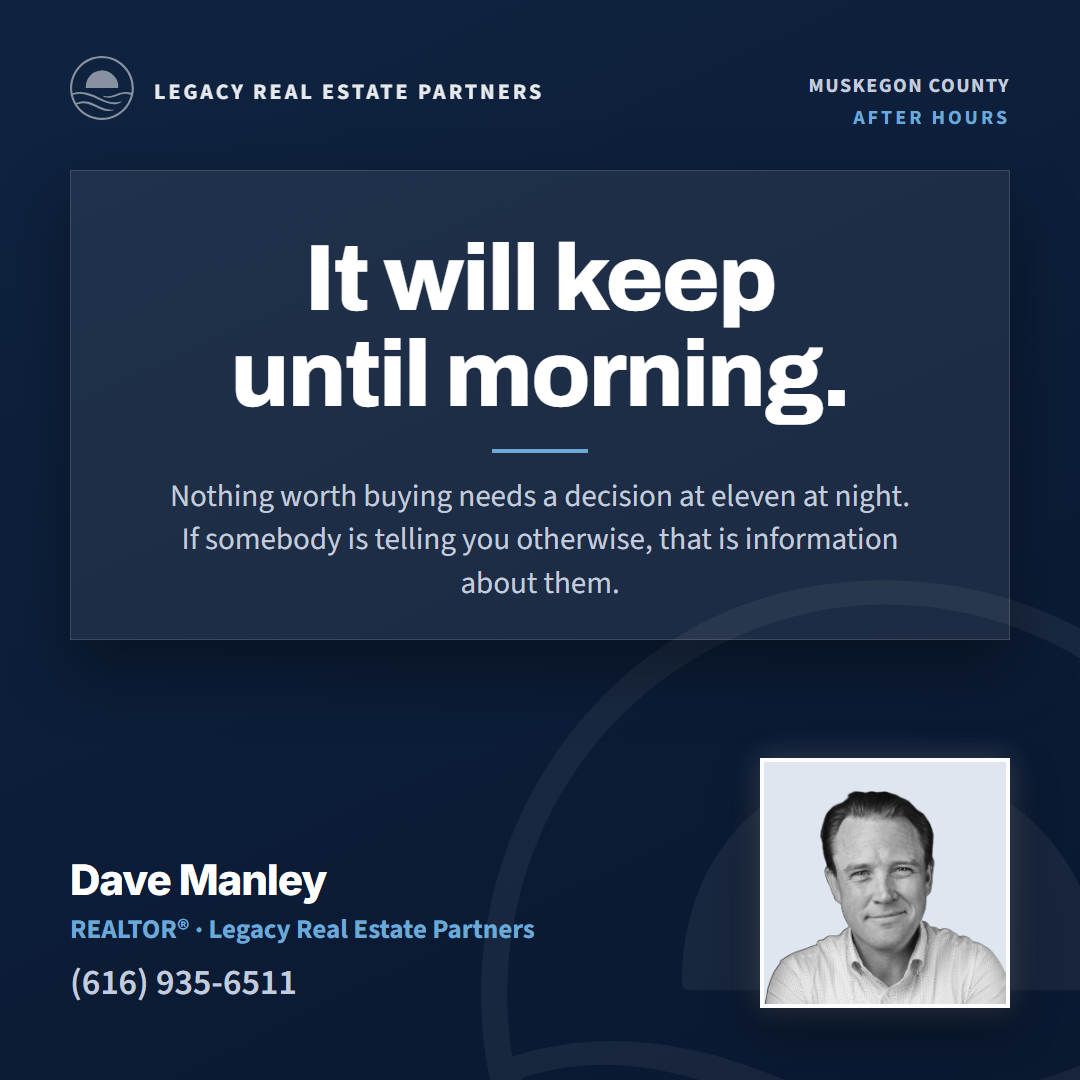
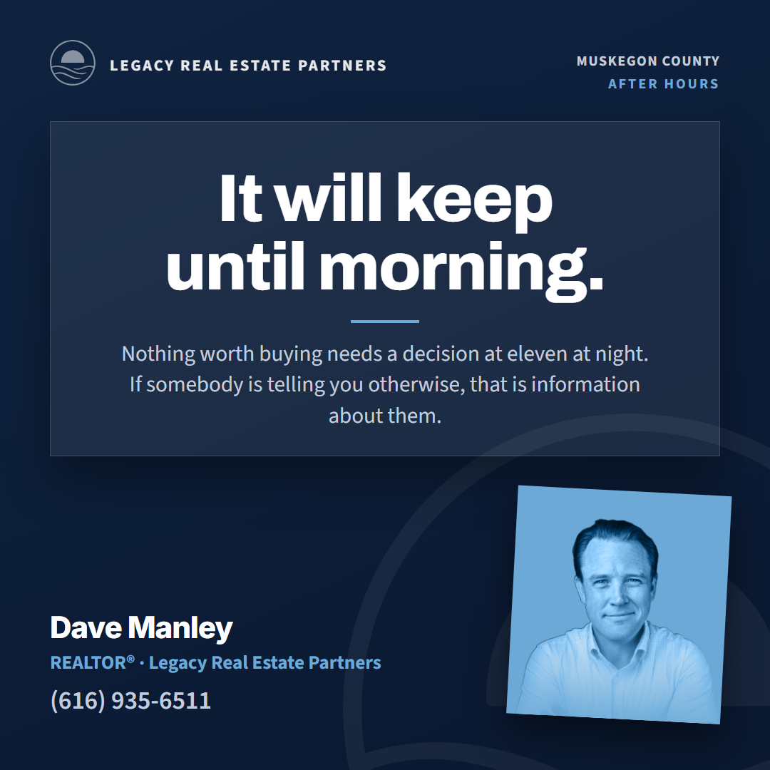
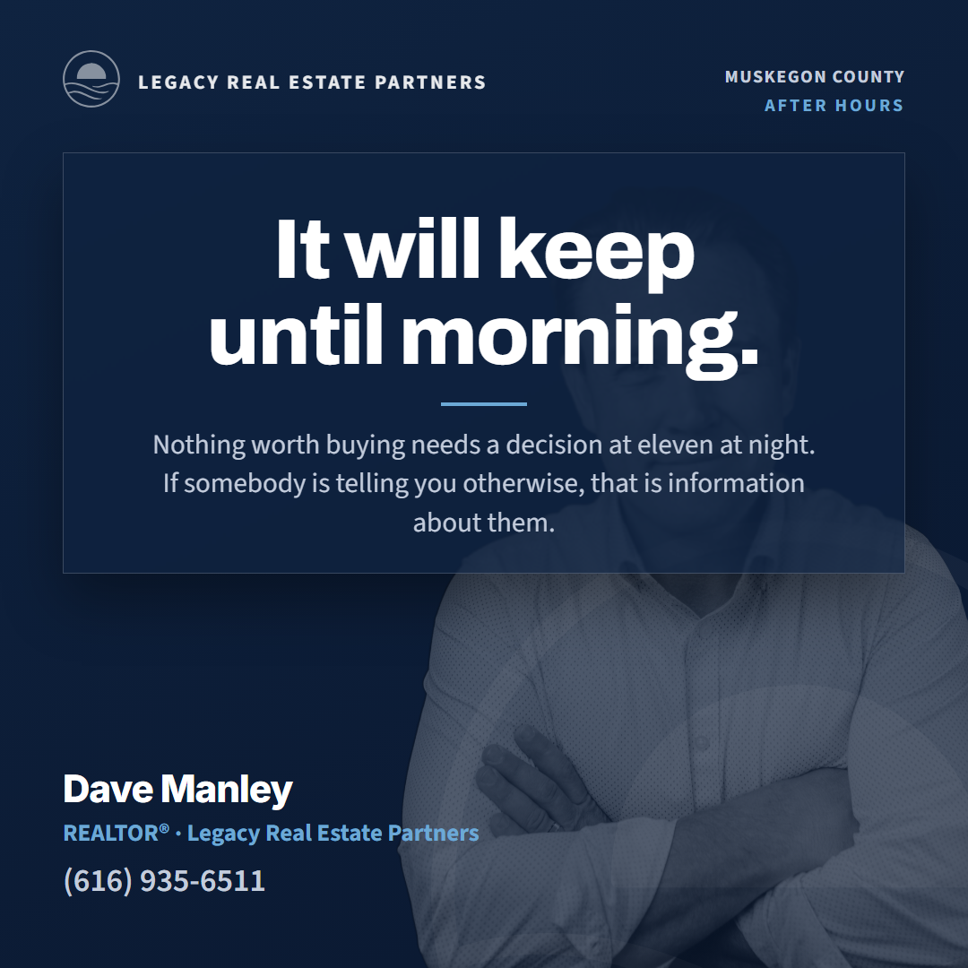
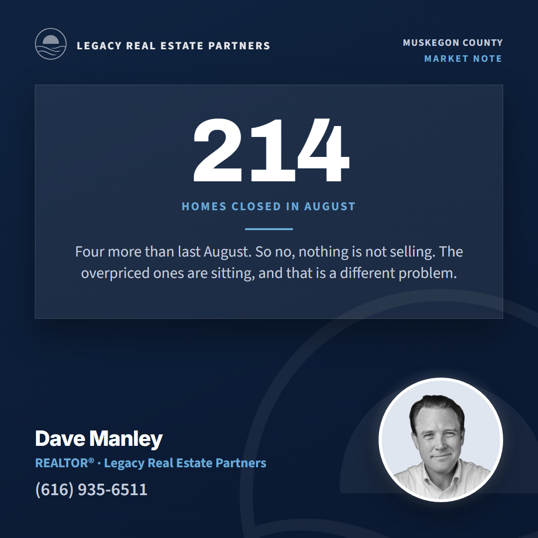
- The agent is a cutout, large, and part of the composition. Not a rectangle dropped in a corner. Where a circle is used, the frame is white or the theme color, not gold and not black.
- The number is followed by what it means. "What this means for you" sits under every stat in plain language a buyer understands. A number without that line does not ship.
- Agent info is big and legible. Name in the display face, contact line readable at feed size, on a clean ground, never over artwork.
- Type is the brand pair, embedded. Archivo for display, Source Sans 3 for body. No pale gold as a text color anywhere. Gold only ever appears as a large graphic mass, if at all.
- The palette is the logo kit. Navy
#0F2340, Ocean Teal#1F6F78, Burgundy#6E2A35, Charcoal with Steel#4A7BA6, Sky#6CA9D6. Solid chips, no tints, no washes. - No dead space and nothing bolted on. Every element earns its spot. The county silhouette on the split card is real US Census geometry for Muskegon and generalizes to any county by FIPS code.
The editorial layout, five palettes


Three more layouts of the same template


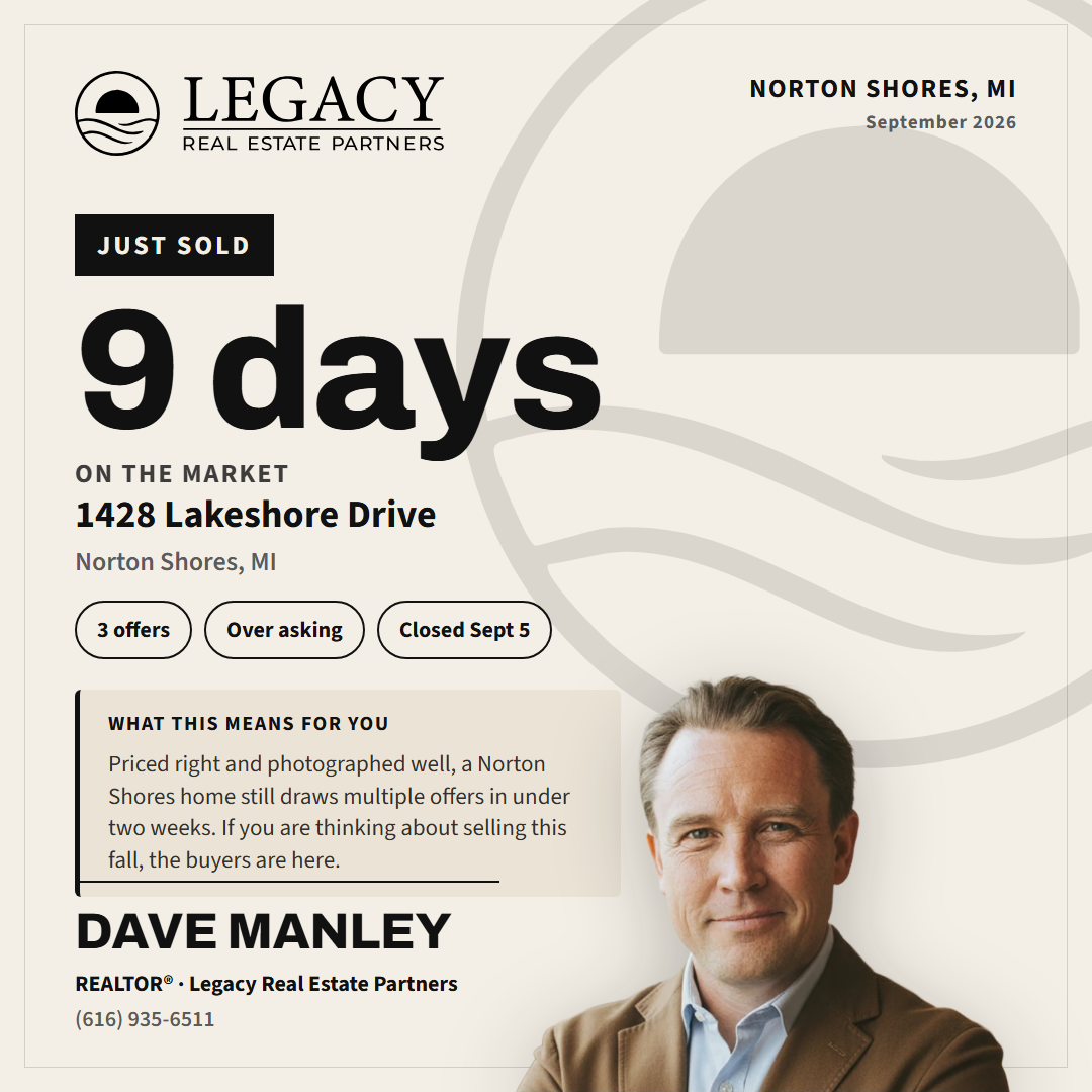
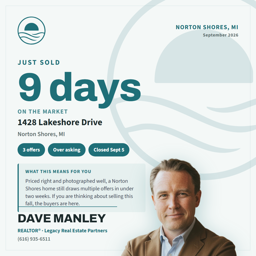
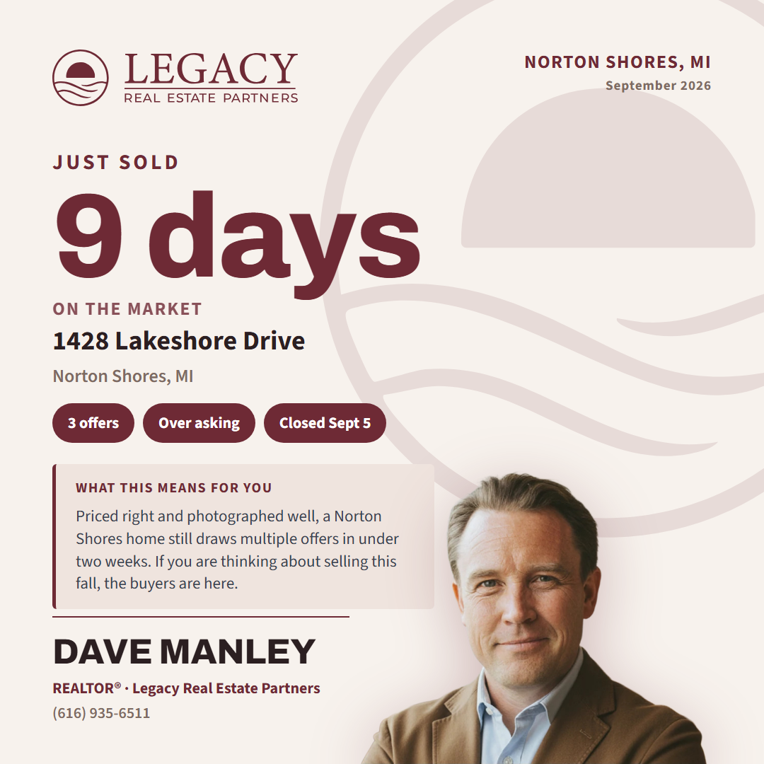
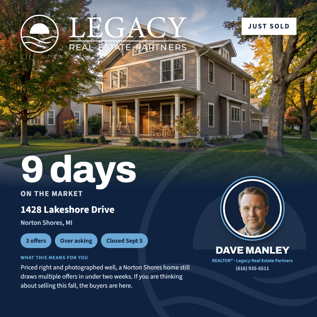
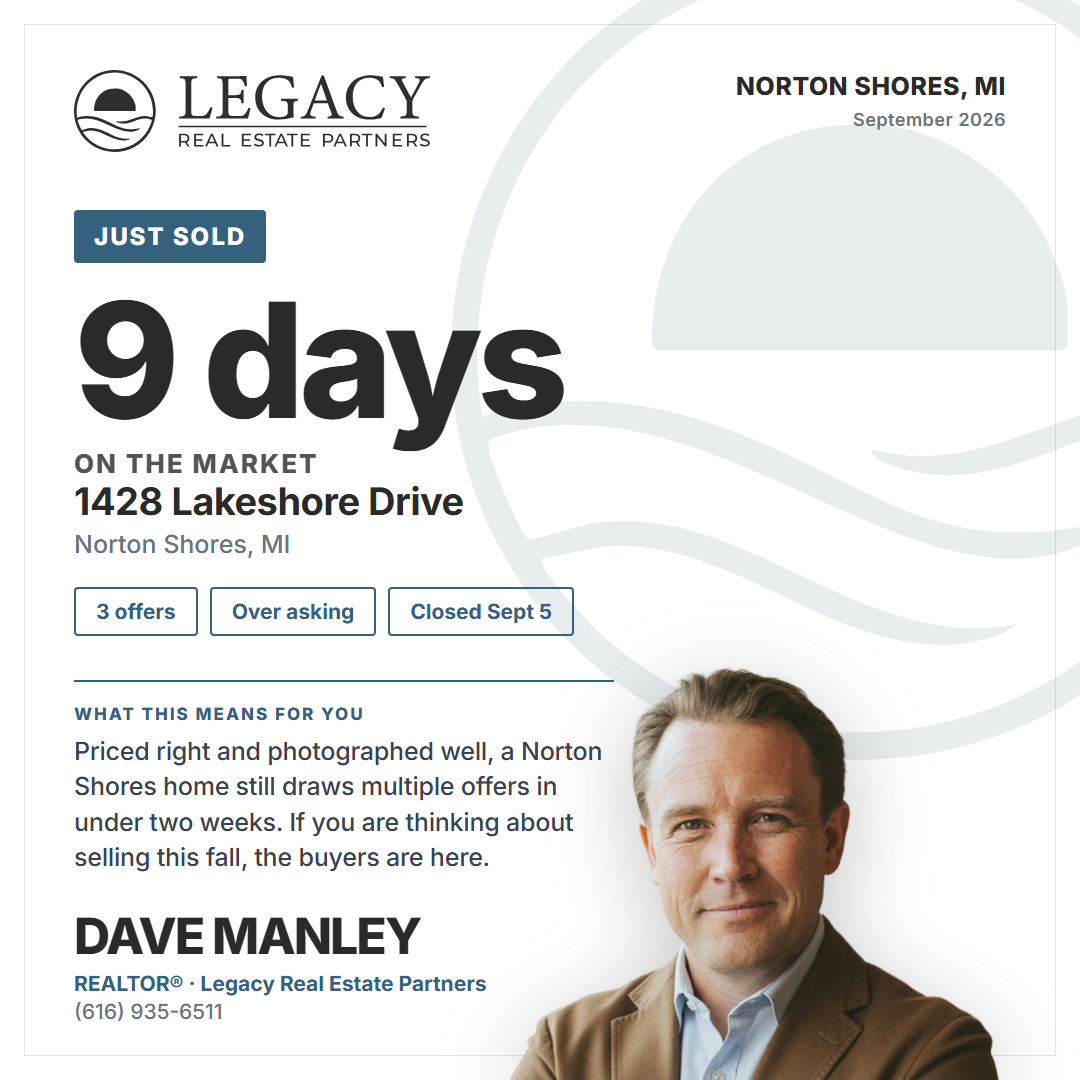
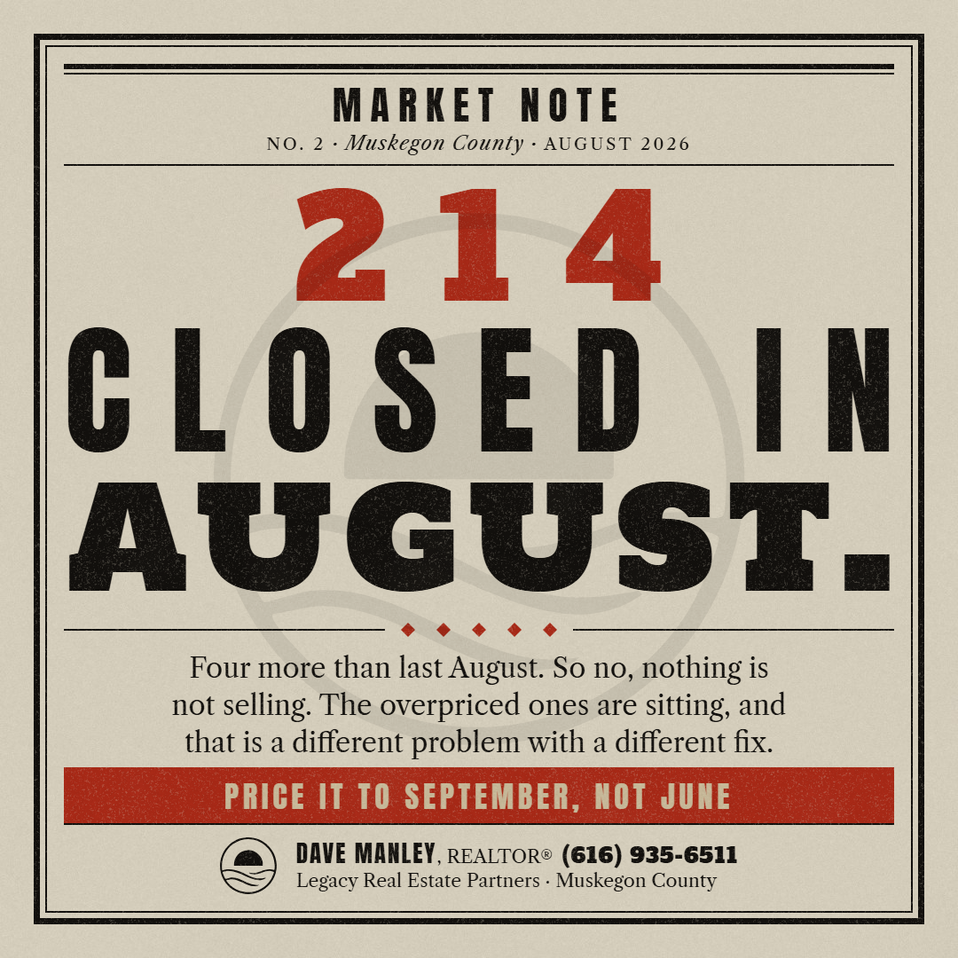
Round 2: Just Sold, seven variations (Dave's pass 2026-09-07)
The same discipline applied to the second archetype. Each card isolates one thing from the 9/4 notes. Full set with captions at round-2-just-sold; builder and renders in the engine repo under reference-cards/style-1-just-sold/.


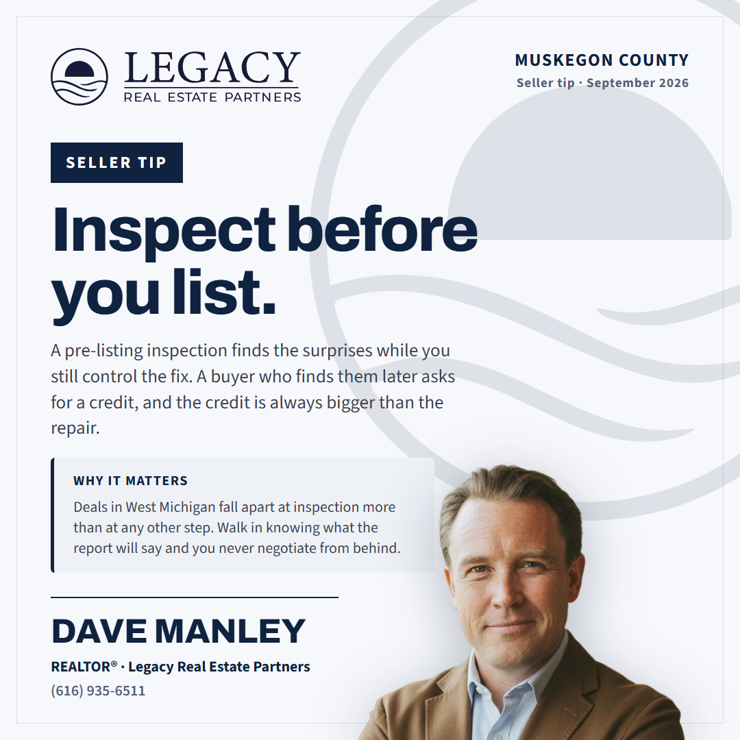
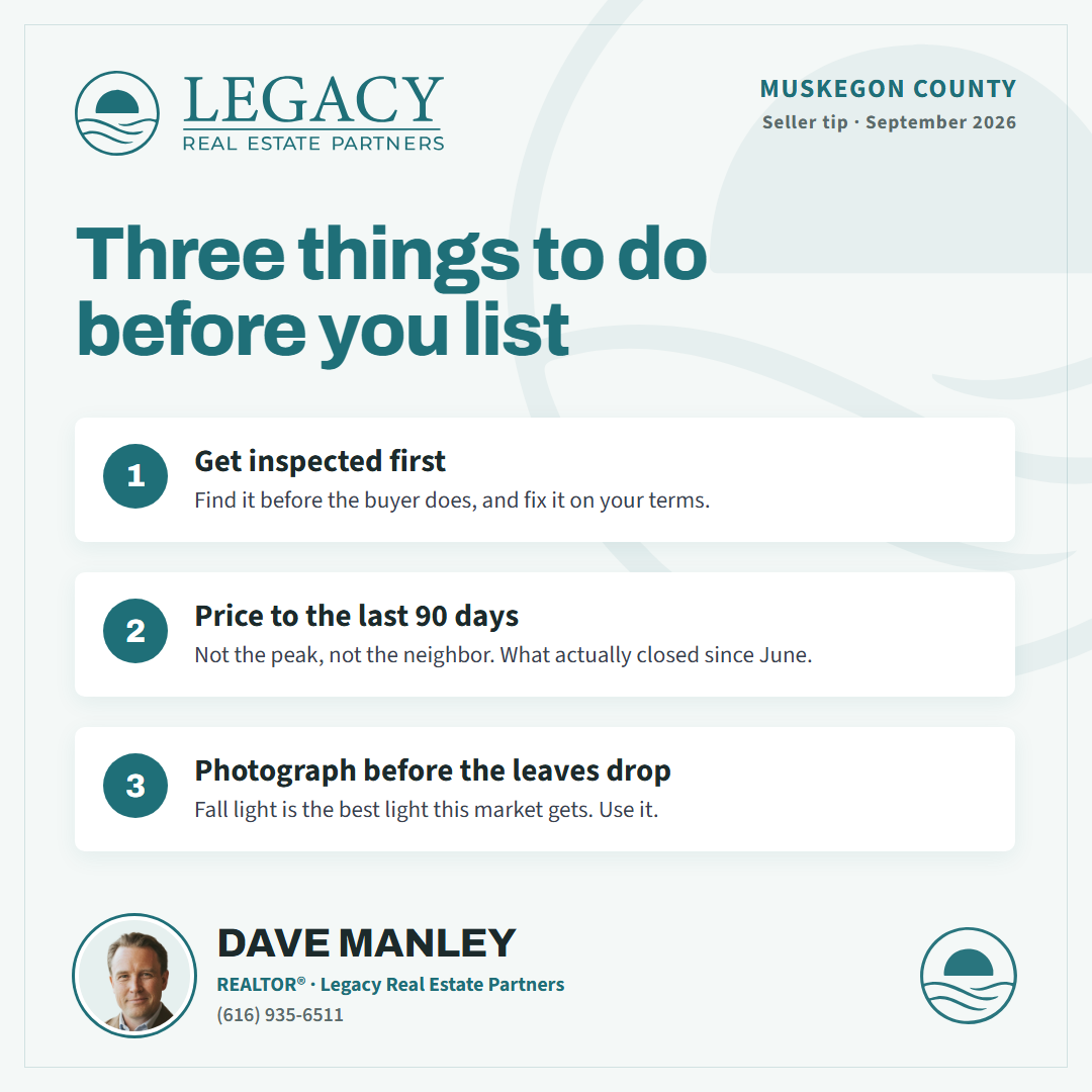
Round 3: Tip, seven variations (Dave's pass 2026-09-07)
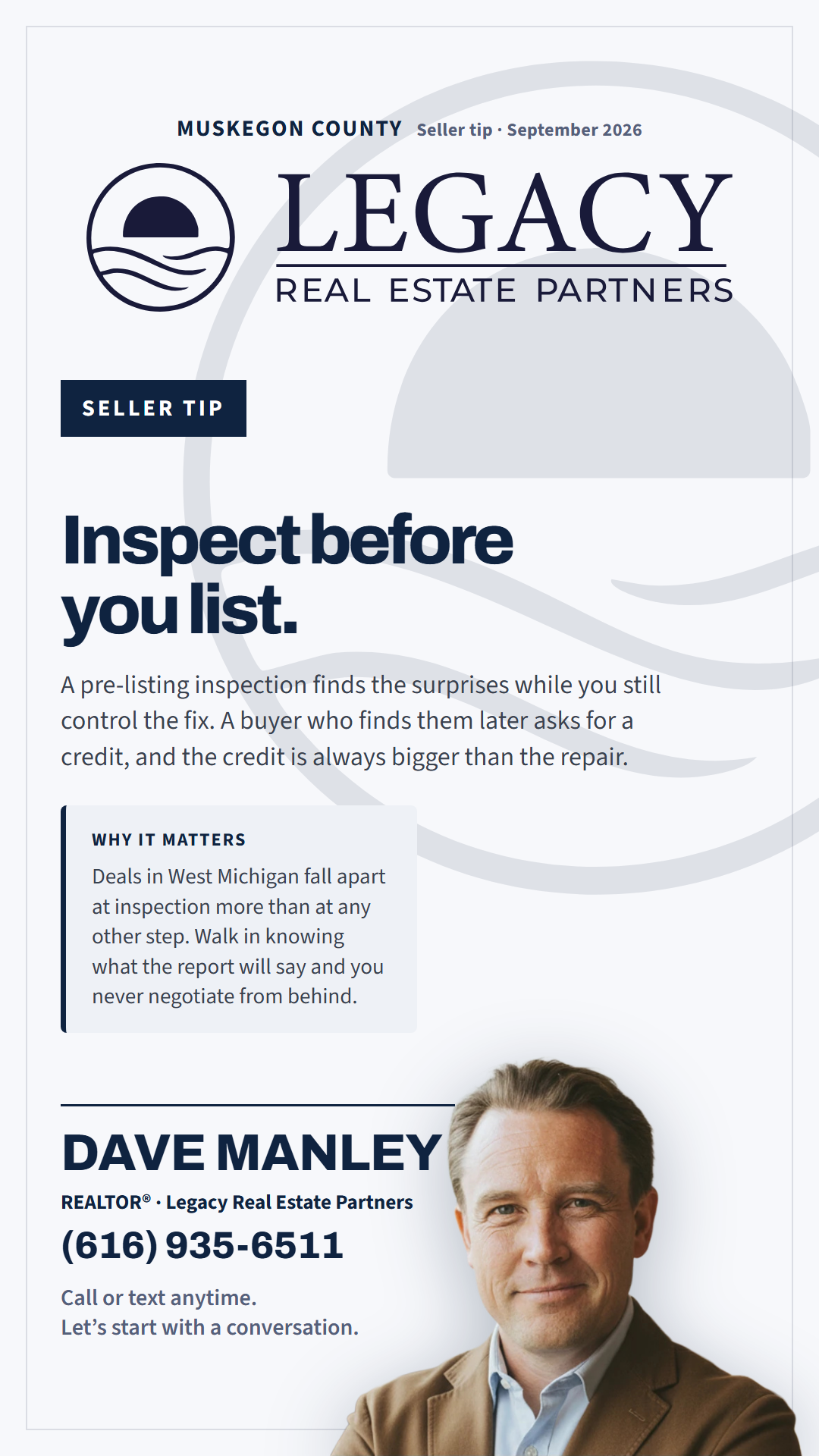
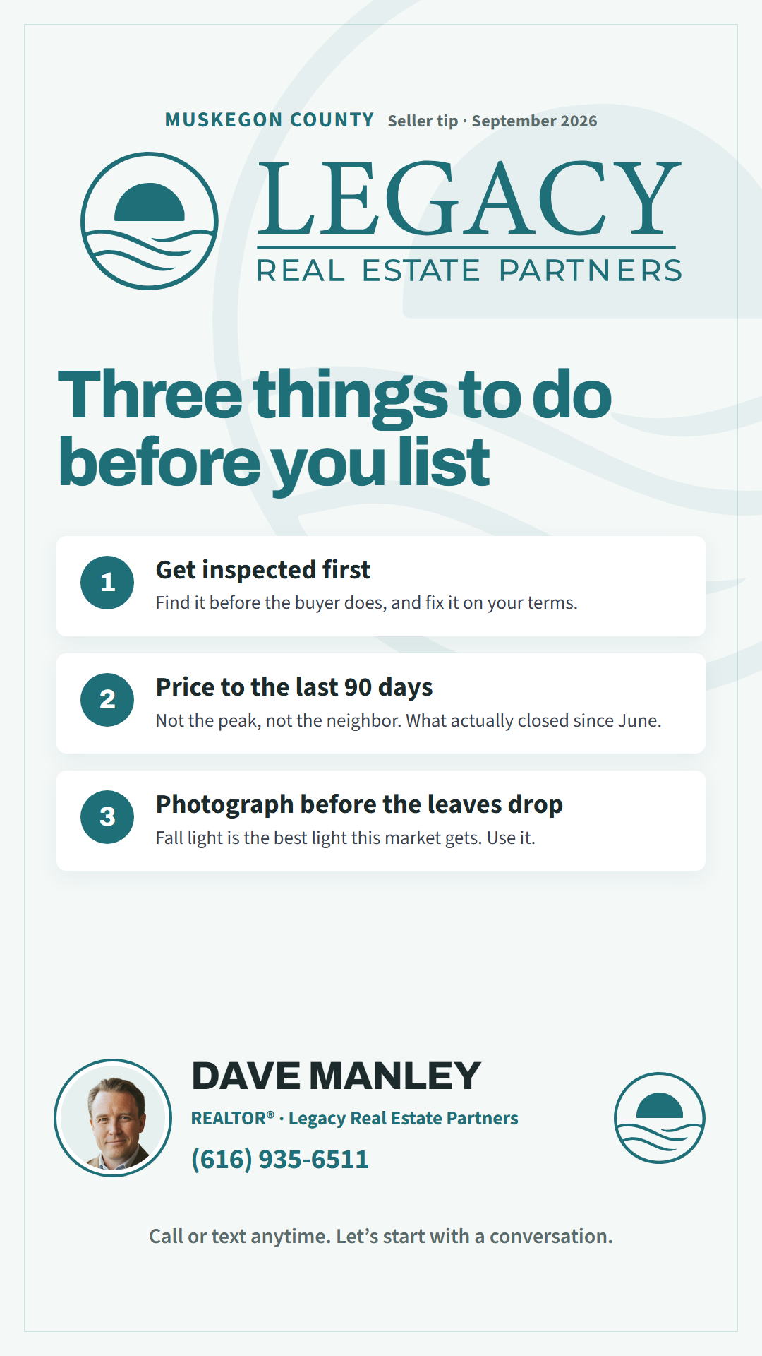
The archetype that serves all nineteen agents, photography or not. The headline is the tip, the why sits under it, and the list card carries three beats the engine already writes. Full set with captions at round-3-tip; builder in the engine repo under reference-cards/style-1-tip/.





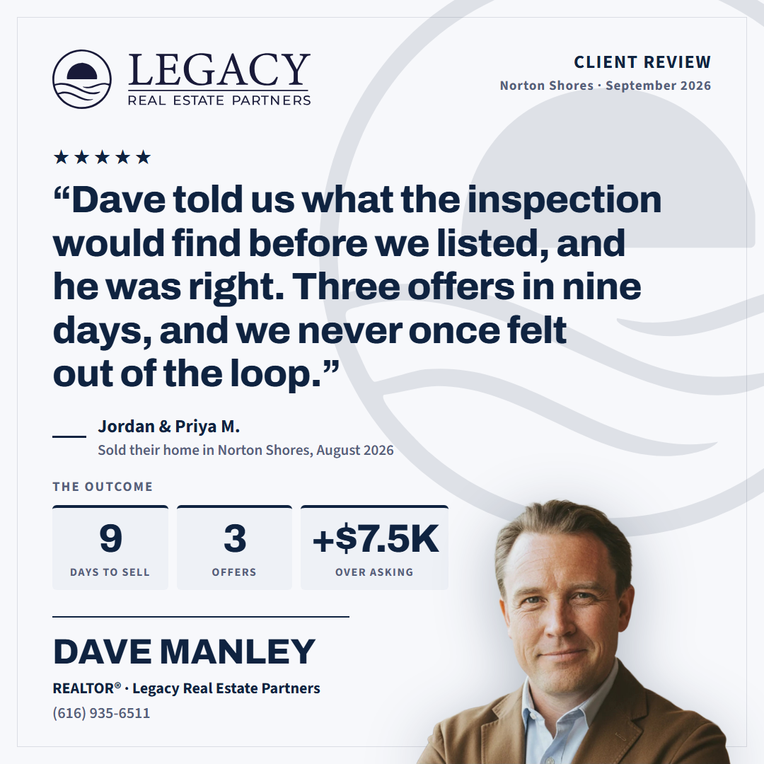
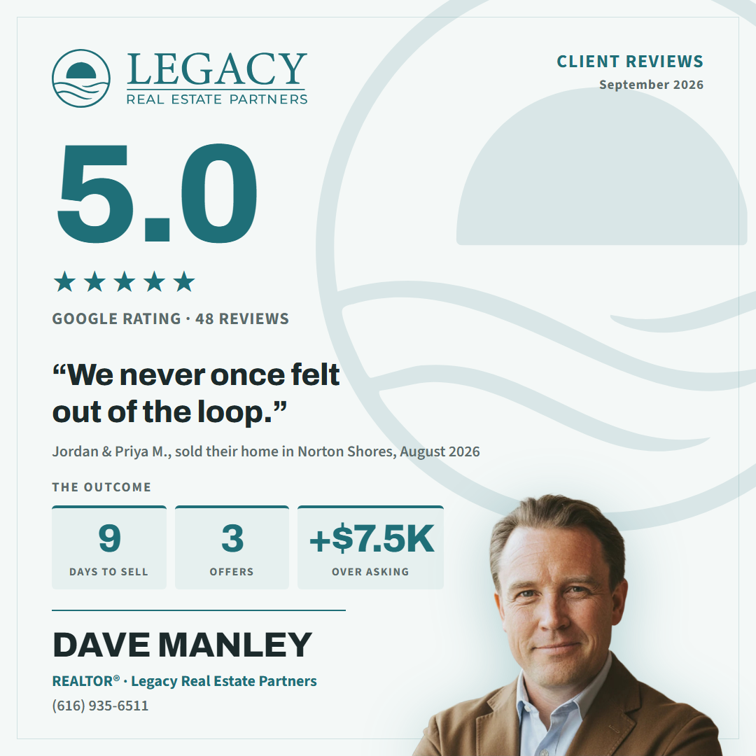
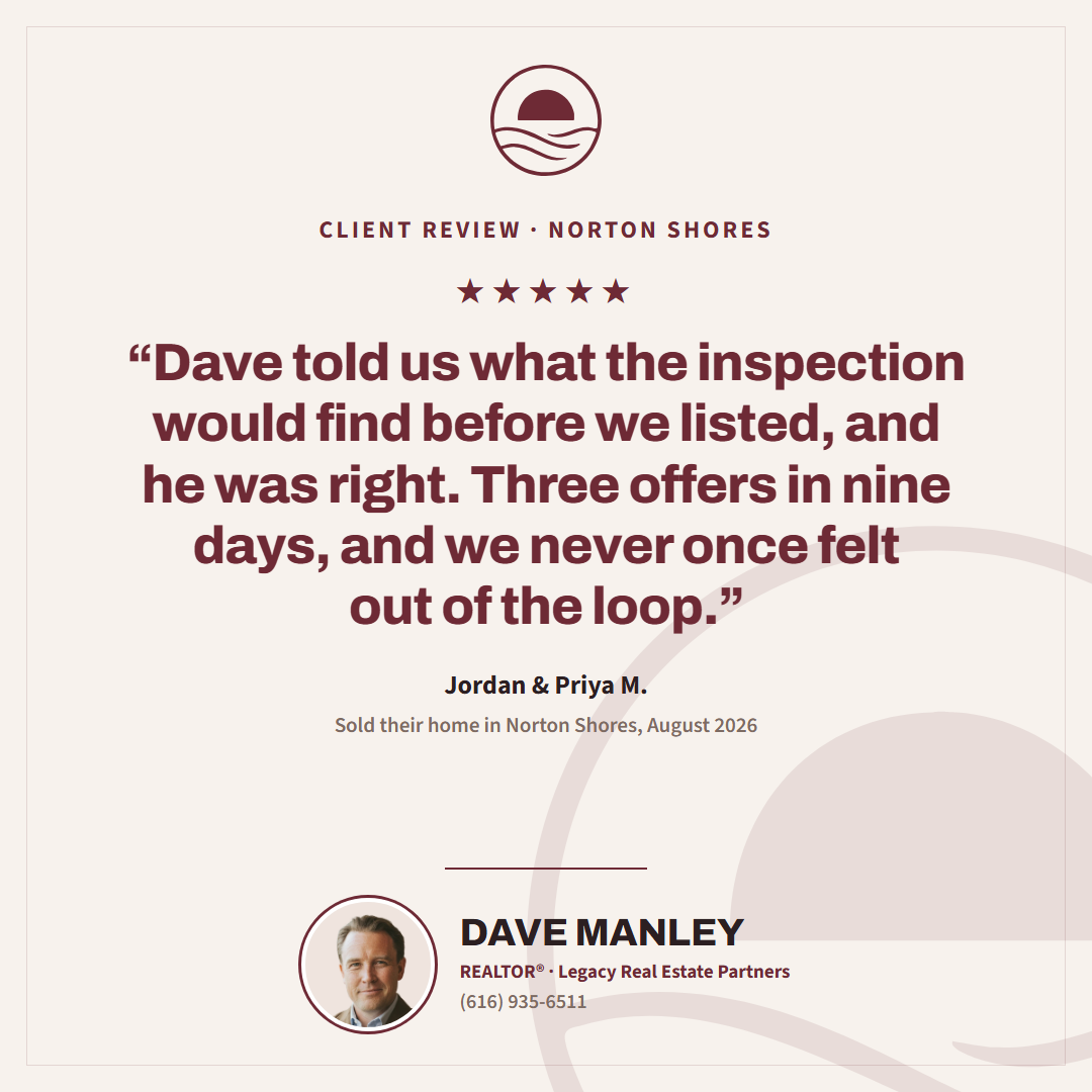
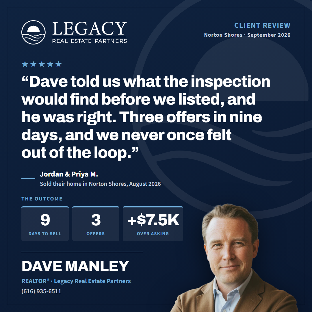
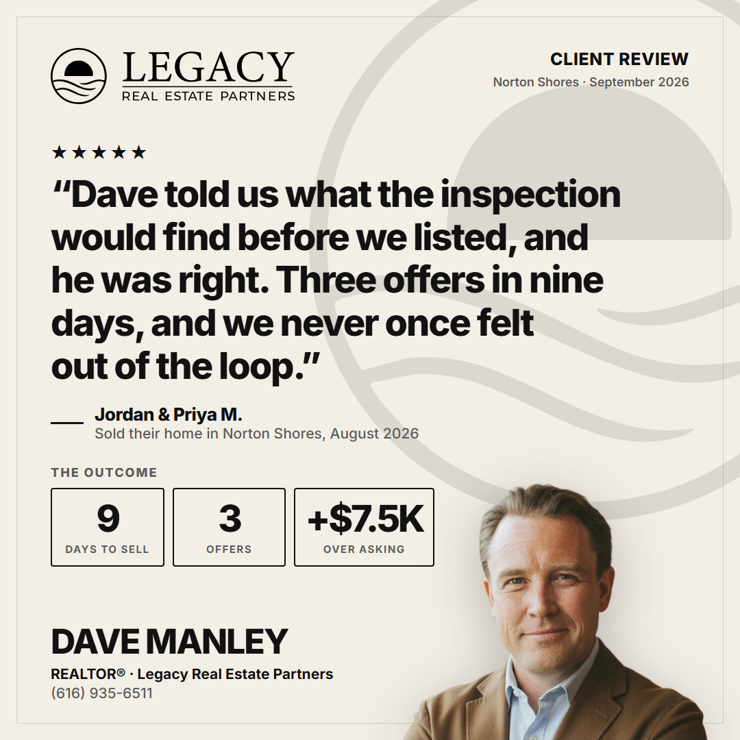
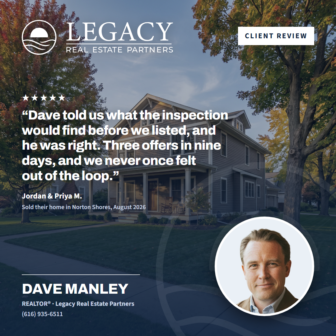
Round 4: Review, seven variations (Dave's pass 2026-09-08)
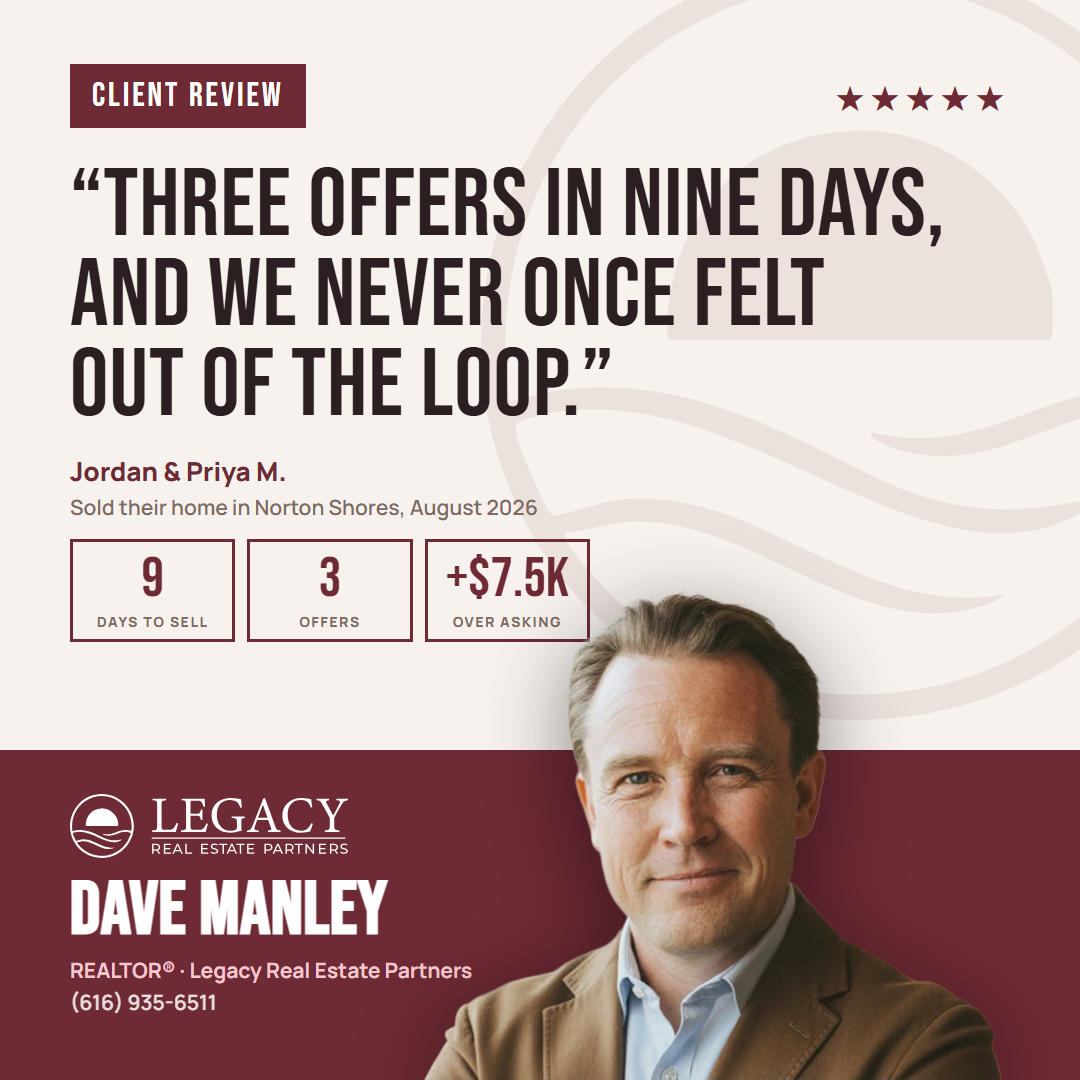
A client's own words, attributed every time, with the outcome beside them. Full set at round-4-review; builder in the engine repo under reference-cards/style-1-review/.

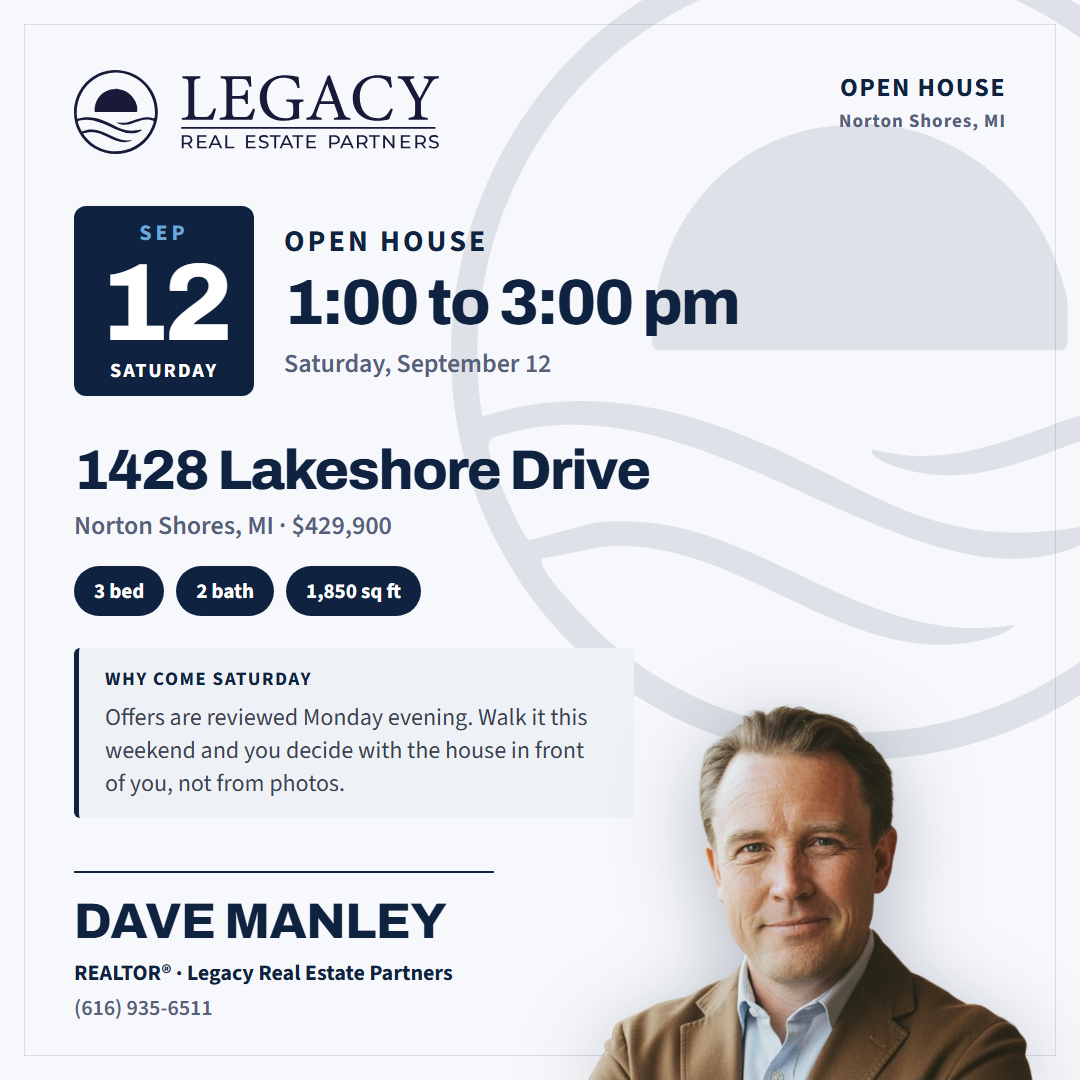
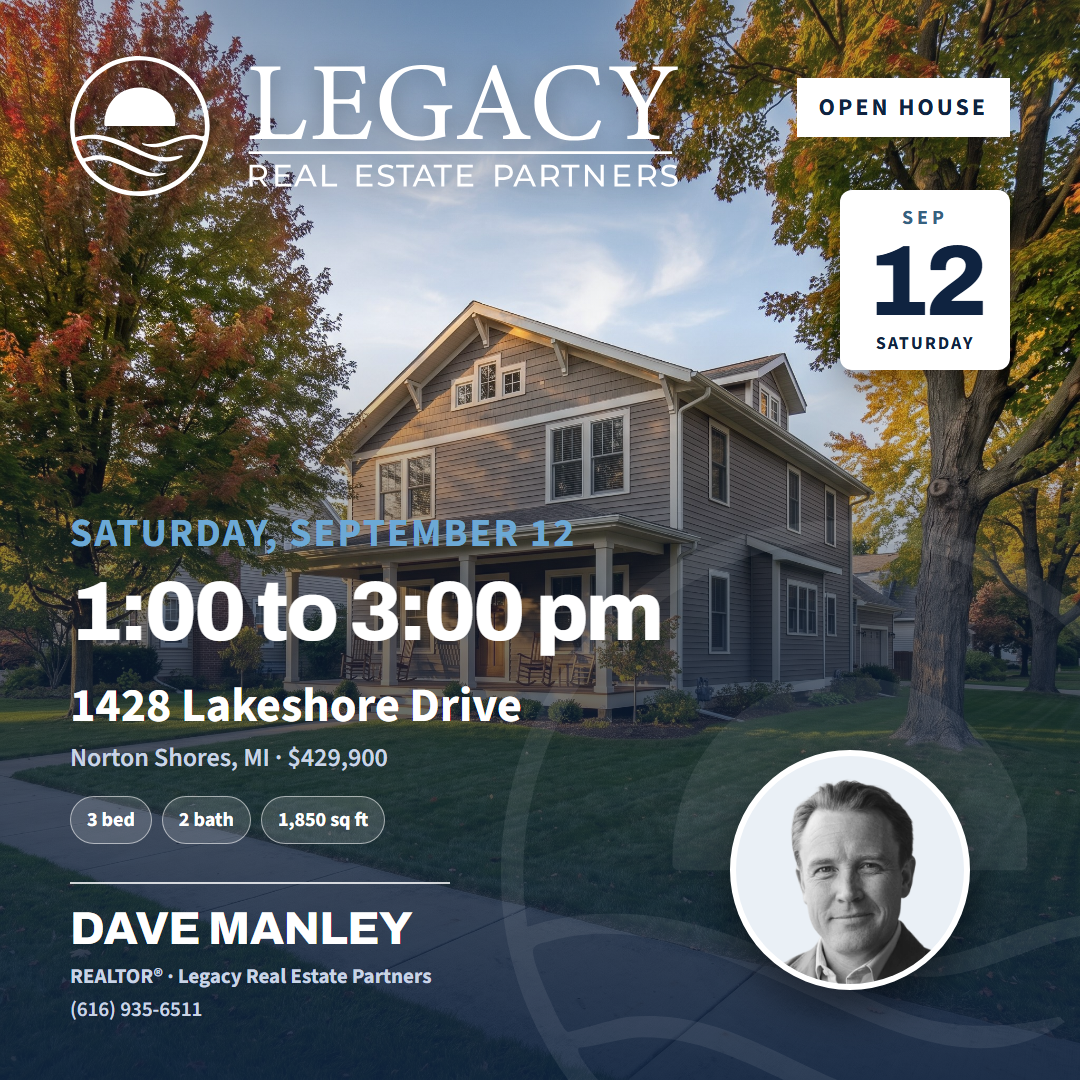
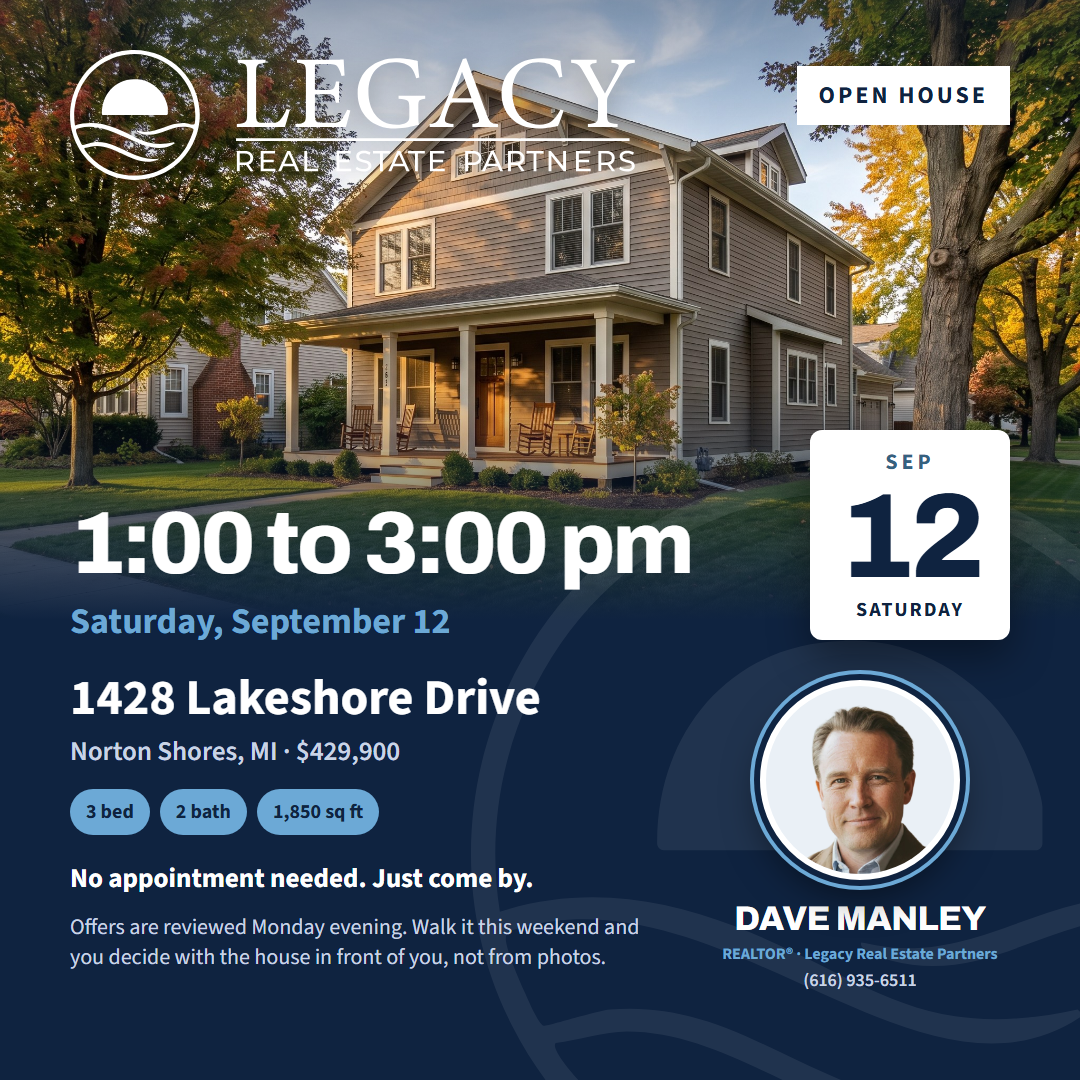
Round 5: Open House, seven variations (Dave's pass 2026-09-08)
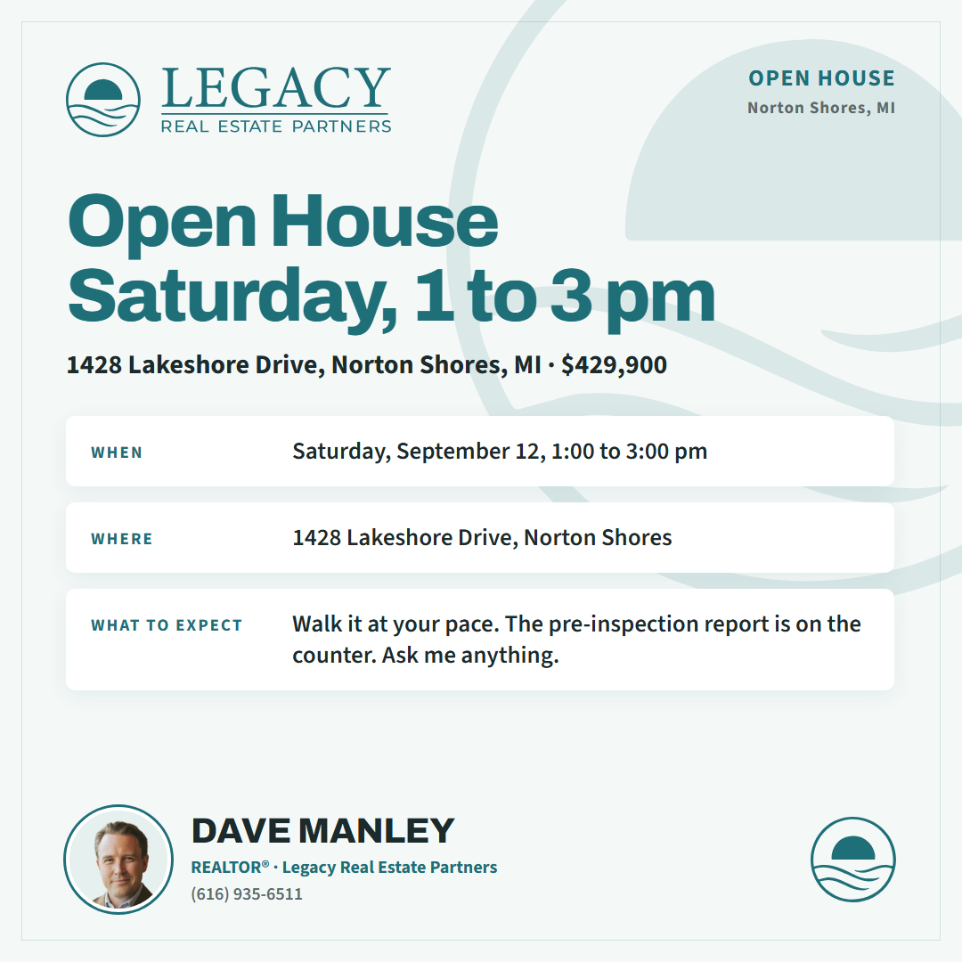
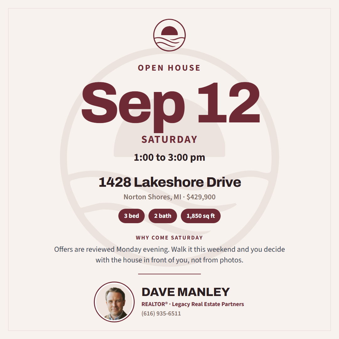
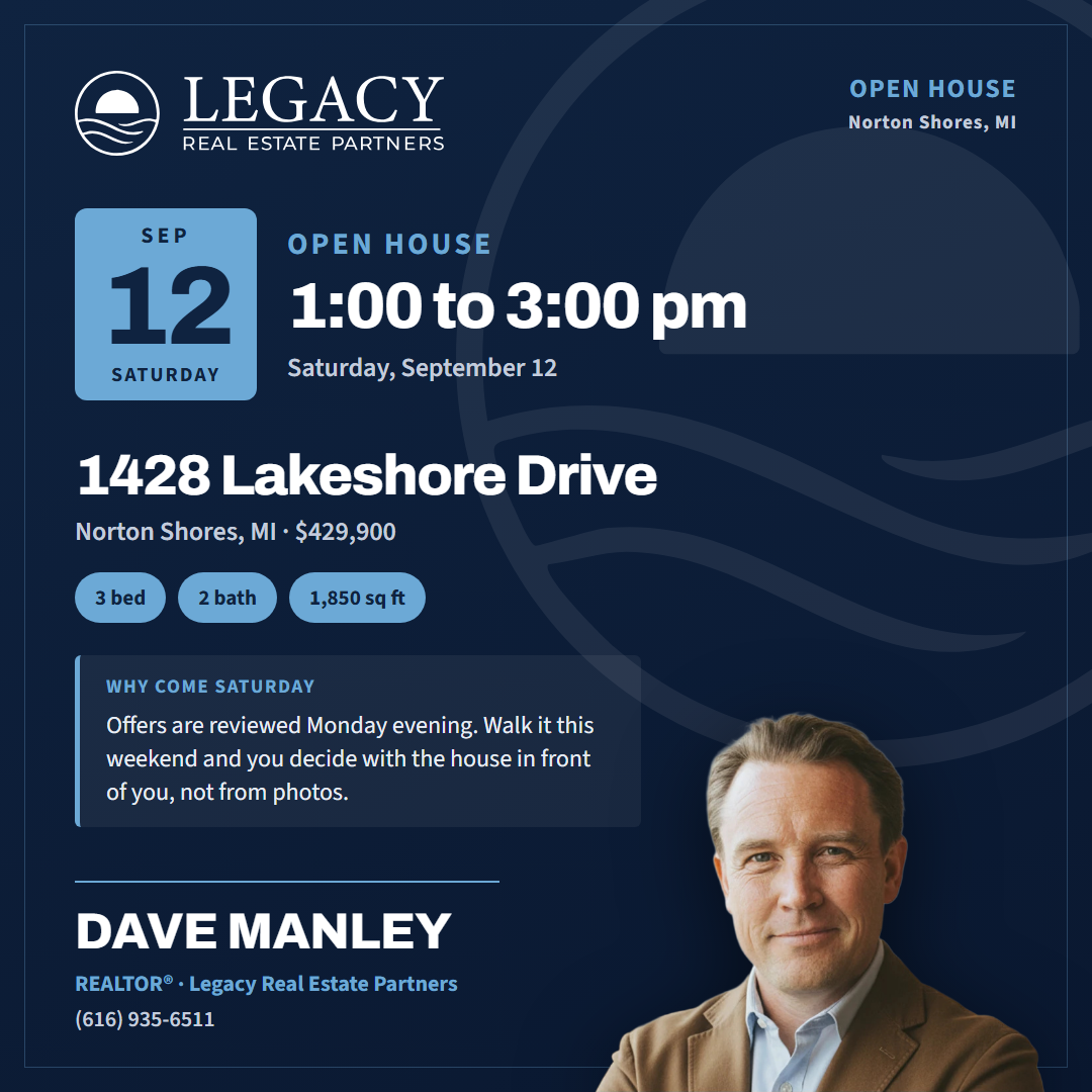
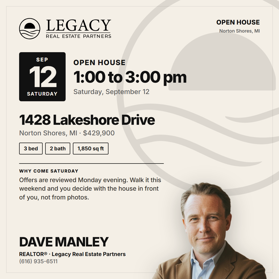
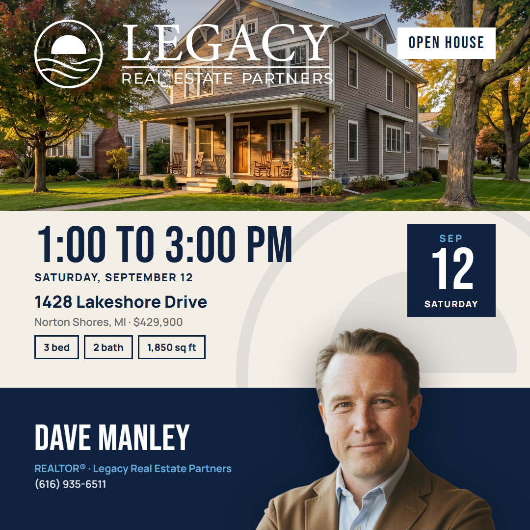
One job: get someone to show up. Date and time lead, the address reads at feed size, and the house is the subject. Full set at round-5-open-house; builder in the engine repo under reference-cards/style-1-open-house/.
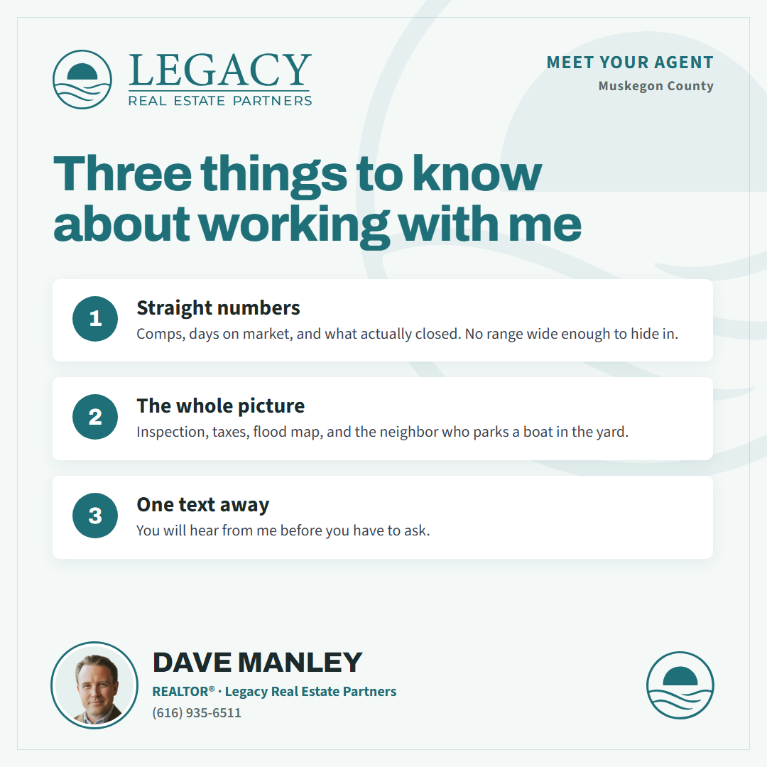
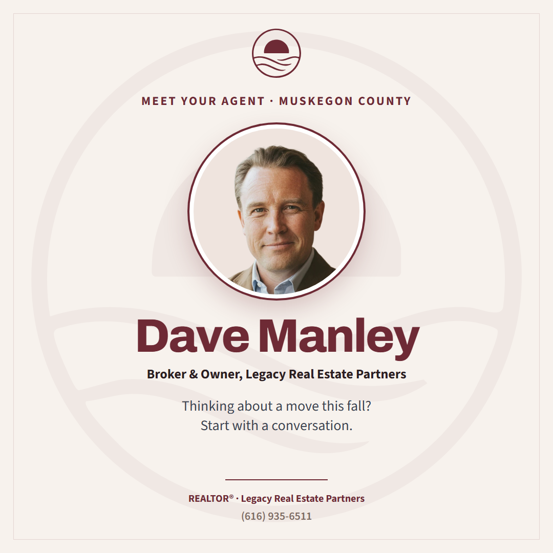
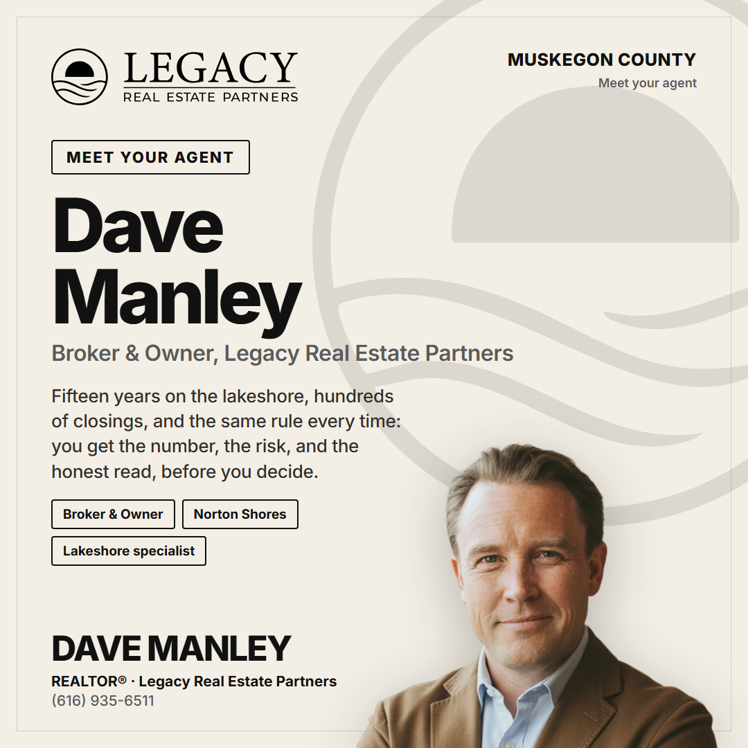
Round 6: Agent Intro, seven cards (Dave's pass 2026-09-08)
The card the agent-intro shapes were reaching for. The name is the headline, one line in the agent's voice under it, facts as chips, the photo the largest thing on the card after the name. At round-6-agent-intro; builder under reference-cards/style-1-agent-intro/.




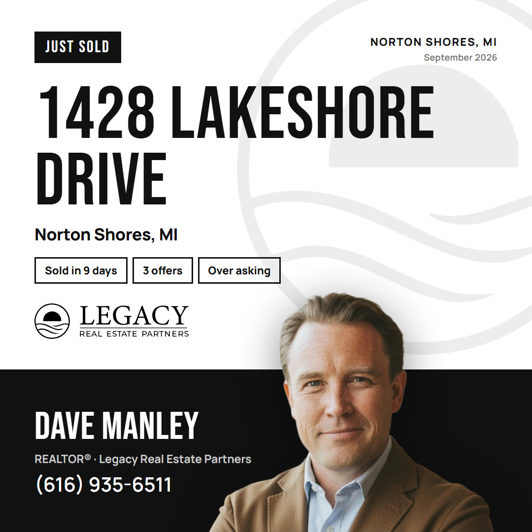
Style 2: Poster, five cards (Dave's pass 2026-09-08)
A second style in the same discipline. Bebas Neue caps for the display line, Manrope body, two solid blocks with a hard seam: the paper block carries the message, the color block carries the agent and the white mark. One card per archetype at style-2; builder in the engine repo under reference-cards/style-2/.


Story, 1080 x 1920, eleven cards (Dave's pass 2026-09-08)
Every archetype laid out again for 9:16, not staged. The rules that only exist at story size: the county and date line sits at the very top with the lockup beneath it, centered; the tag button and the content are left-aligned under that; the phone number is a headline with a call-to-action line under it; the figure runs off the bottom of the frame and the ring sits above the footer. At story; builder under reference-cards/style-1-story/.

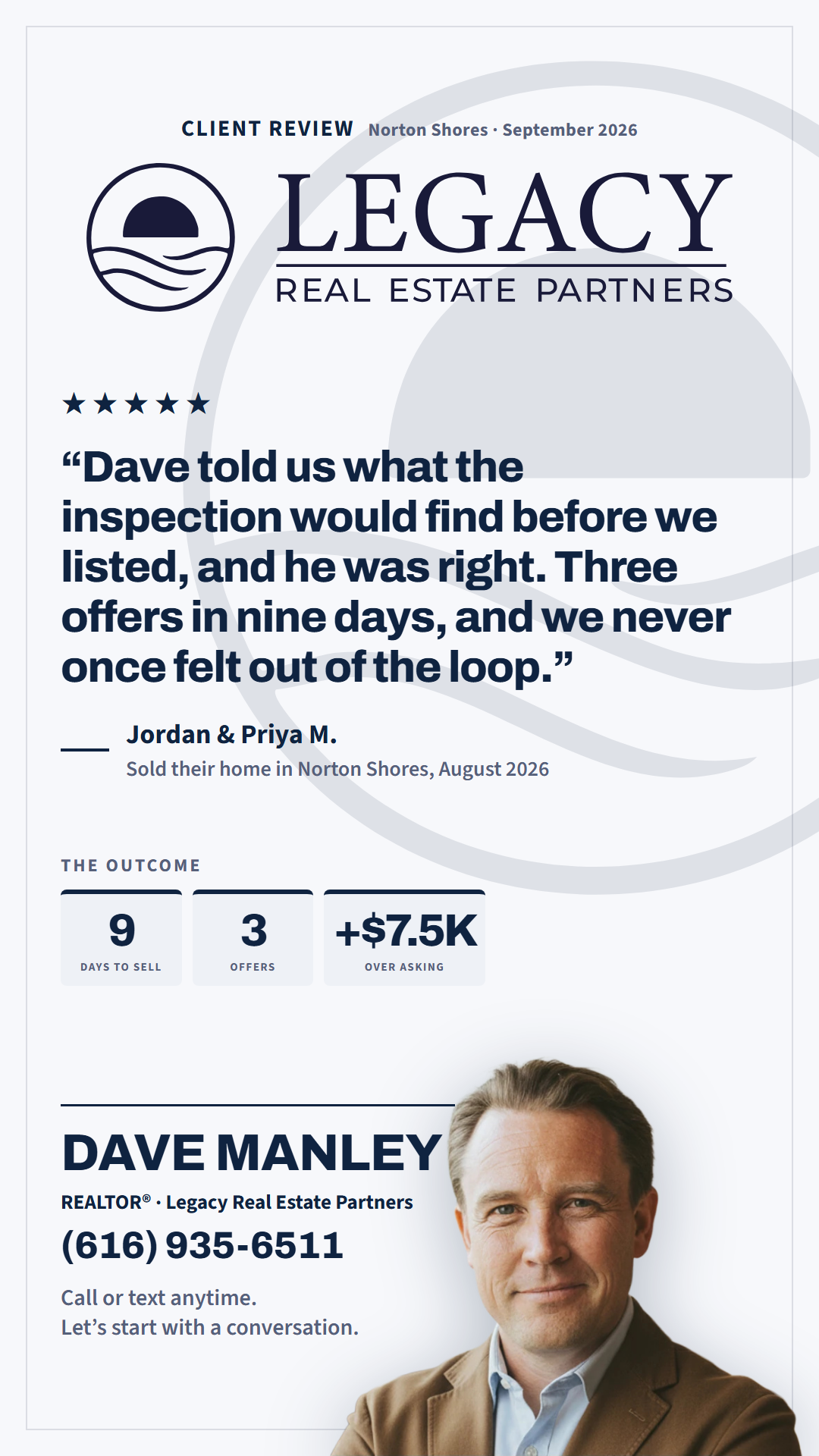
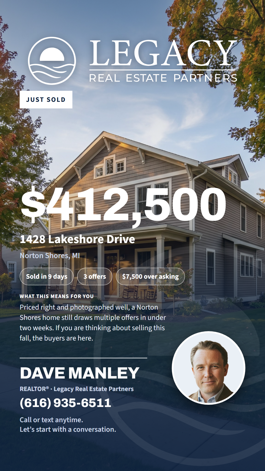

Round 7: Listing Status, three cards (Dave's pass 2026-09-08)
The three states a listing passes through besides sold and open. On the approved layouts; one new rule: a price drop is the one place red appears in the set, as the chip that carries the number. At round-7-status; builder under reference-cards/style-1-status/.

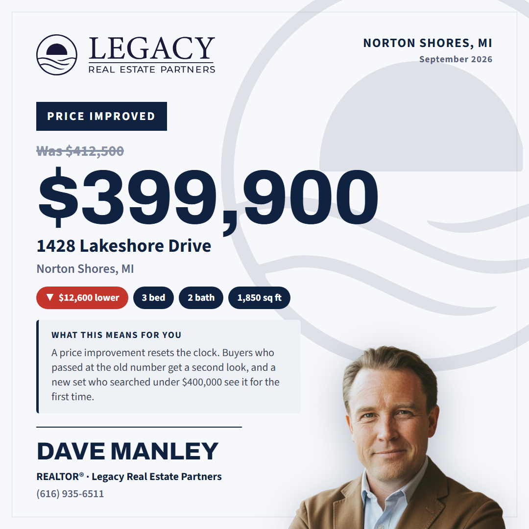
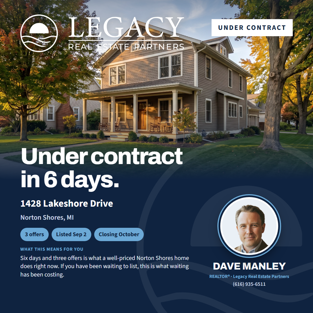
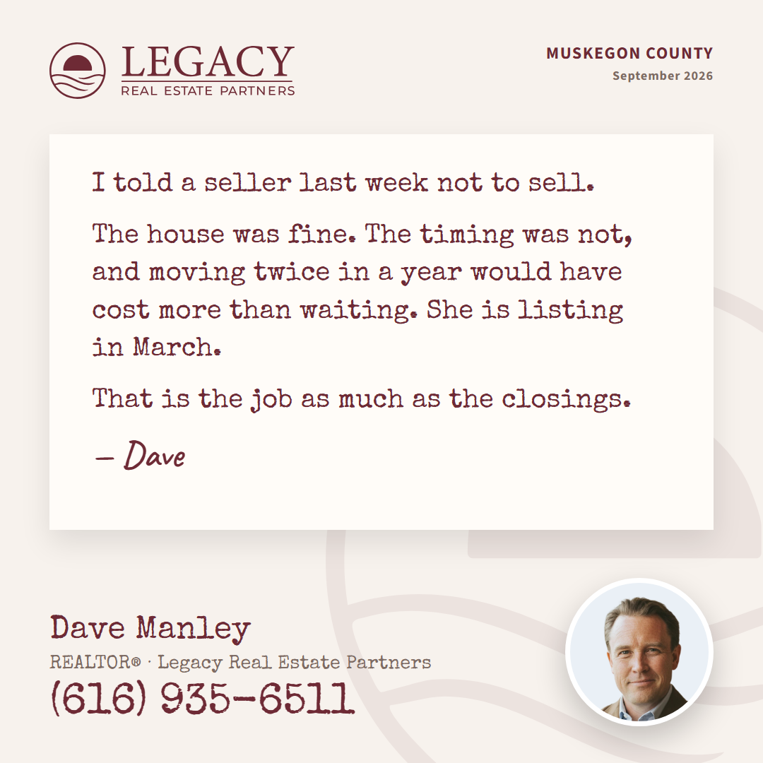
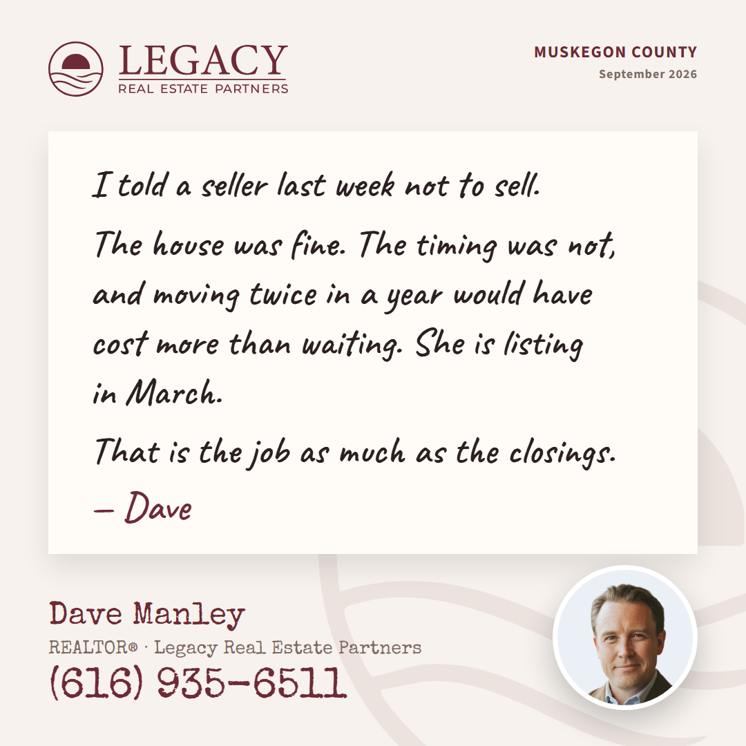
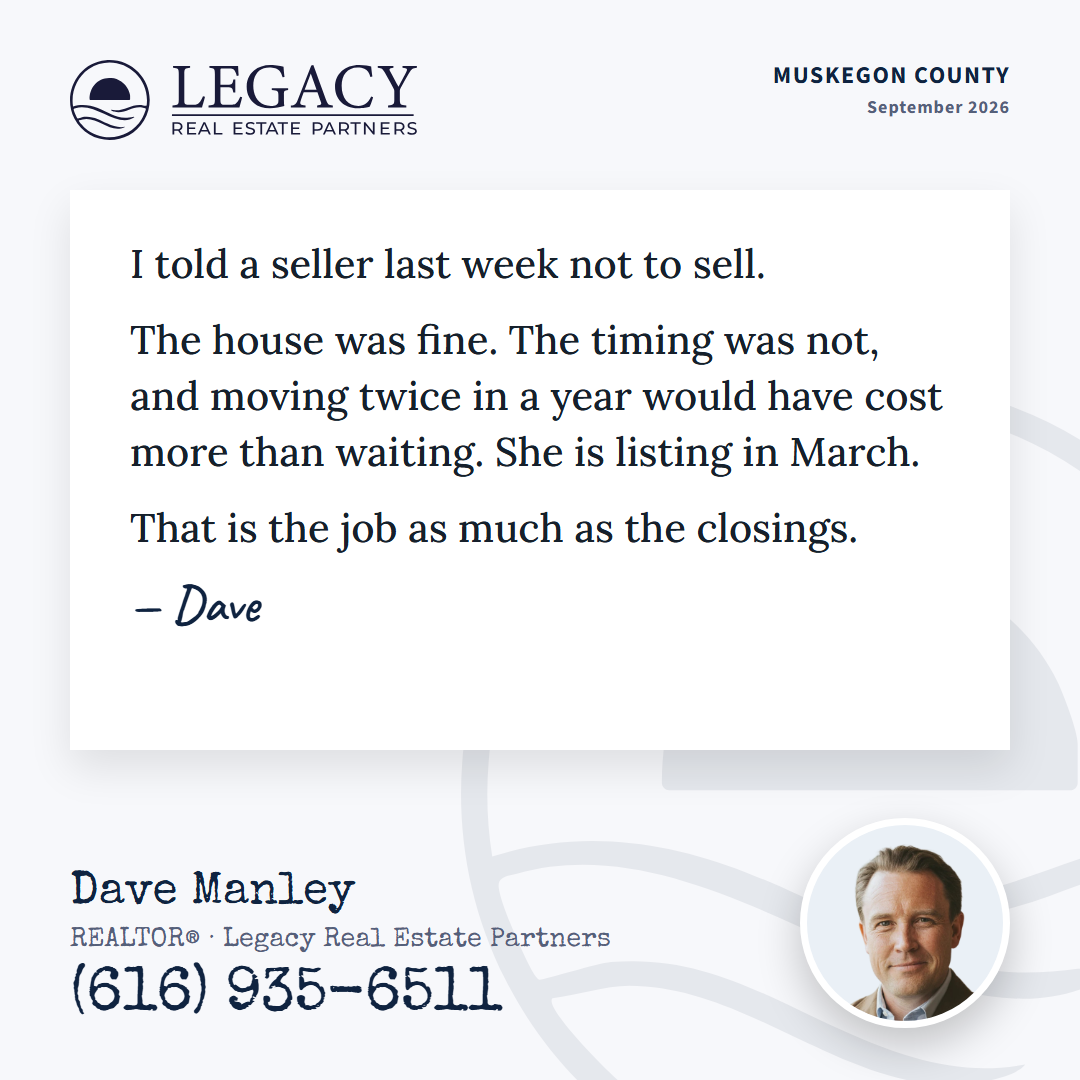
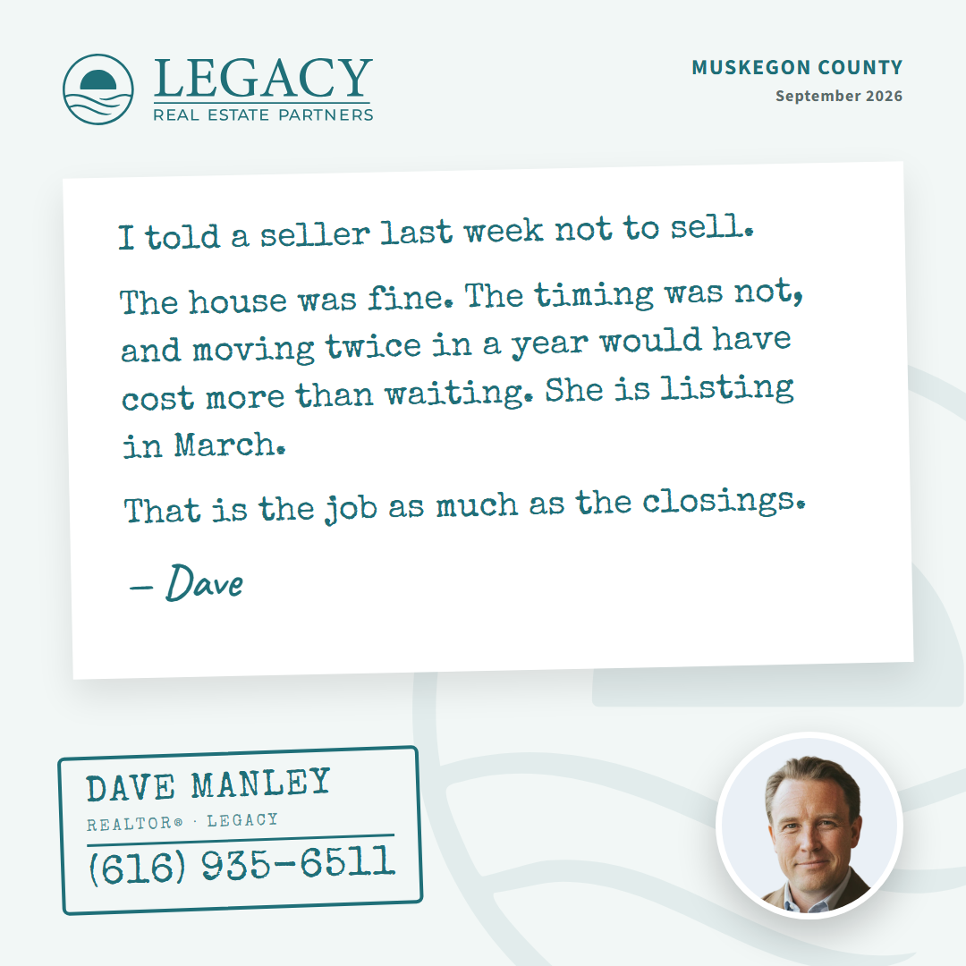
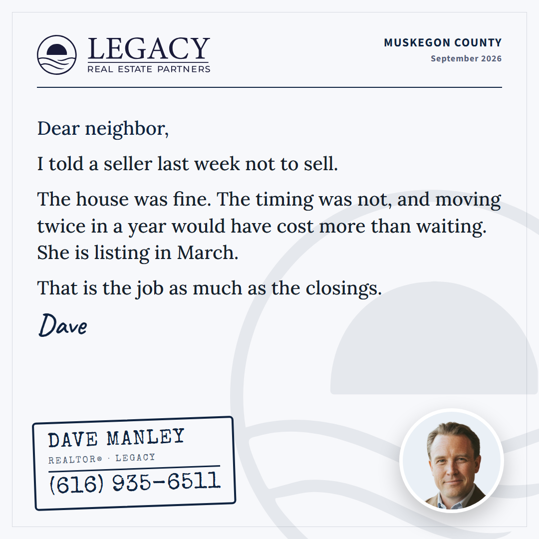
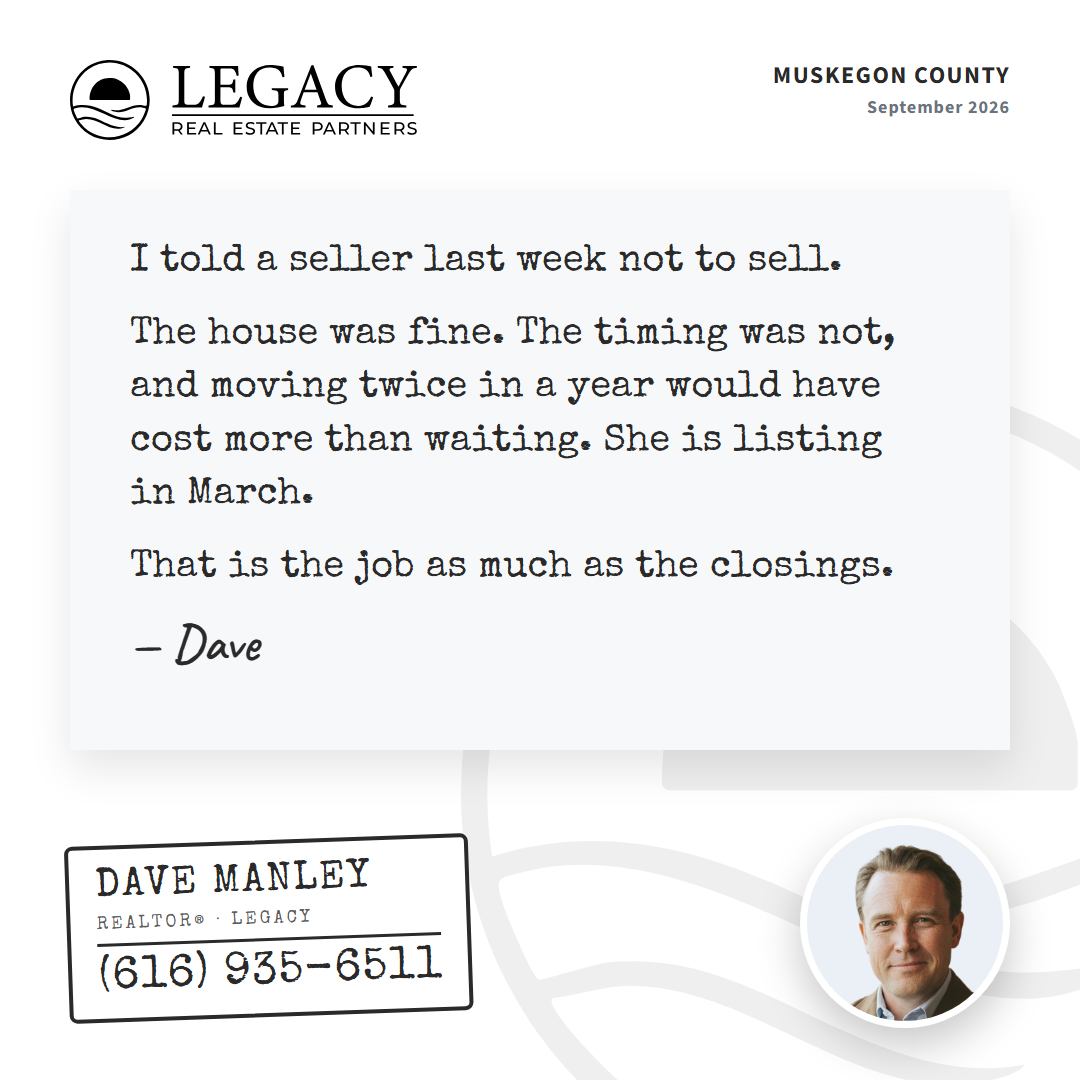
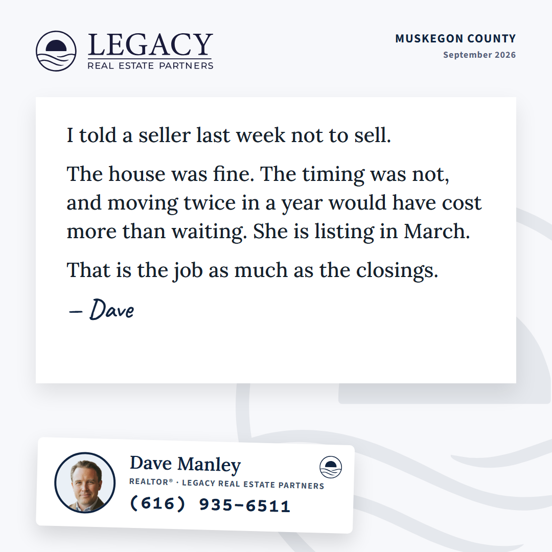
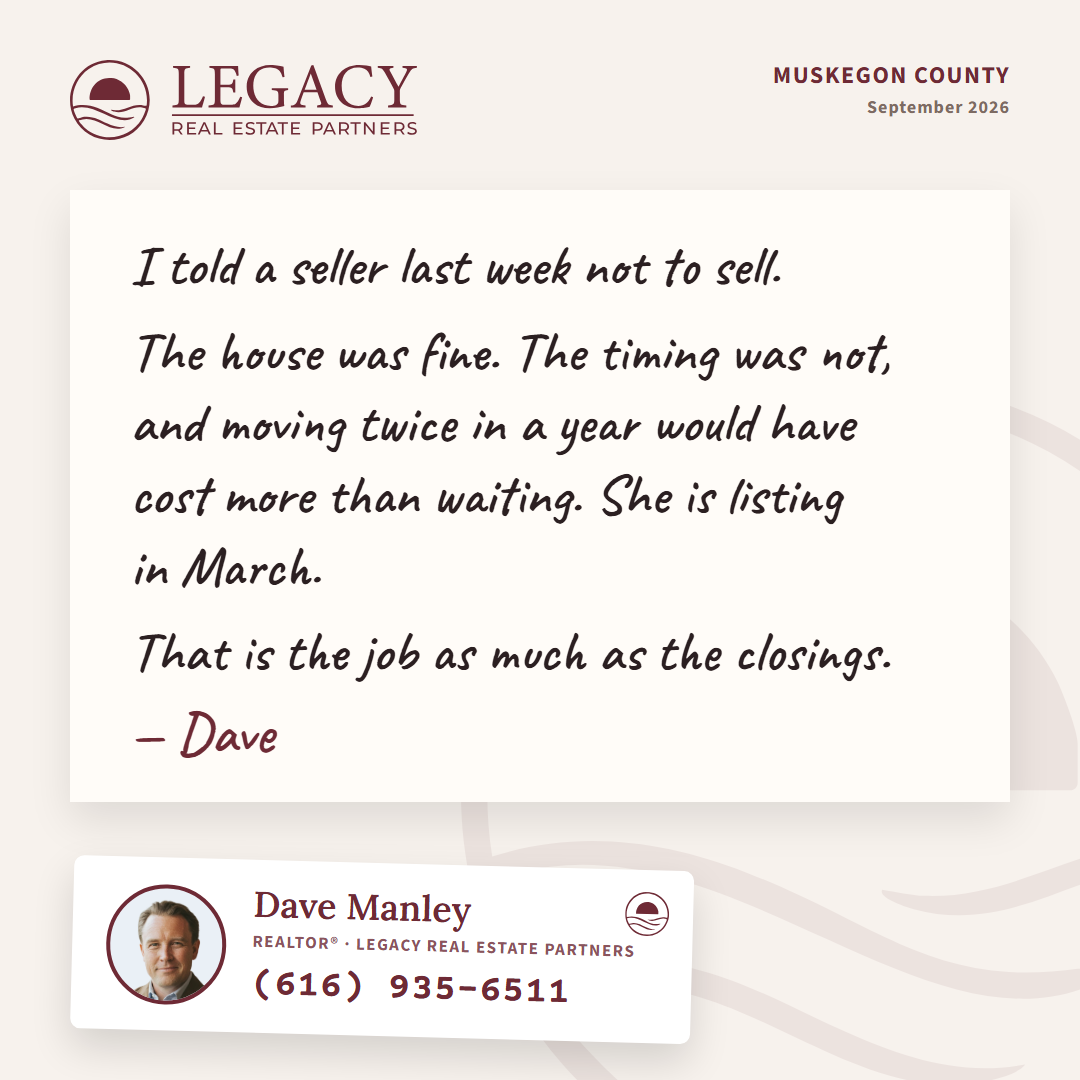
Style 3: the Note, nine cards (Dave's pass 2026-09-10)
Seeded from one of Brett's eighty-three (typewriter-note) and run through four rounds in one day: faces and grounds, then the agent block, then the set, then formats. A short written statement from the agent, no headline, no number, all voice. Rounds at 1, 2, 3, 4 (portrait and story).
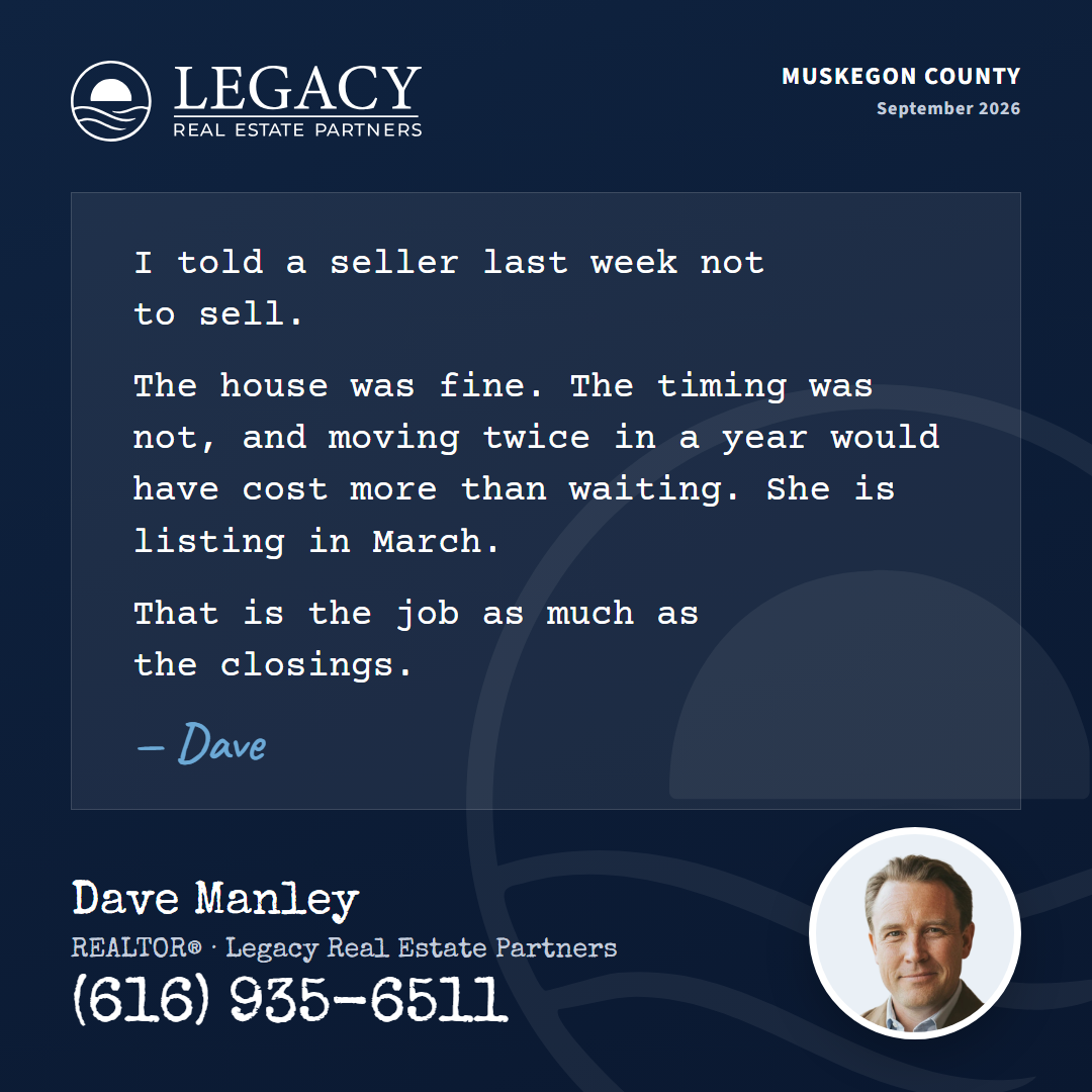
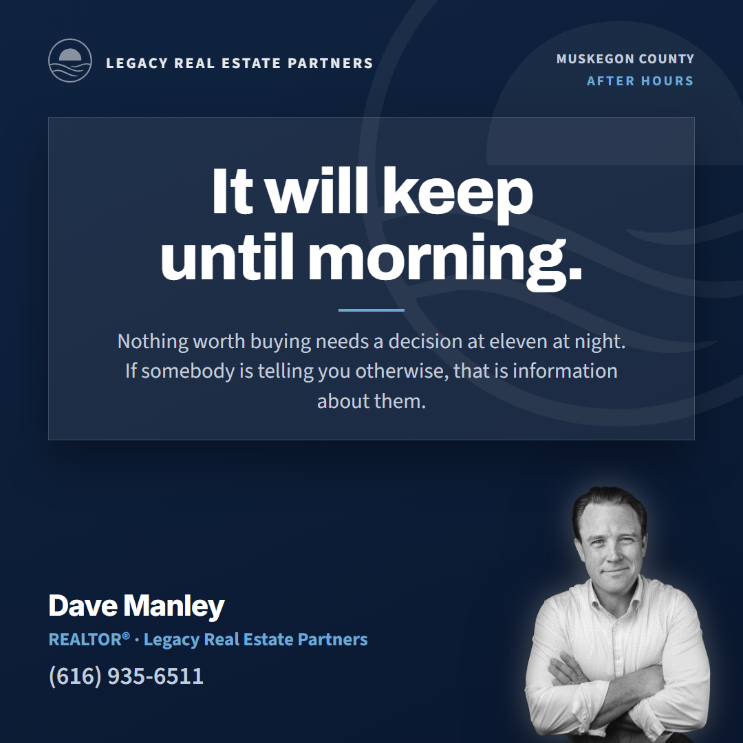
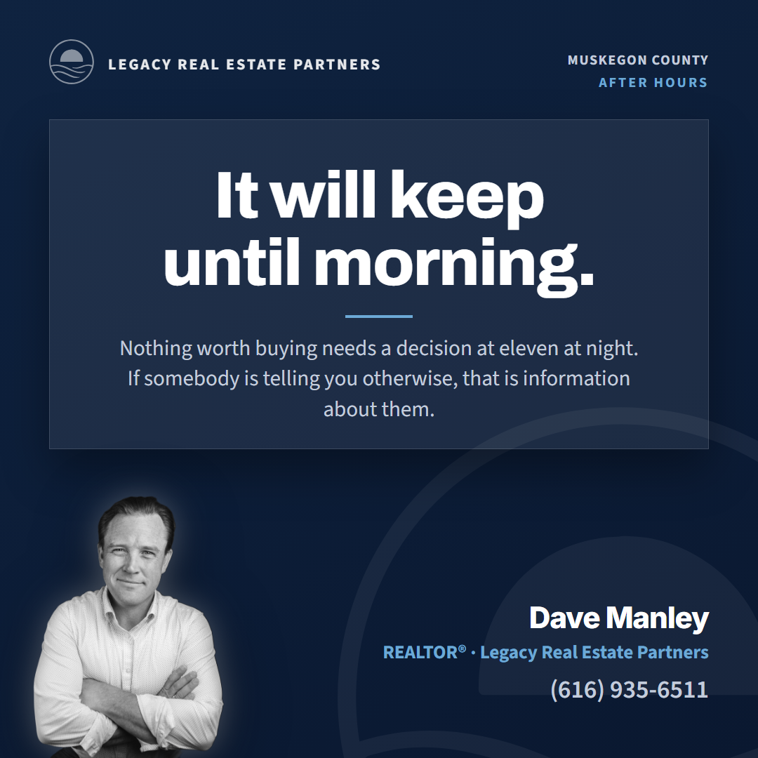
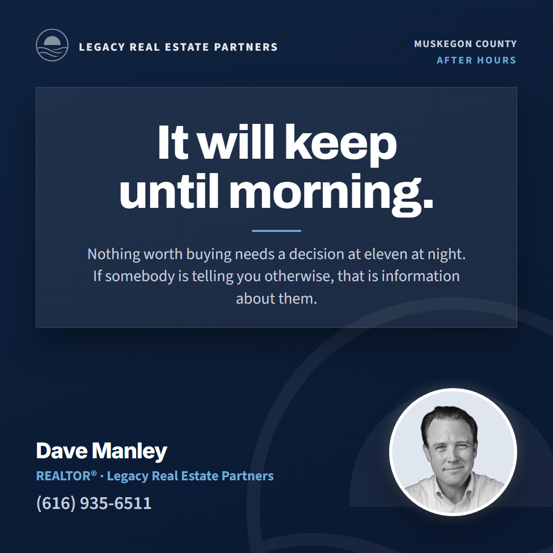
Style 4: the Fold, nine cards (Dave's pass 2026-09-11)
Seeded from Brett's corner-fold, the only dark card in his eighty-three, and run through five rounds. A full-width raised panel on a dark ground, one statement on two set lines, the line under it, and the agent in black and white in one of six treatments below the panel. Rounds at 1, 2, 3, 4, 5 (all three formats). Twelve more grounds at fold-colors.

Style 5: the Tear, nine cards (Dave's pass 2026-09-11)
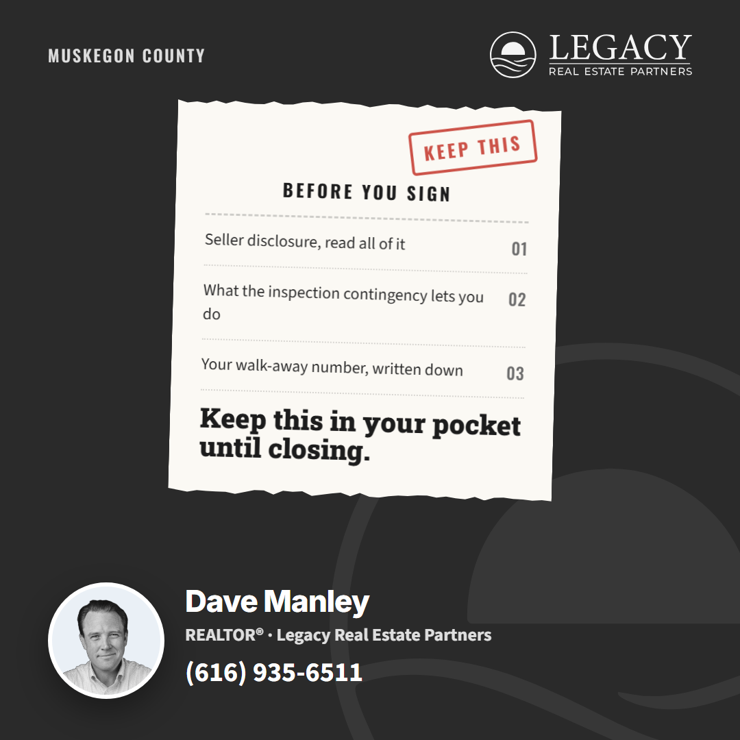
Seeded from Brett's perforated-tear, number 66 of his eighty-three. The first round was thrown out the same day: Dave read it as Style 1 with a torn edge, and it was. The real one starts from what a tear is: a scrap of paper as an object, smaller than the card, torn top and bottom, held to a colored ground by tape, a pin or a clip, at a slight angle, with its own type (a black slab serif for the line, a condensed face for the labels) and a small outlined rubber stamp top right that carries the job. Rounds at 2, 3 (the set), 4 (portrait and story), 5 (the six jobs).








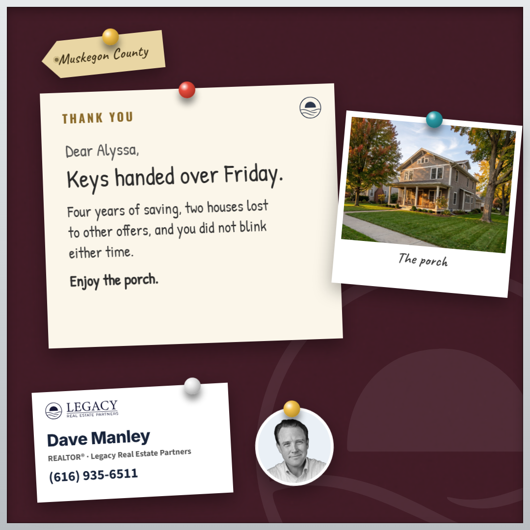
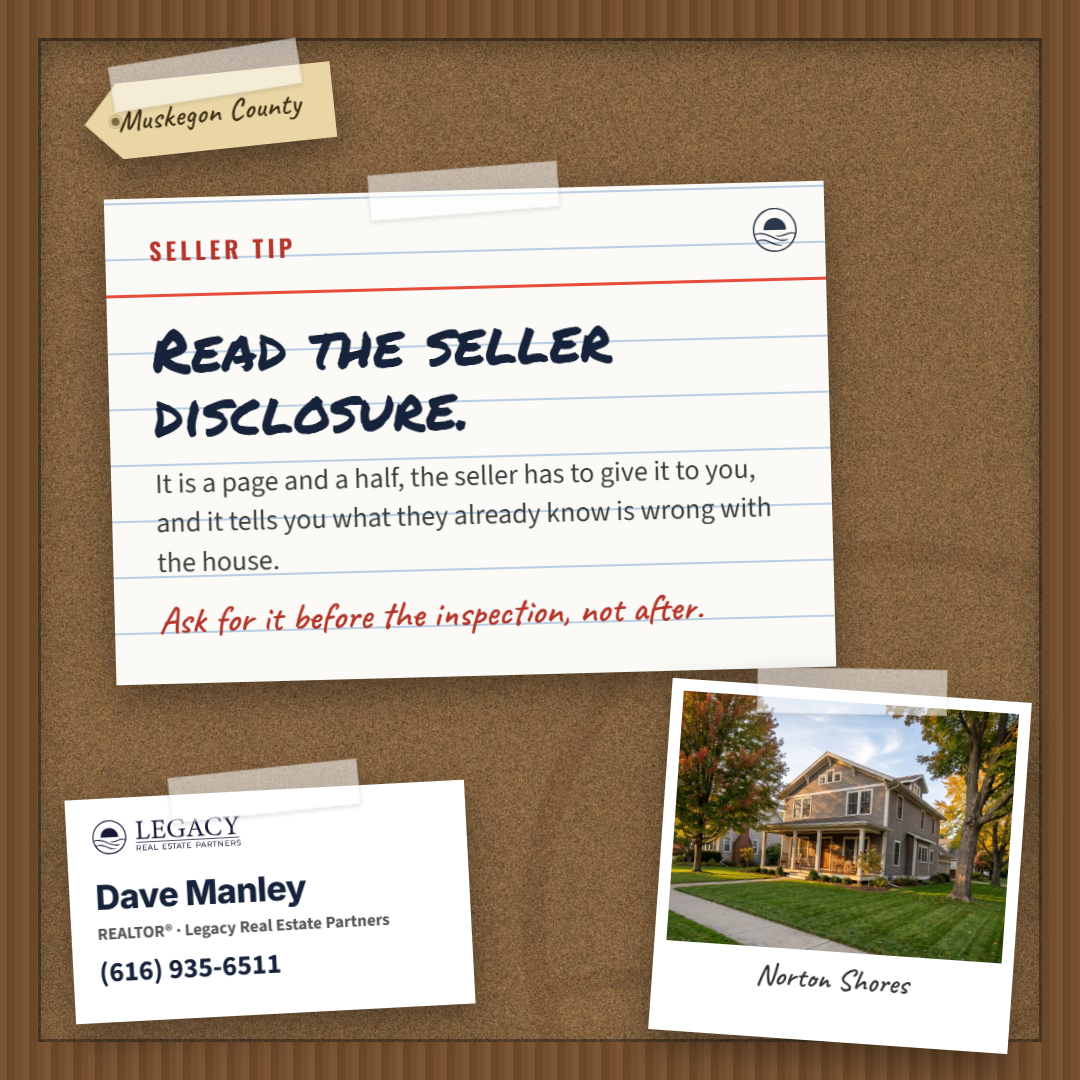
Style 6: the Board, nine cards (Dave's pass 2026-09-13)
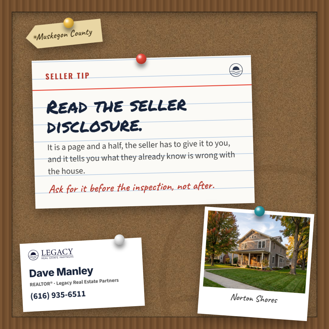
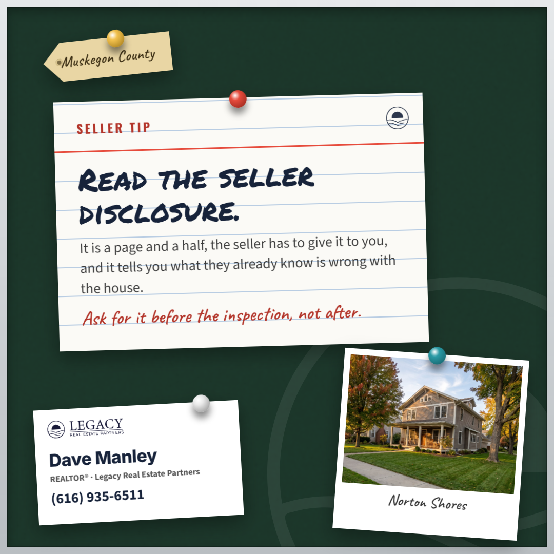
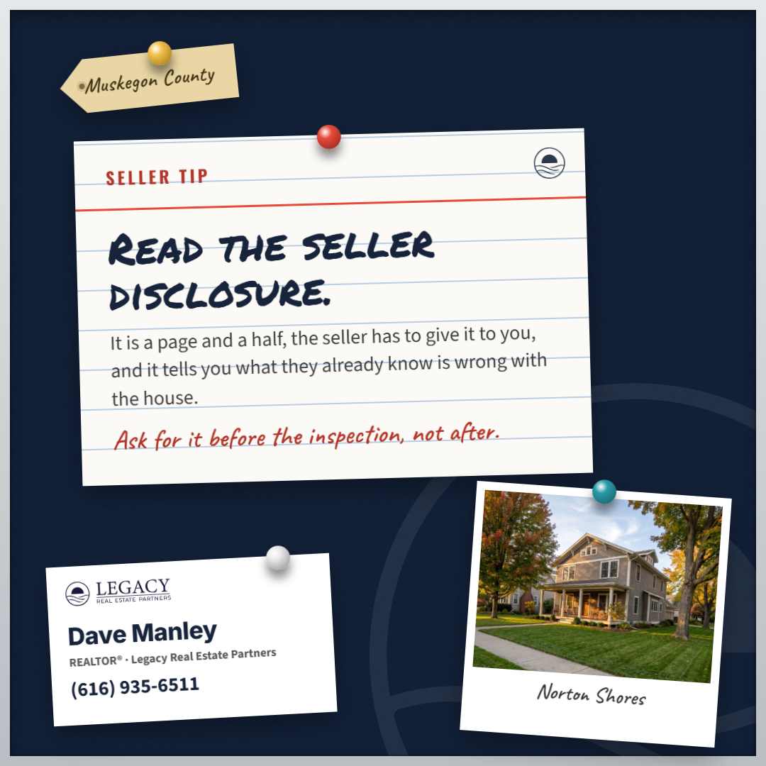
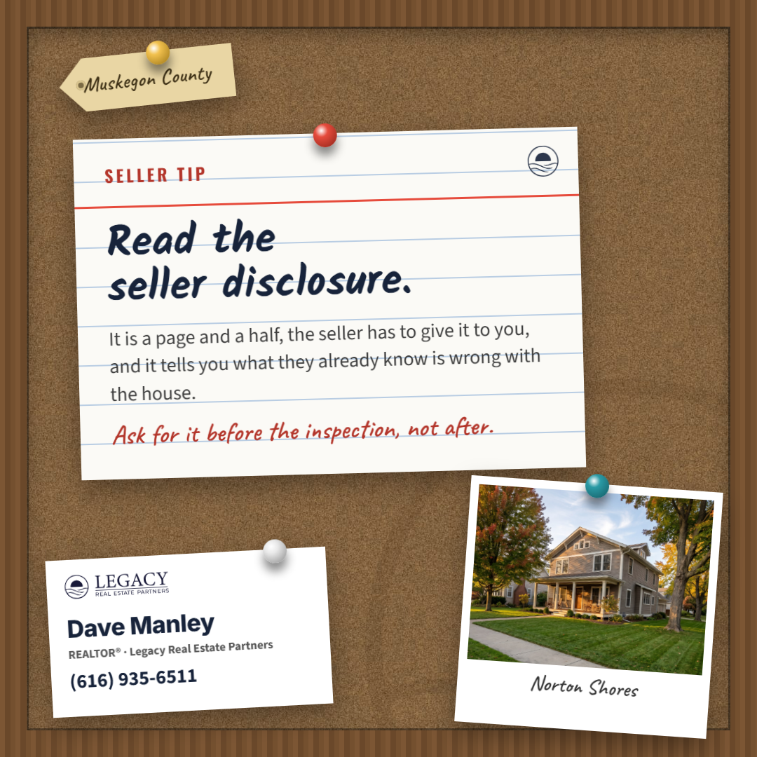
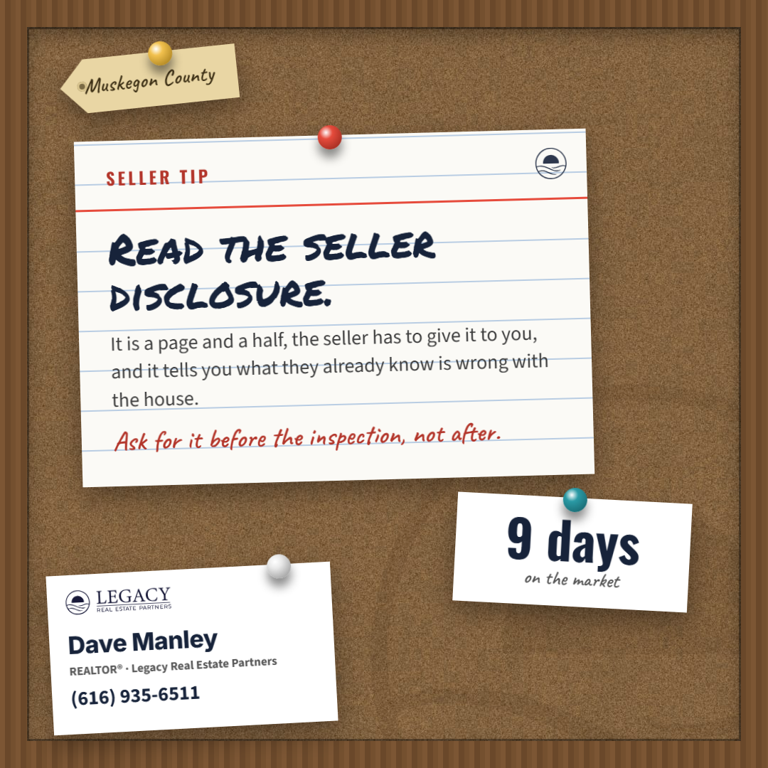
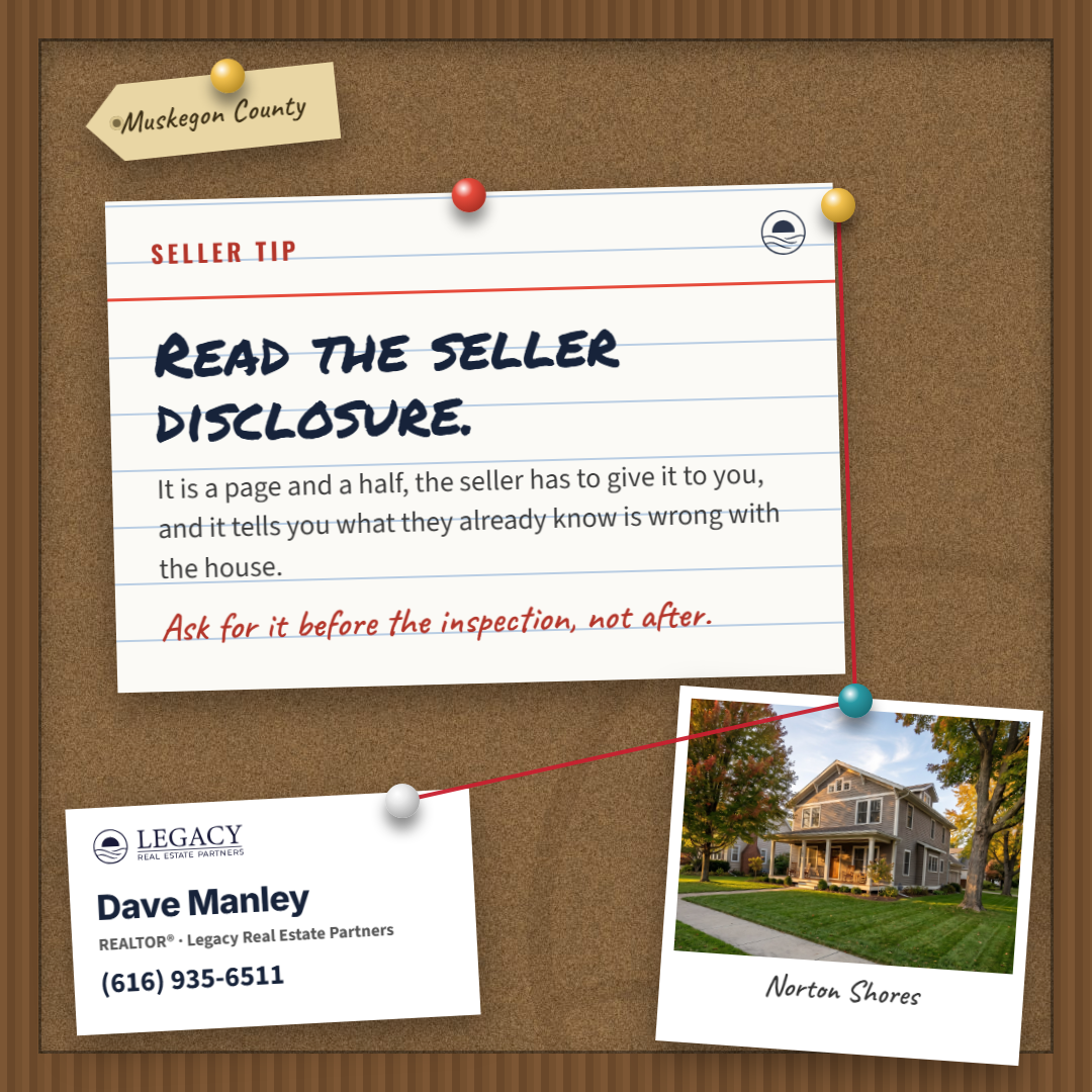
Seeded from Brett's community-board, number 93 on his board, which Dave read as more of the same. Round 1 started from what a board is: the board is the whole ground, cork in a wood frame or felt with a metal edge, and two or three things are pinned to it at slight angles, each its own object with its own paper and shadow. An index card carries the line, with the job label and the favicon in the band above its red rule. A photograph, a strip with a count, a manila tag with the county. The agent is a business card pinned in the corner, where the kit mark lives, and a round photo print pinned beside it. Its own type: a marker for the line, a hand for the labels, plain sans for the body, Inter on the card. Rounds at 1, 2, 3 (the set), 5 (portrait and story), 6 (the six jobs).

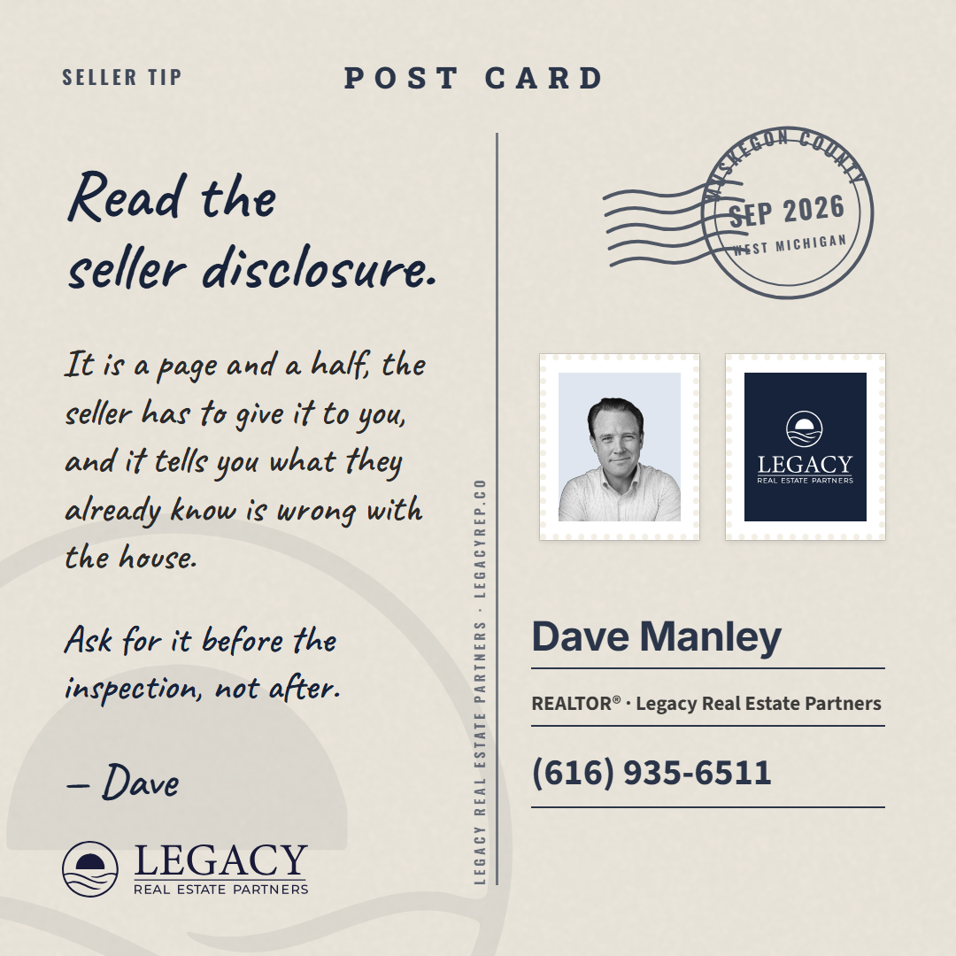
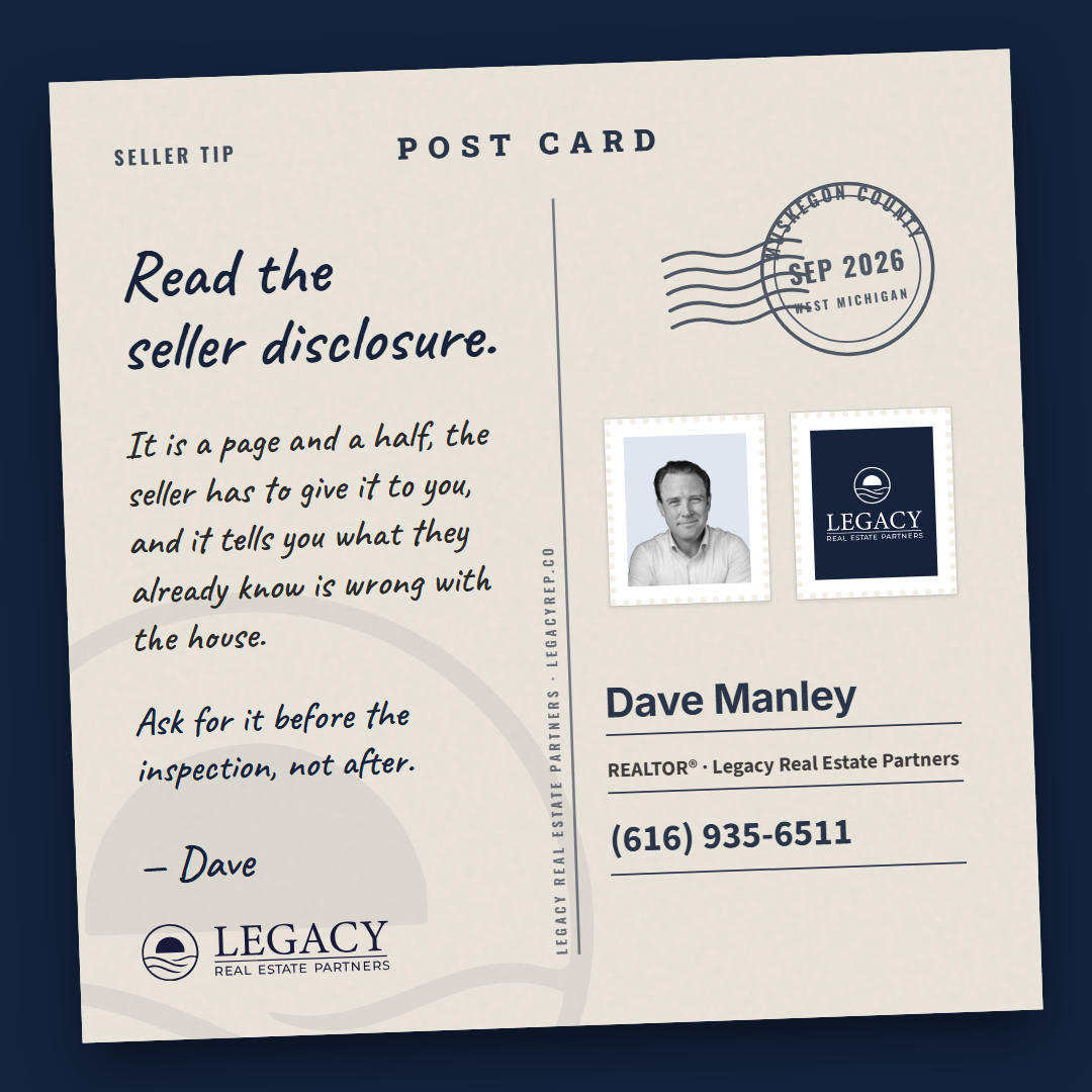
Style 7: the Postcard, nine cards (Dave's pass 2026-09-13)
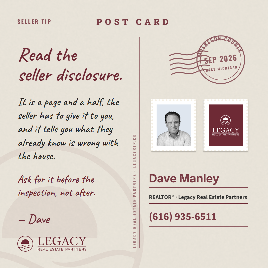
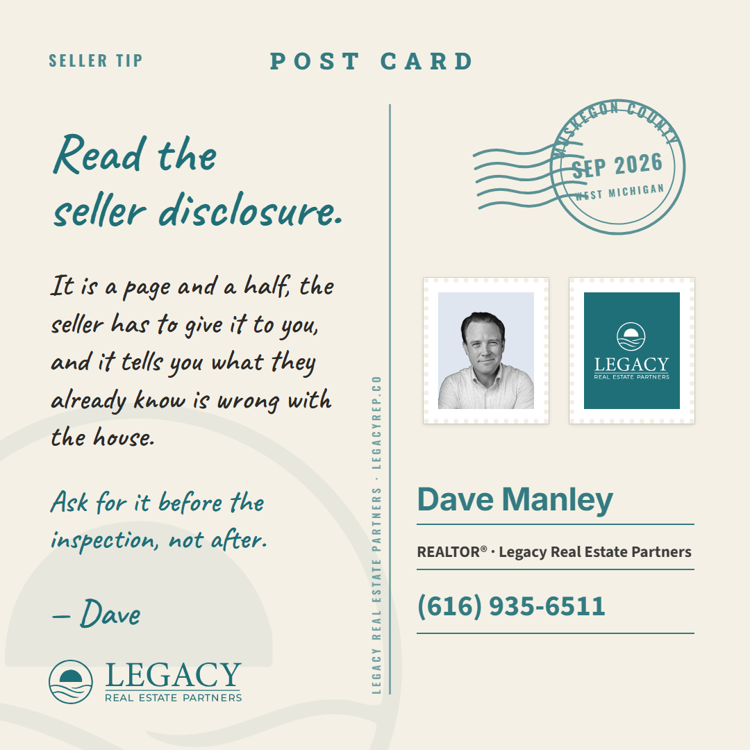
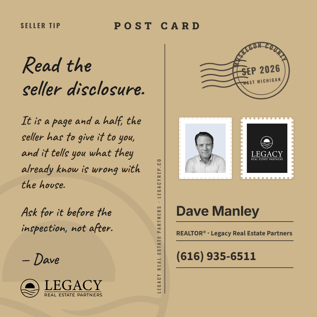
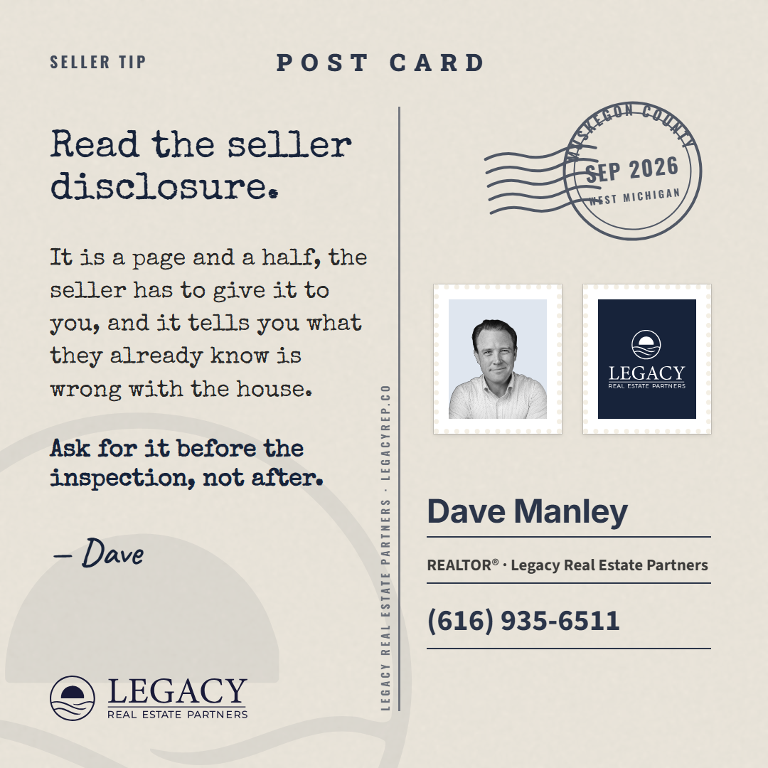
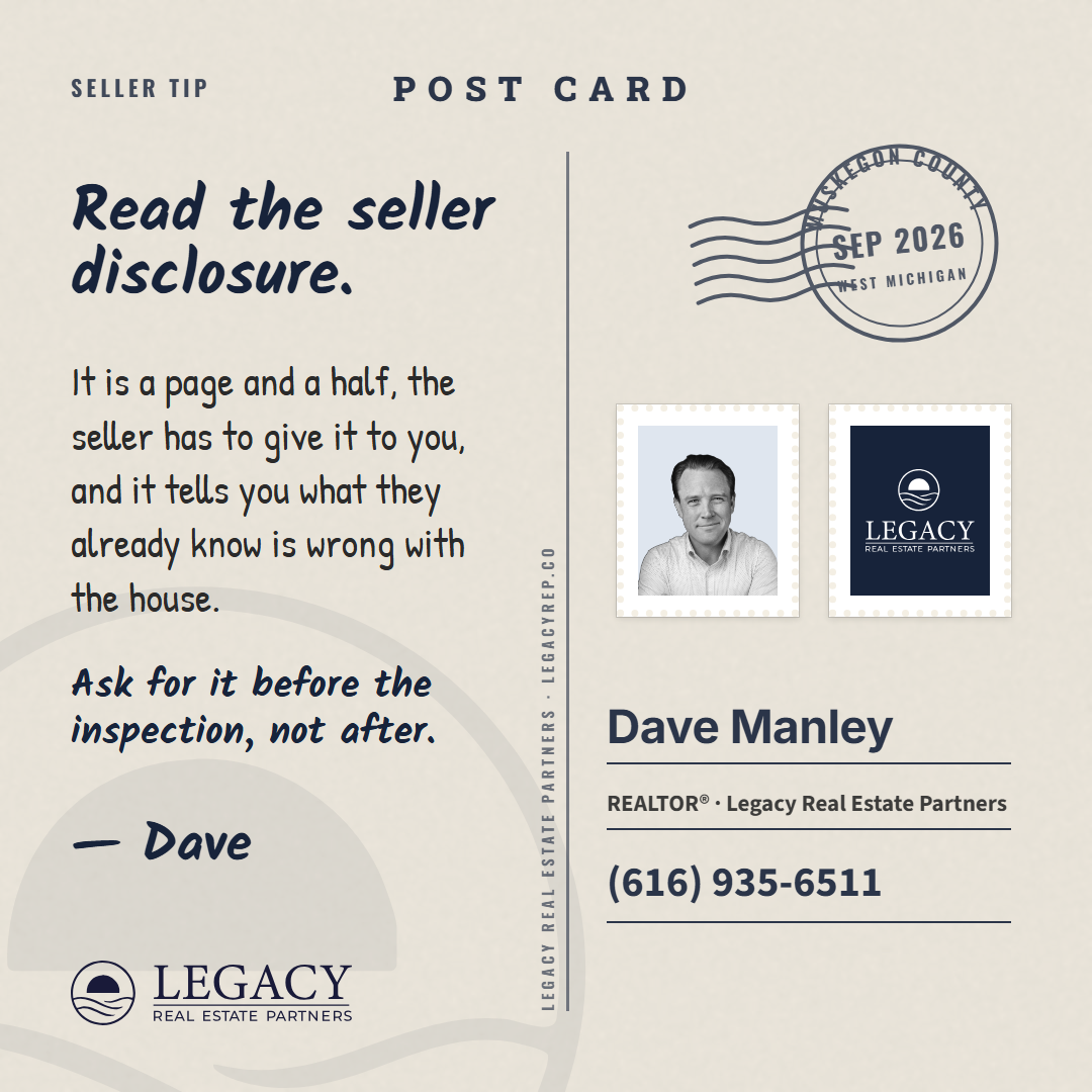
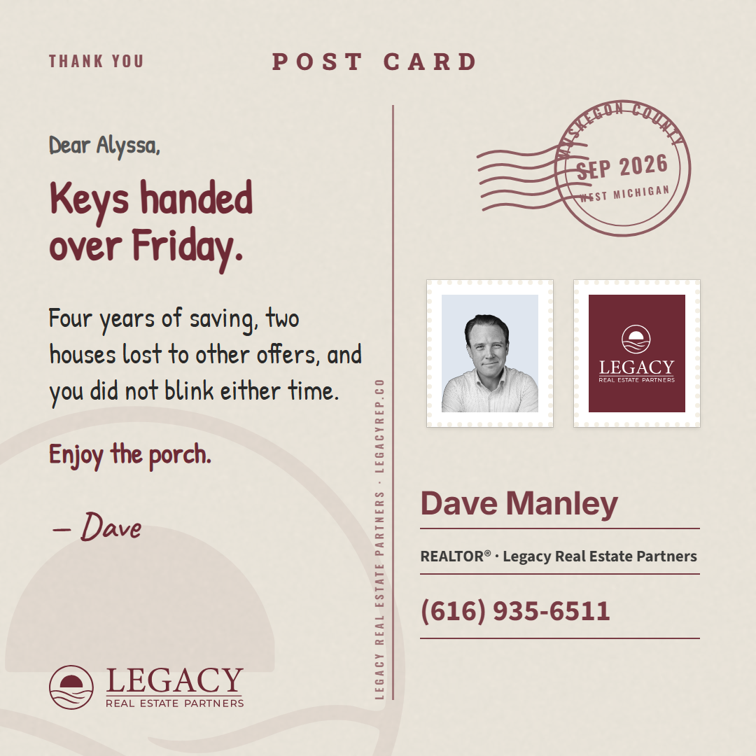
Seeded from Brett's holiday-postcard, number 22 on his board. It is the back of a postcard: cream card stock with a faint grain, a rule down the middle with the printer's line running up it, POST CARD set small across the top, the job label top left where the caption goes. On the left, the message in a written face, signed with a first name, with a line of air between its parts. On the right, the postmark at the top, a circle with the county and the month and three cancellation waves running into it; under it the agent's photo stamp and the Legacy stamp, perforated, the stamp carrying the stacked mark in white; and at the foot the address lines with the agent as the sender. The lockup sits at the foot of the message where the publisher's line goes. Rounds at 1, 2, 3 (the set), 5 (portrait and story), 6 (the six jobs).

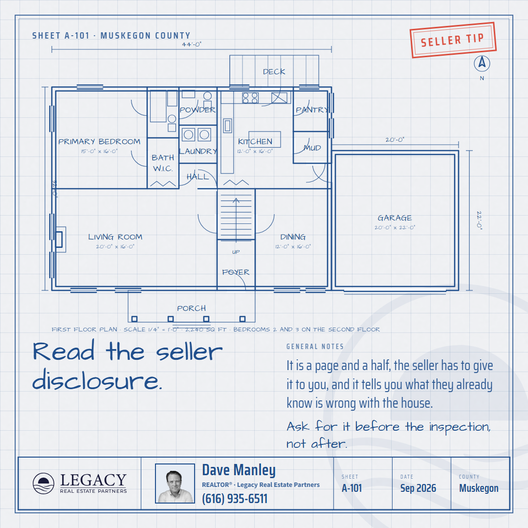
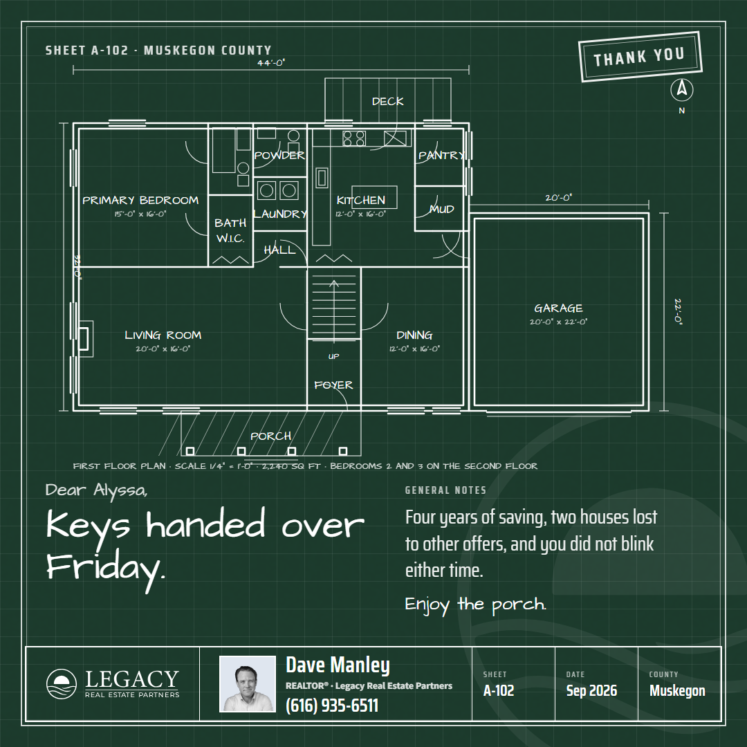
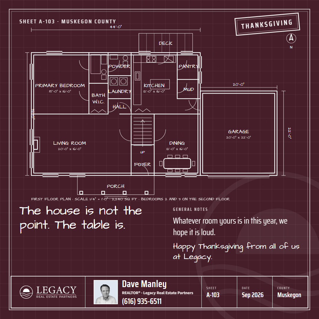
Style 8: the Blueprint, nine cards (Dave's pass 2026-09-14)
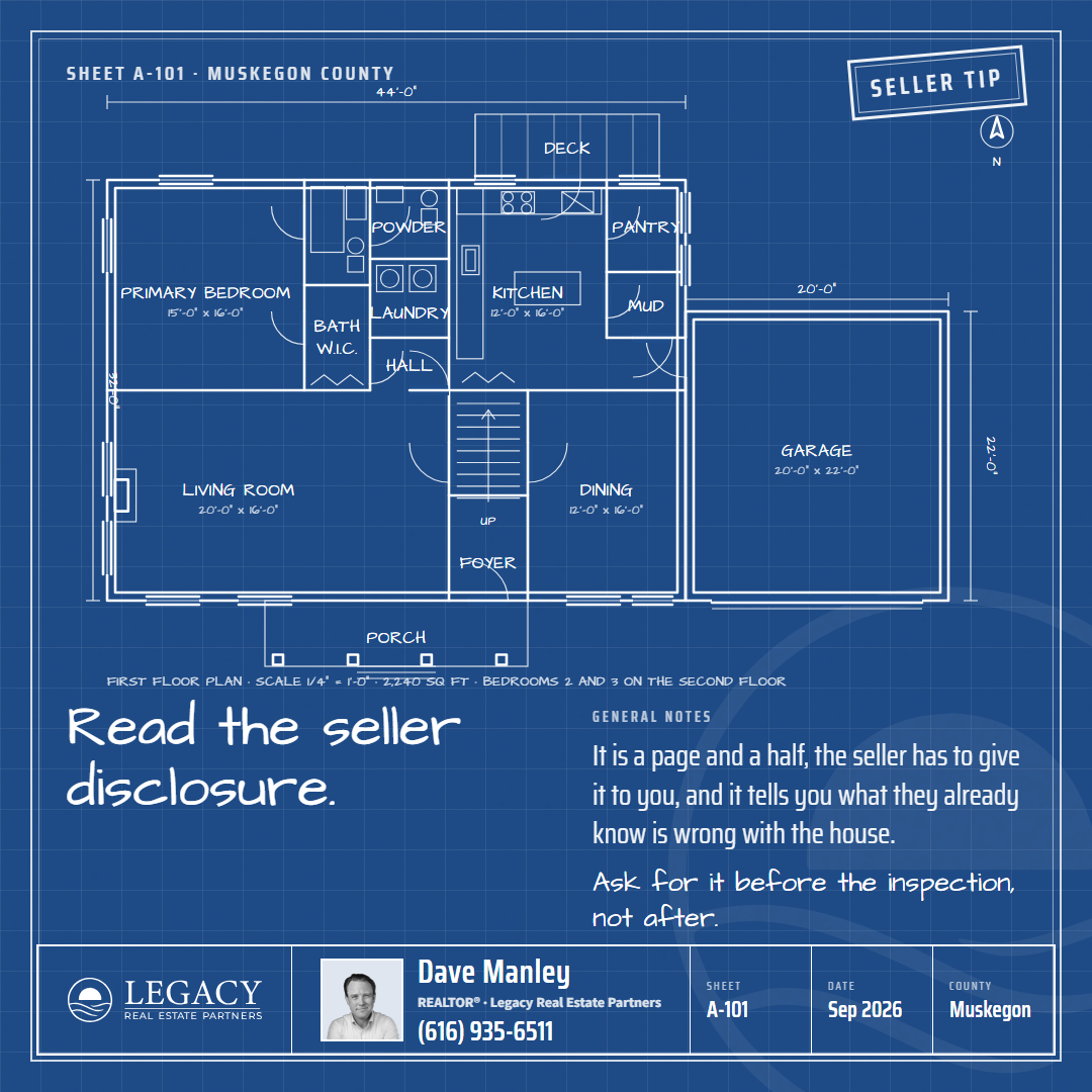
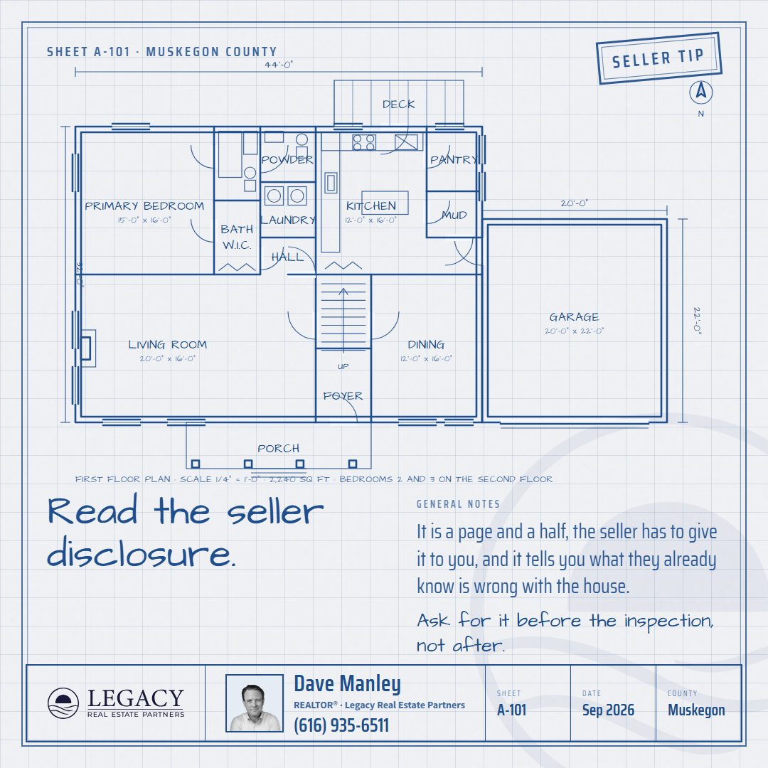
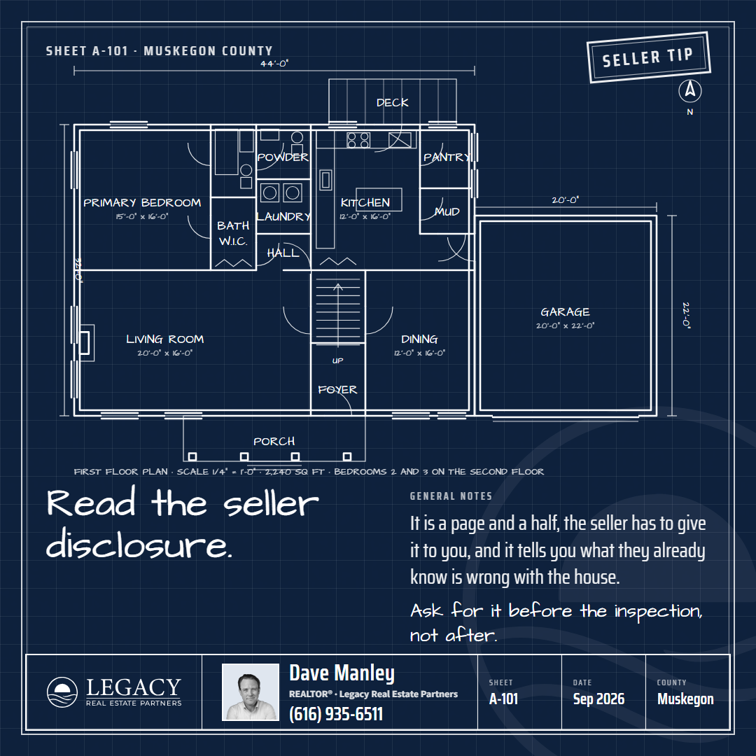
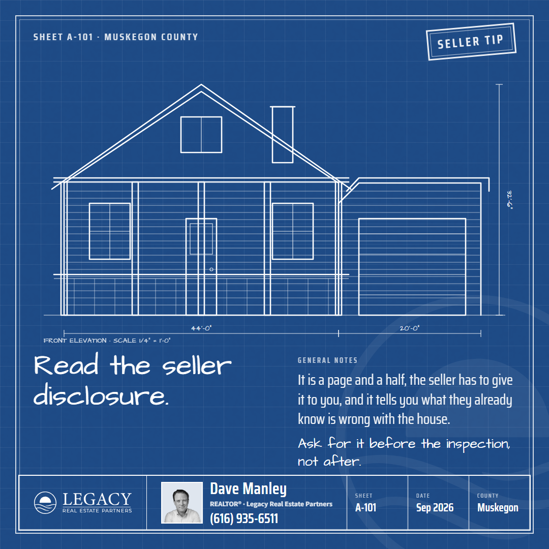
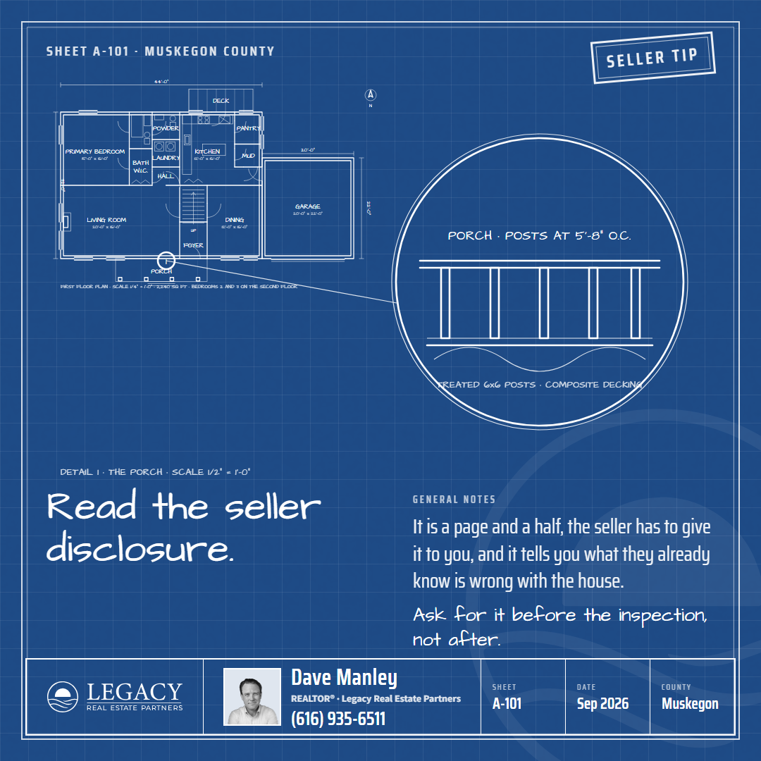
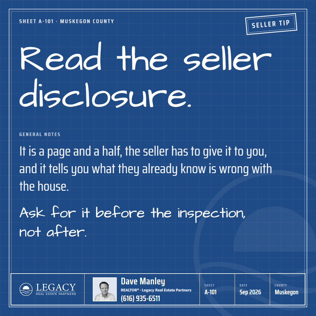
The hard one. Seeded from Brett's listing-blueprint, number 188. An architect's sheet: blueprint blue with the drafting grid and the paper's grain, a double-line frame, and a real first floor drawn to scale across the full width, a 44 by 32 house with a foyer, a living room with a fireplace, a dining room, a kitchen with an L of counters and an island, a pantry, a mudroom to the attached two-car garage, a powder room, laundry, the stairs going up, a primary suite, a porch on columns and a deck, with the doors swinging, the windows in the walls, the fixtures drawn, the dimension strings and the north arrow. The text is the drawing's notes in two columns under it, the line in a drafting hand and the notes in a condensed technical face. The title block is a strip along the foot: the lockup, the agent with an ID photo, the sheet, the date, the county. A revision stamp top right carries the job. Rounds at 1, 2, 3 (the set), 4 (portrait and story), 5 (the six jobs).
Style 9: the Broadside, nine cards (Dave's pass 2026-09-14)
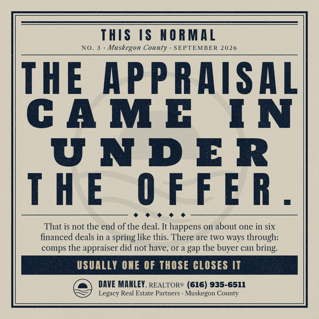
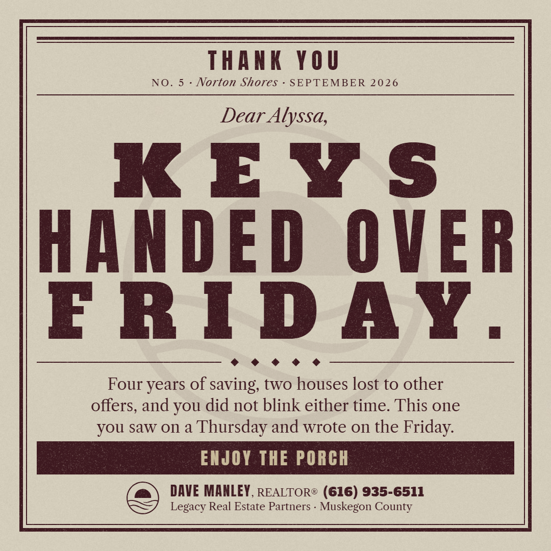
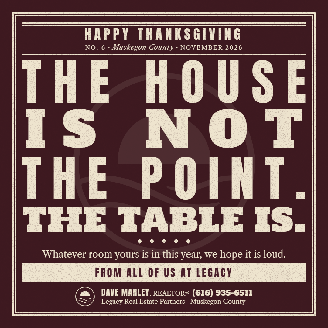
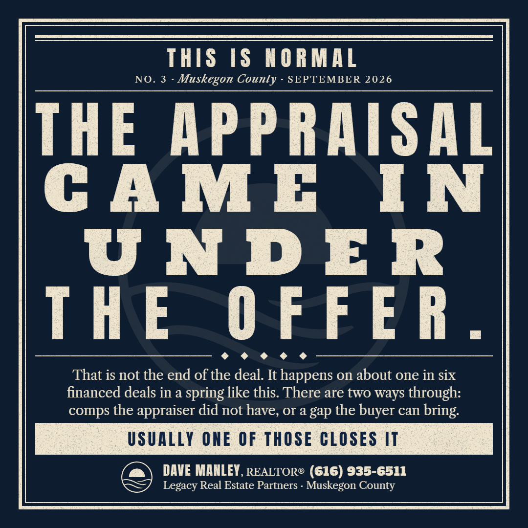
Dave asked for one vastly different from the eight, which are paper objects with hand-lettered or drafted type. The Broadside is a letterpress poster set from wood type, the kind a print shop ran for a fair or a sale. Nothing on it is written by hand and nothing on it is a scrap: the type is the object. Every line of the headline is set to fill the measure, so a short word gets a huge face and a long phrase a small one, and the faces change line by line: a condensed gothic (Anton), a fat wood type (Holtwood One SC), a slab (Alfa Slab One), a Tuscan (Rye) and an ornamented face (Sancreek). A line that hits its cap is letterspaced out to the edge. The ink is printed, not drawn: it multiplies into the paper's grain and wears thin in speckles. The job sits in the top slug between a double rule and a single; the paragraph is Libre Caslon, centered and balanced; the last line is reversed out of a solid band; the slug at the foot carries the kit mark as the printer's device beside the name, the credential, the phone, the firm and the county. Rounds at 1 (faces and inks), 2 (the set), 3 (portrait and story), 4 (the six jobs in the neutral voice).




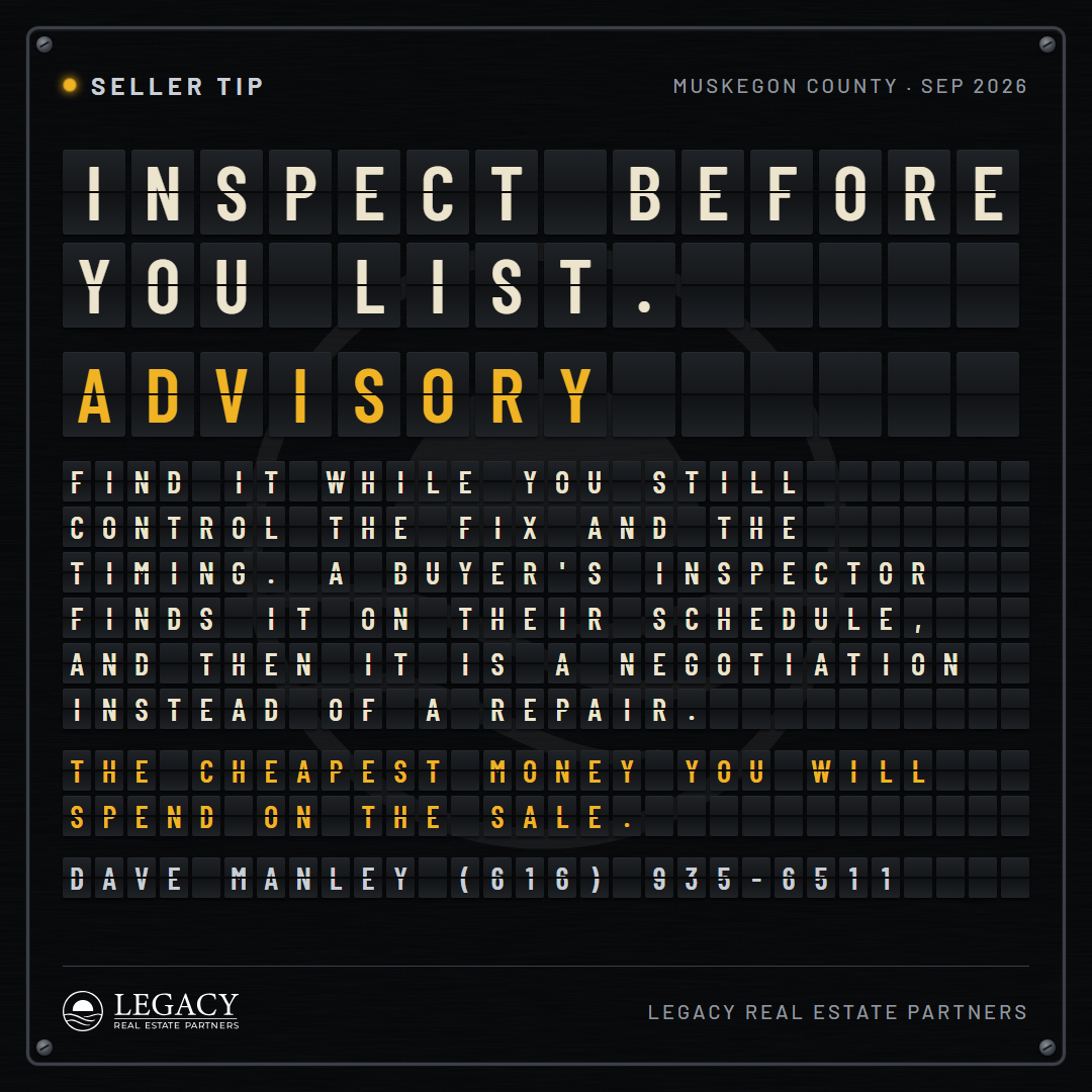
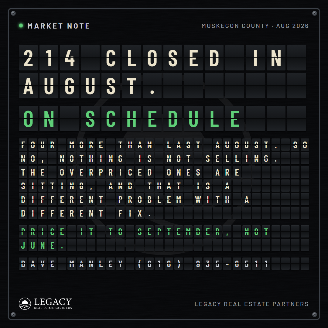
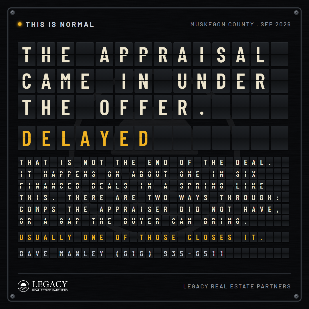
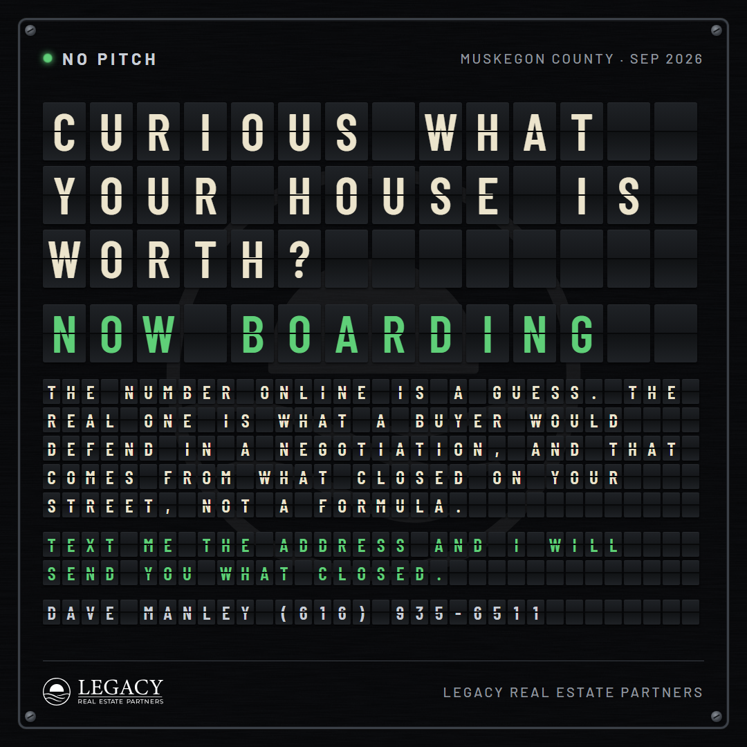
Style 10: the Split-Flap, nine cards (Dave's pass 2026-09-14)
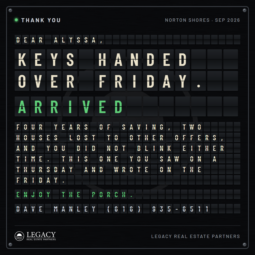
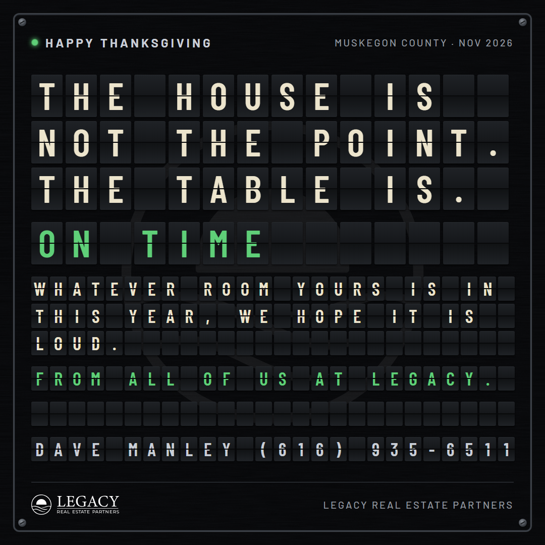
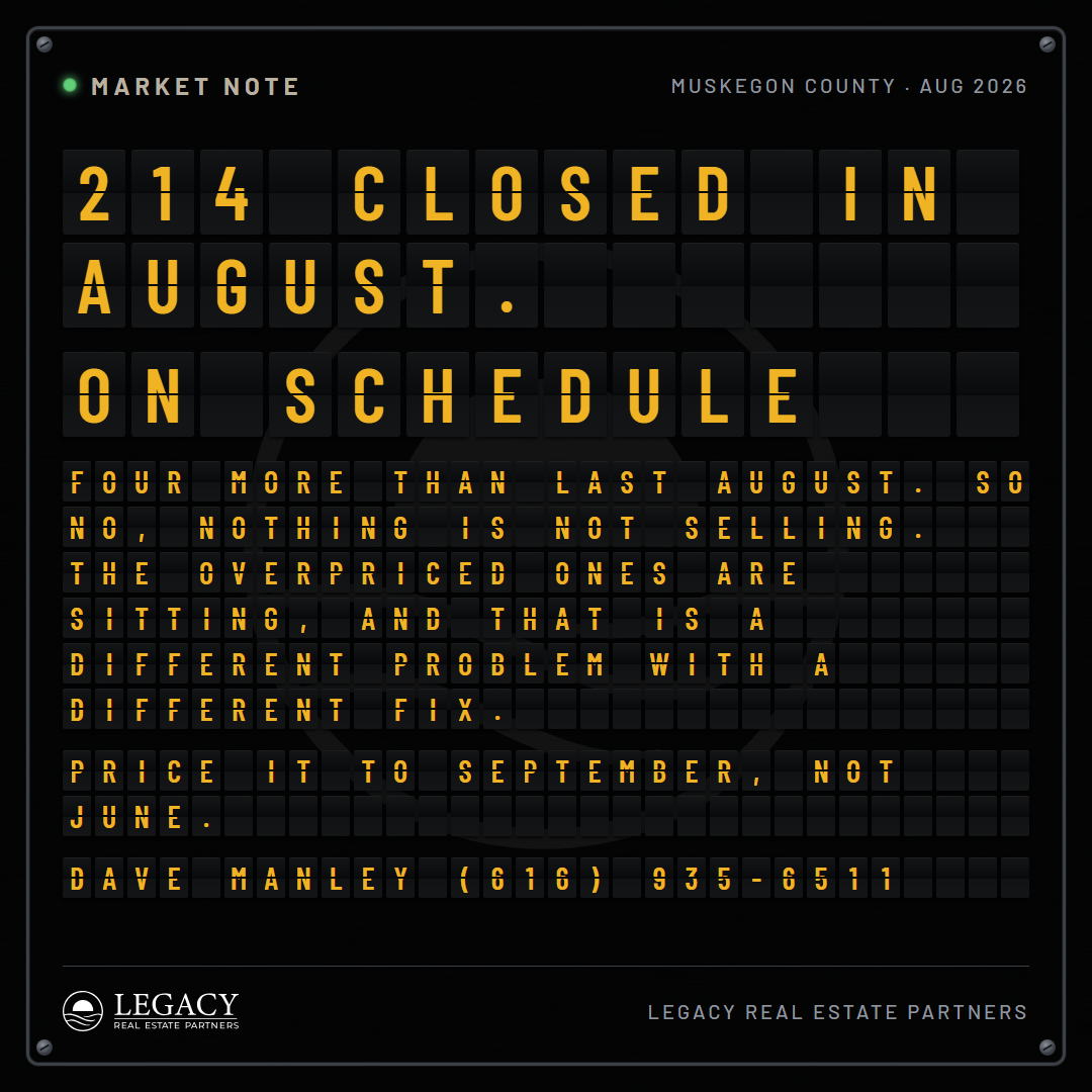
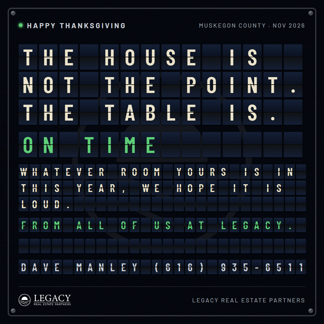
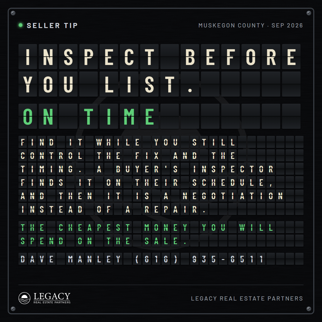
My pick, and Dave's read on it: unique, hard to read at the foot, and it will get their attention. A departure board. Nothing on it is drawn, printed or written by hand: every character is its own mechanical flap, a dark card split across the middle, and the words are rows of them on a brushed panel behind a bezel with four screws. The board lays the copy on a fixed grid: big flaps for the headline, a row in the status color, small flaps for the paragraph, the last line in the status color, and the board signs itself on its last row with the agent's name and phone in flaps. The rows the copy does not use stay blank between the note and the signature, the way a real board has empty rows. The board picks the largest flaps the copy fits on, so long copy drops to a denser grid and short copy gets bigger flaps; a taller board gets bigger flaps still. The job reads as a status in the board's own vocabulary: ADVISORY, ON SCHEDULE, DELAYED, NOW BOARDING, ARRIVED, ON TIME. The job label with a lamp in the status color and the county are printed on the panel above the board; the lockup and the firm below it. Rounds at 1 (panels, letters, statuses), 2 (the set, signed), 3 (portrait and story), 4 (the six jobs in the neutral voice).
Style 11: the Engraving, nine cards (Dave's pass 2026-09-14)
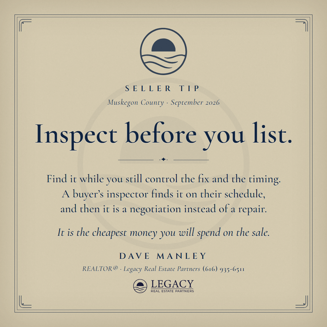
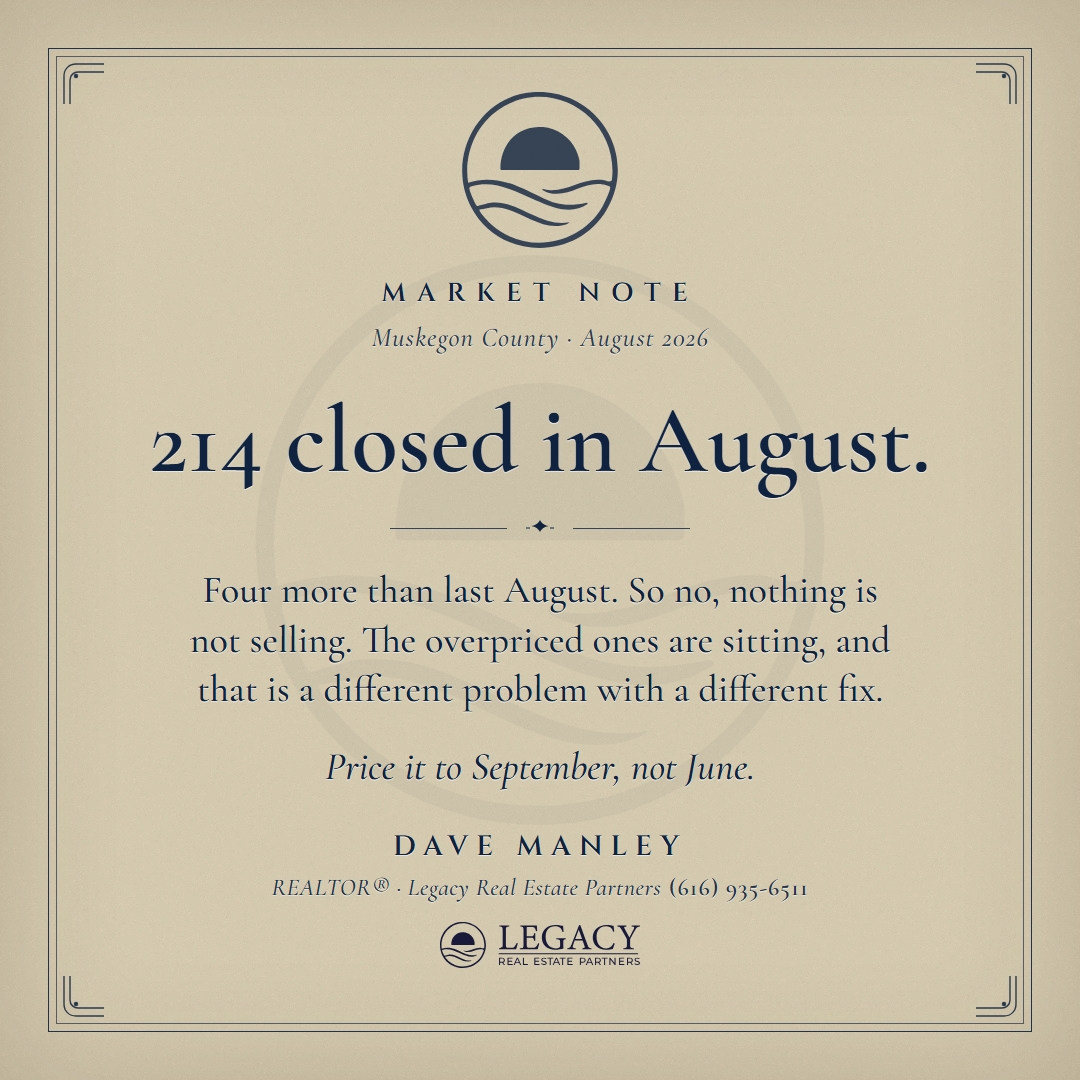
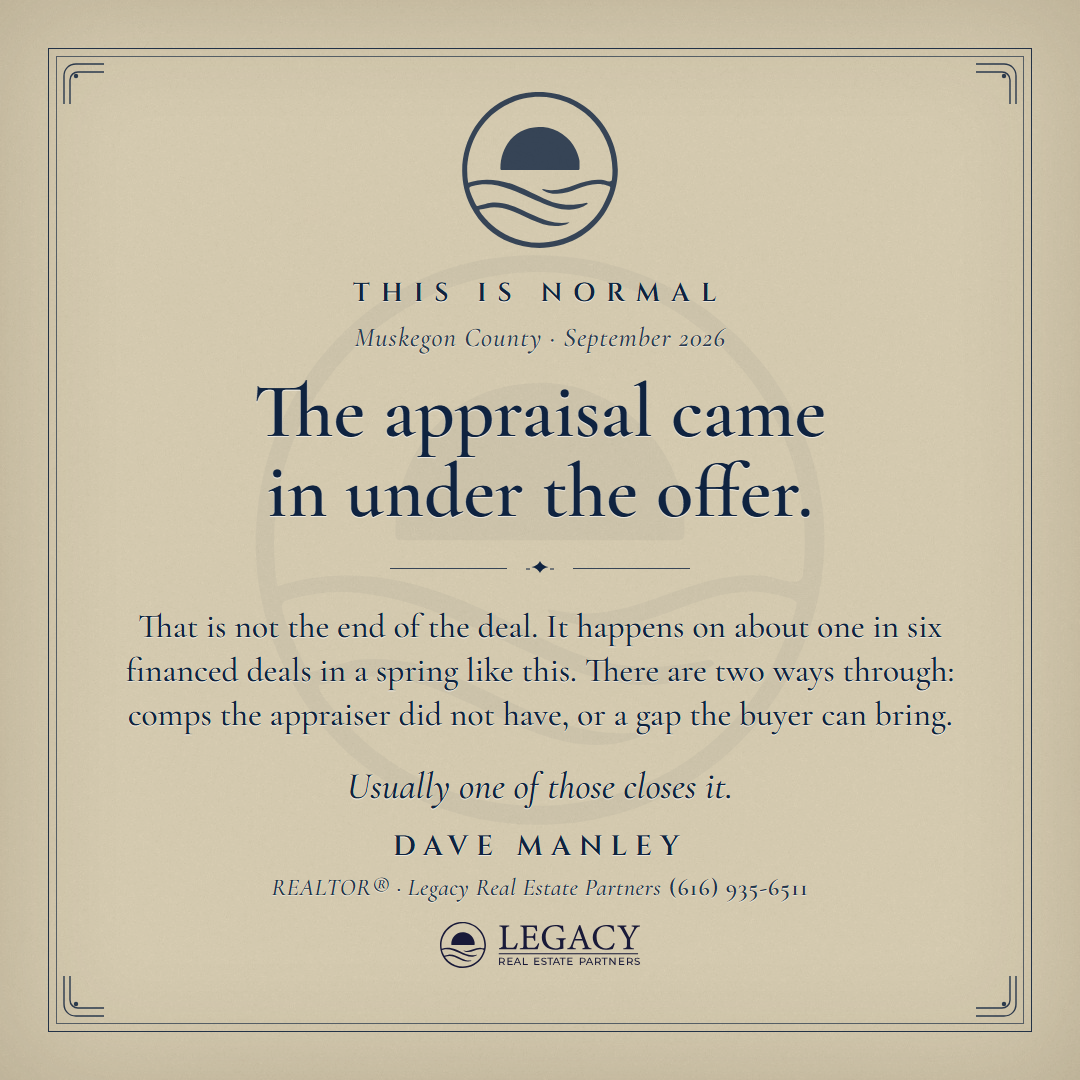
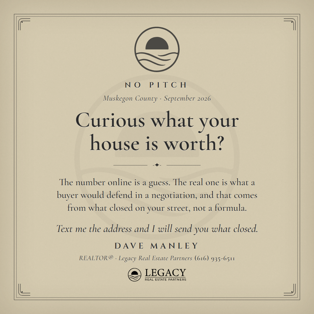
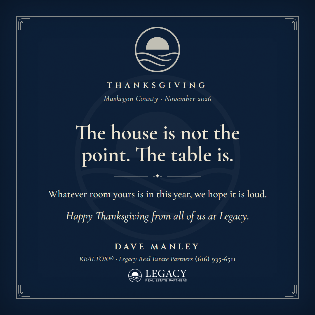
My pick, and the fastest pass yet: three rounds. After the wood type and the machine, the register the library lacked was elegance. An engraved card: thick cotton stock with a soft vignette at its edges, a thin double keyline with engraved corners, and the kit mark at the head engraved in the ink at 80 percent. The job in engraved small caps (Cinzel), the line in a Garamond (Cormorant), a fleuron rule, the paragraph in the roman and the last line in the italic, and the agent engraved at the foot over the lockup. The ink switches per card, navy, burgundy, charcoal, or reversed in cream on navy stock, and the mark and the lockup follow it. A fit pass sizes the type so the form always fills the card between the mark and the keyline: the line grows until it would take a third line, the rest until the form is full, and anything that overruns backs off. Rounds at 1 (inks and the mark), 2 (the set), 3 (portrait and story), 4 (the six jobs in the neutral voice).
Style 13: the Lock Screen, nine cards (Dave's pass 2026-09-14)
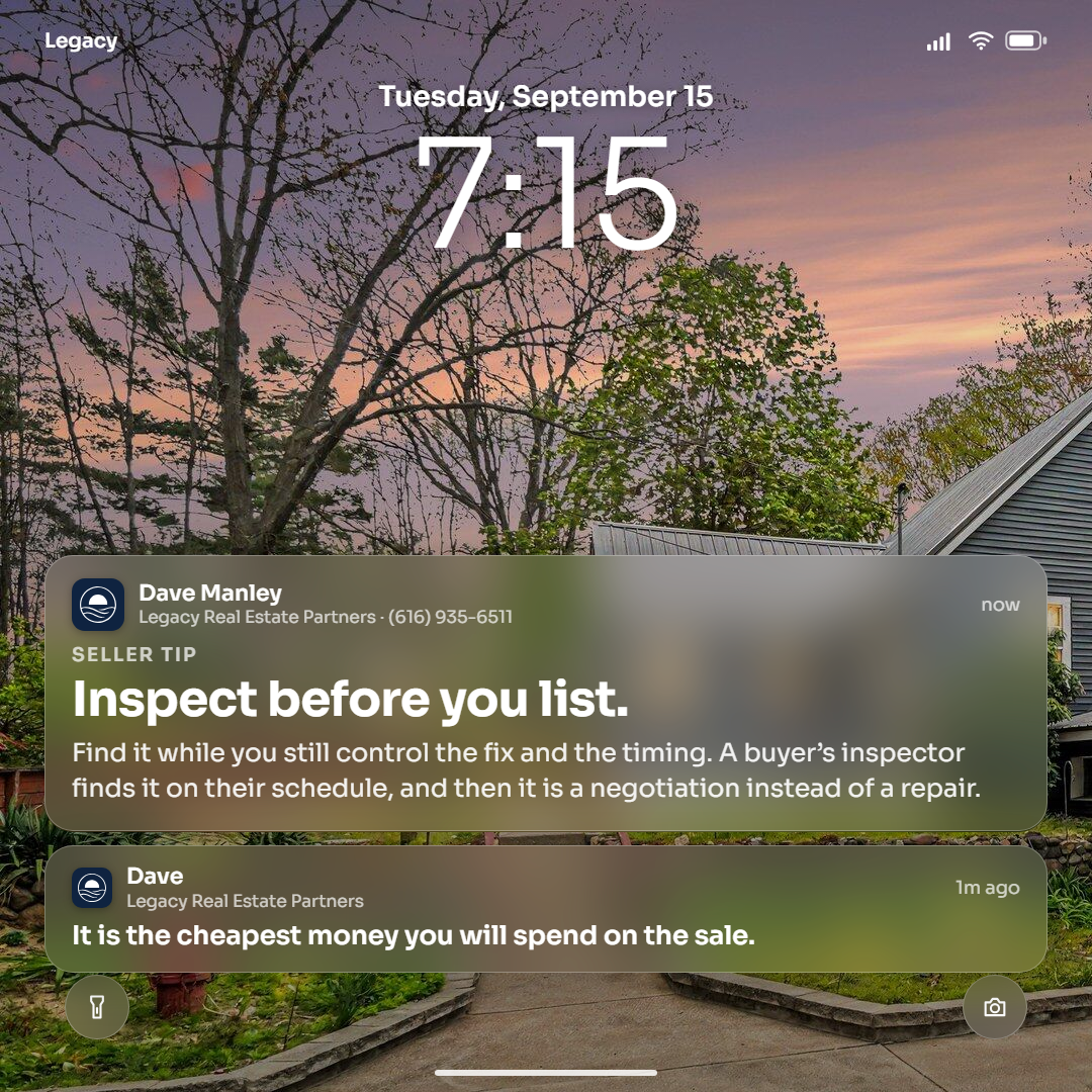
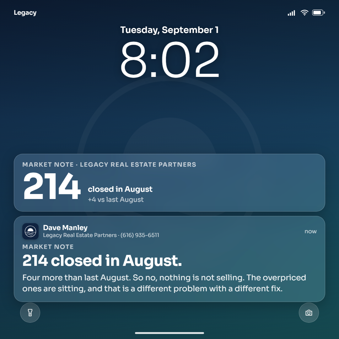
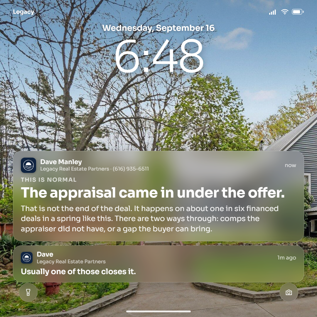
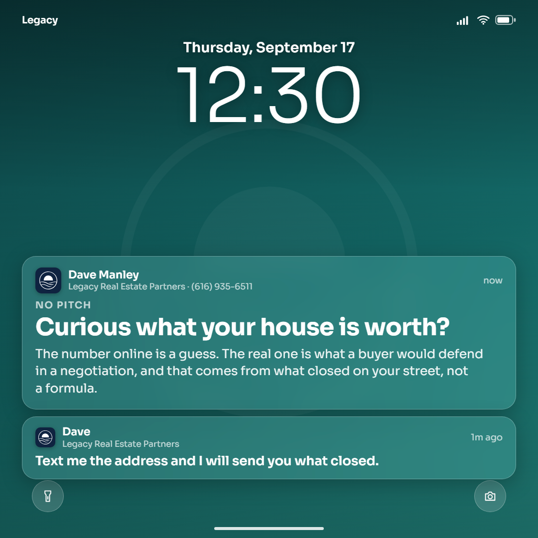
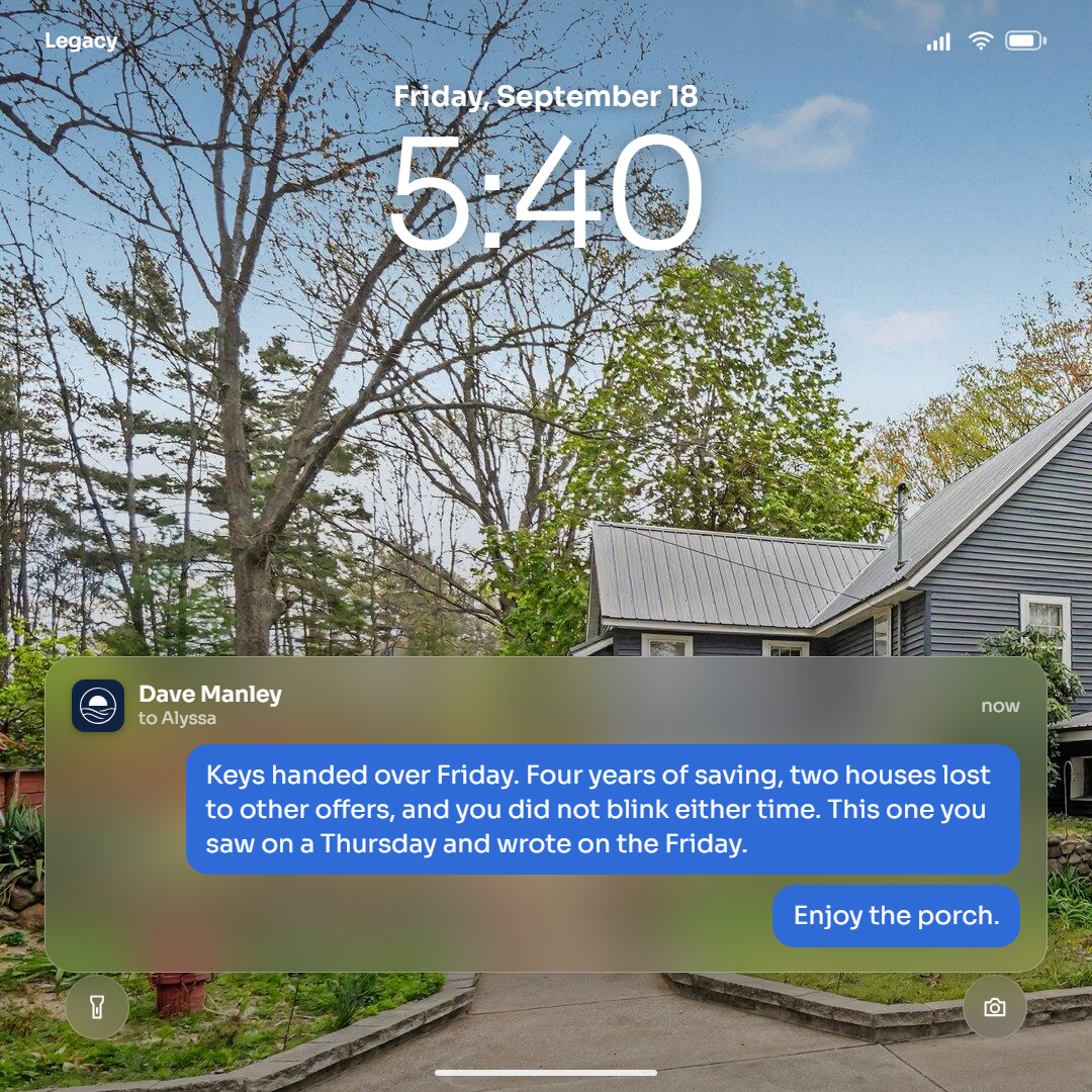
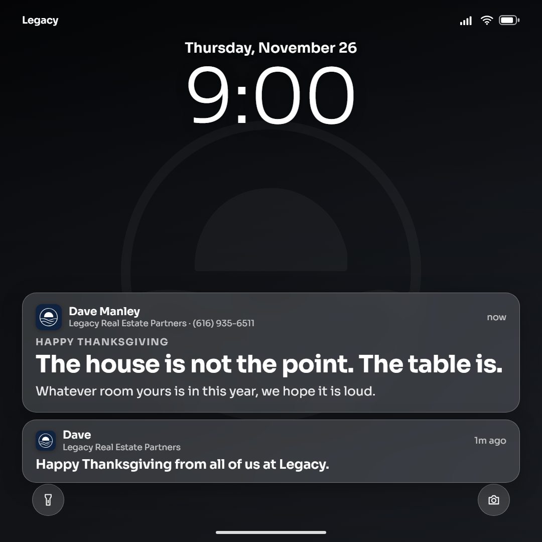
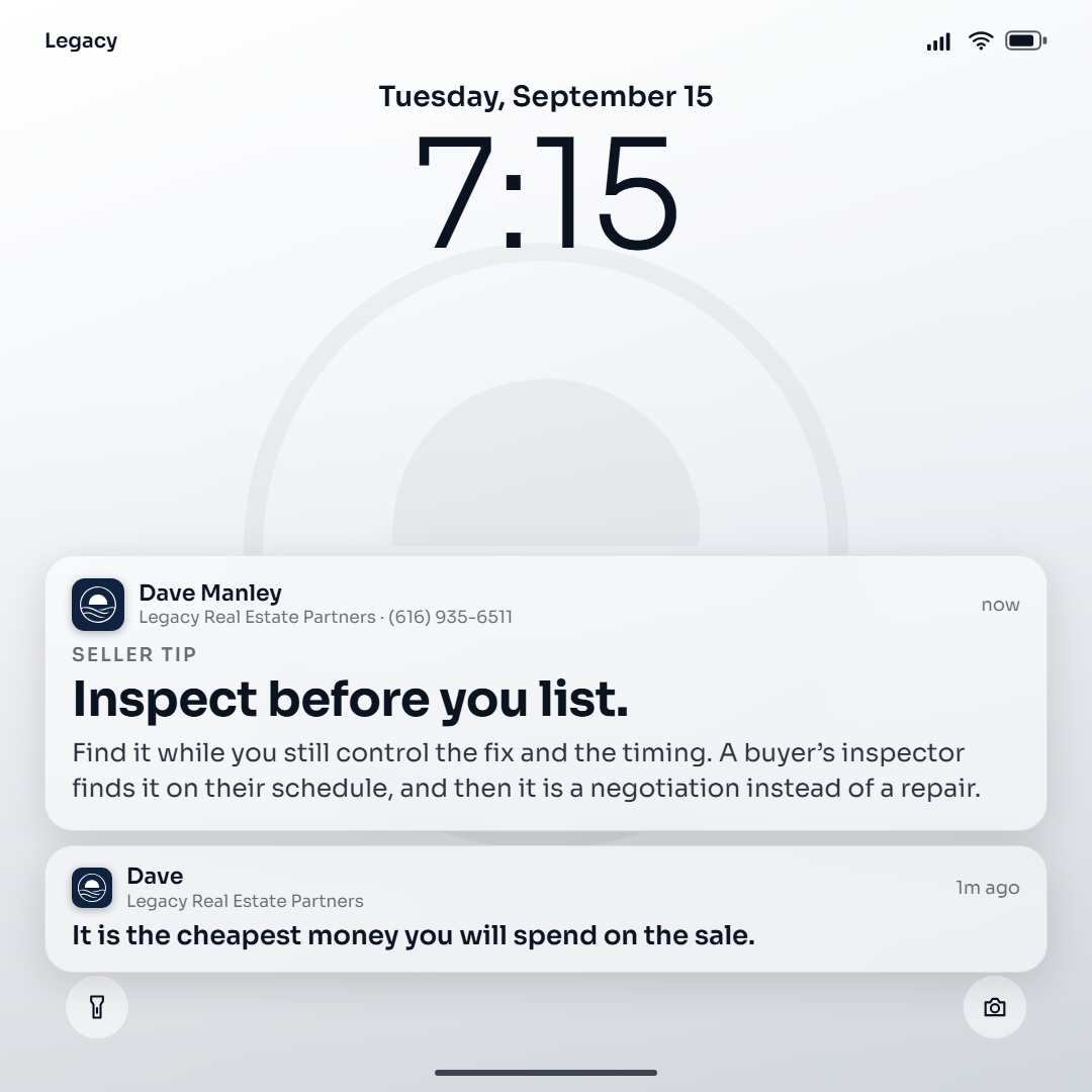
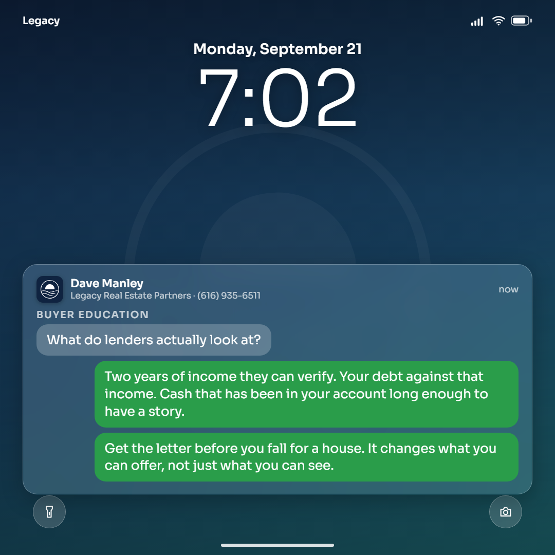
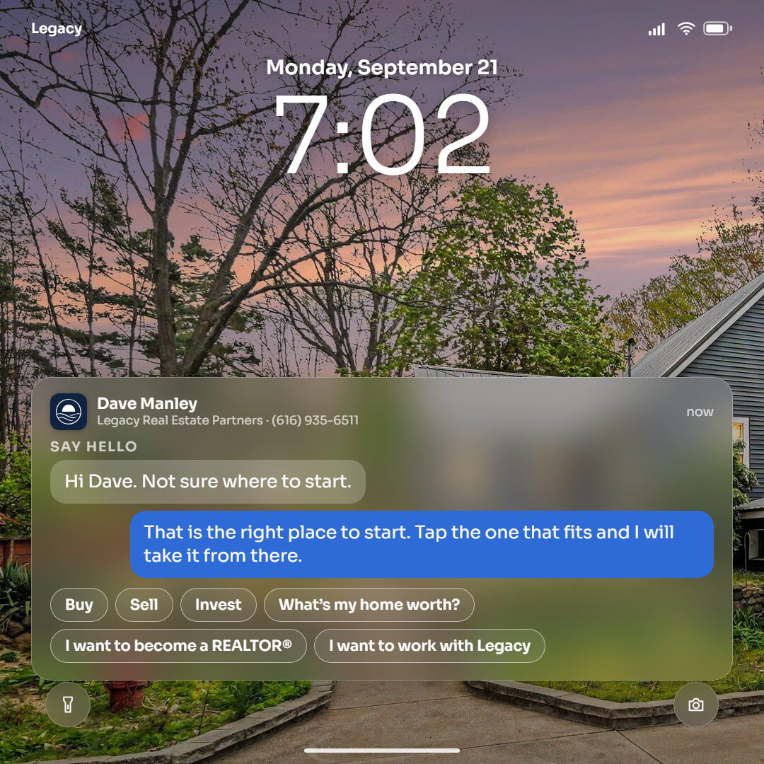
After the Survey was shelved for being the third aged serif in a row, this went the other way entirely: no paper, no serif, no age. A phone's lock screen: the wallpaper (the house at twilight or by day, or a gradient in the agent's color, navy, teal, black, gray, or white in light mode), a drawn status bar, the clock, and a stack of frosted-glass notifications from Legacy. The job is the notification's title, the line and the paragraph are its body, and the last line lands as a shorter follow-up under it. The agent is the sender with the kit icon as the app icon. The market note gets a stat widget; a thank-you or a question is a message thread, in Apple blue or Android green, with the question coming in gray; a thread can end in quick replies, the six chips a person can tap: Buy, Sell, Invest, What’s my home worth?, I want to become a REALTOR®, I want to work with Legacy. Story is this style's native shape, with a widget row under the clock. The face is Sora. Rounds at 1, 2 (the set), 3 (portrait and story), 4 (the range: nine content types from the bank), 5 (quick replies).
Style 14: the Sign, nine cards (Dave's pass 2026-09-16, "good enough, let's be done")
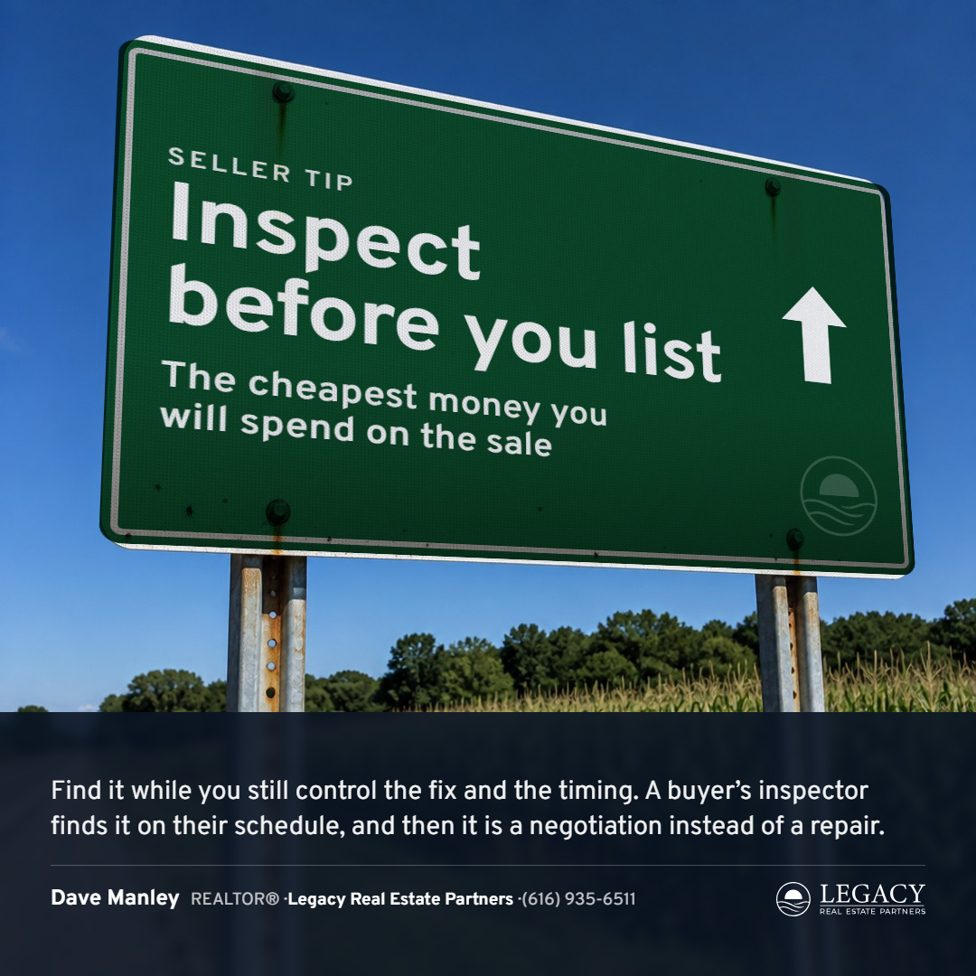
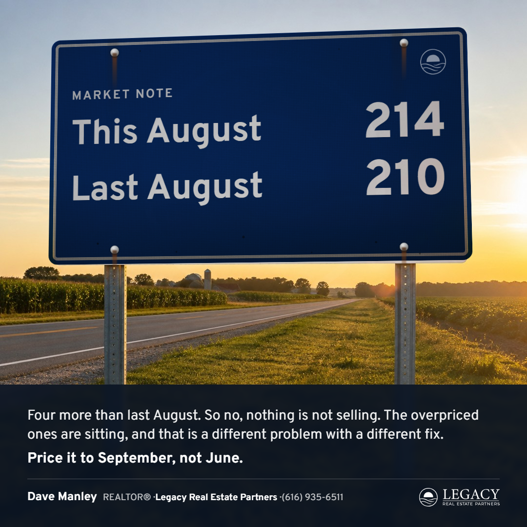
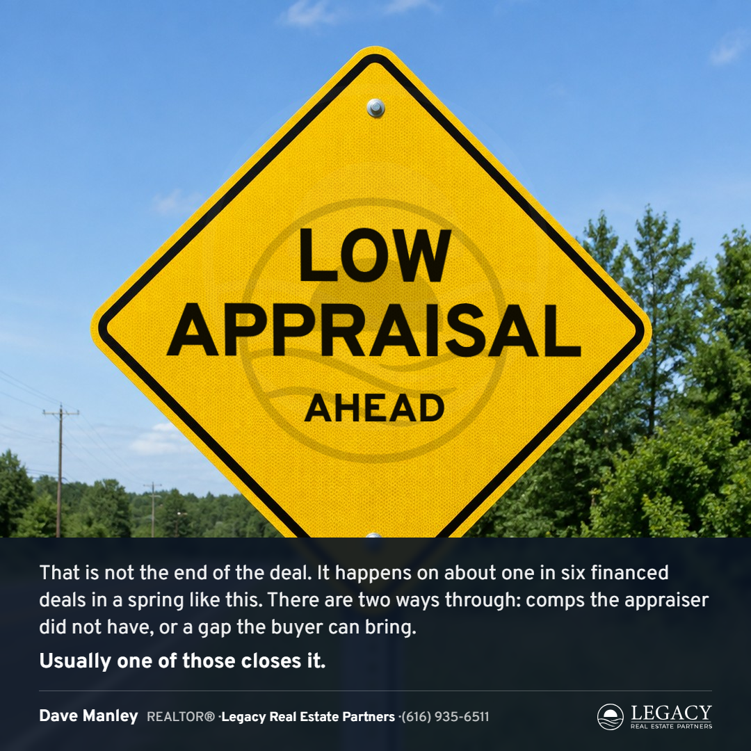
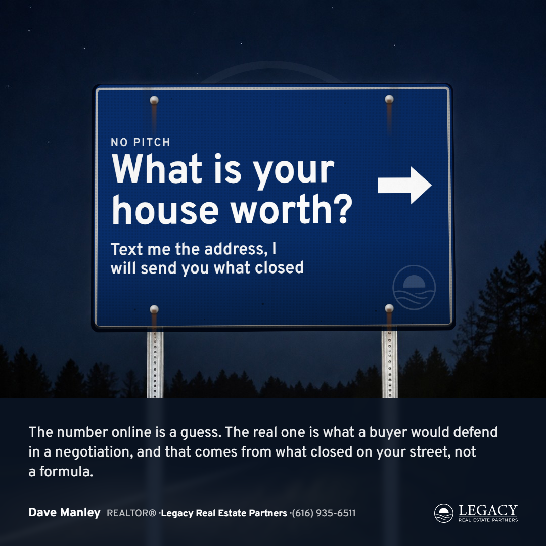
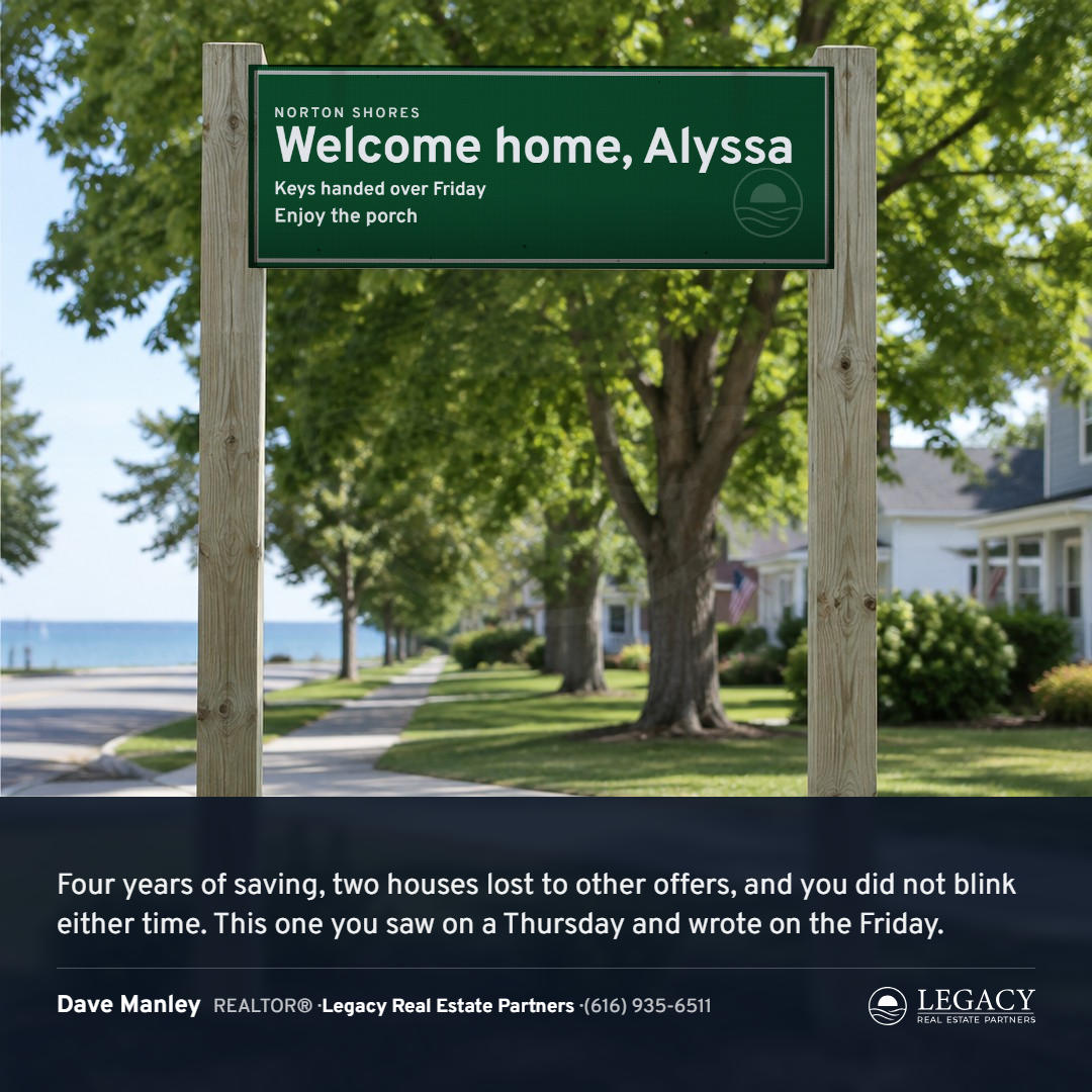
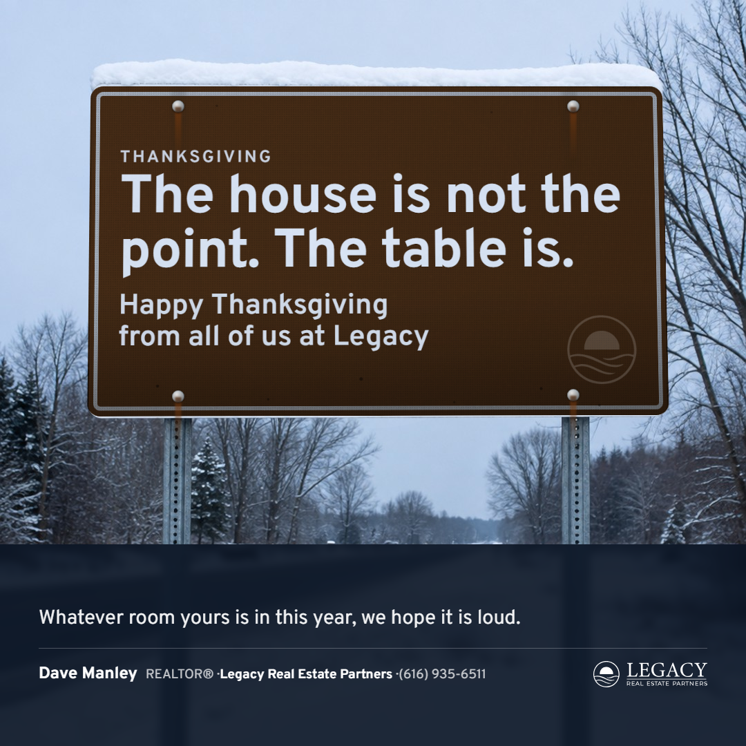
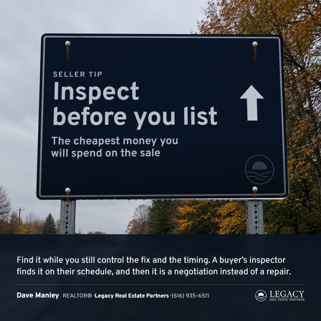
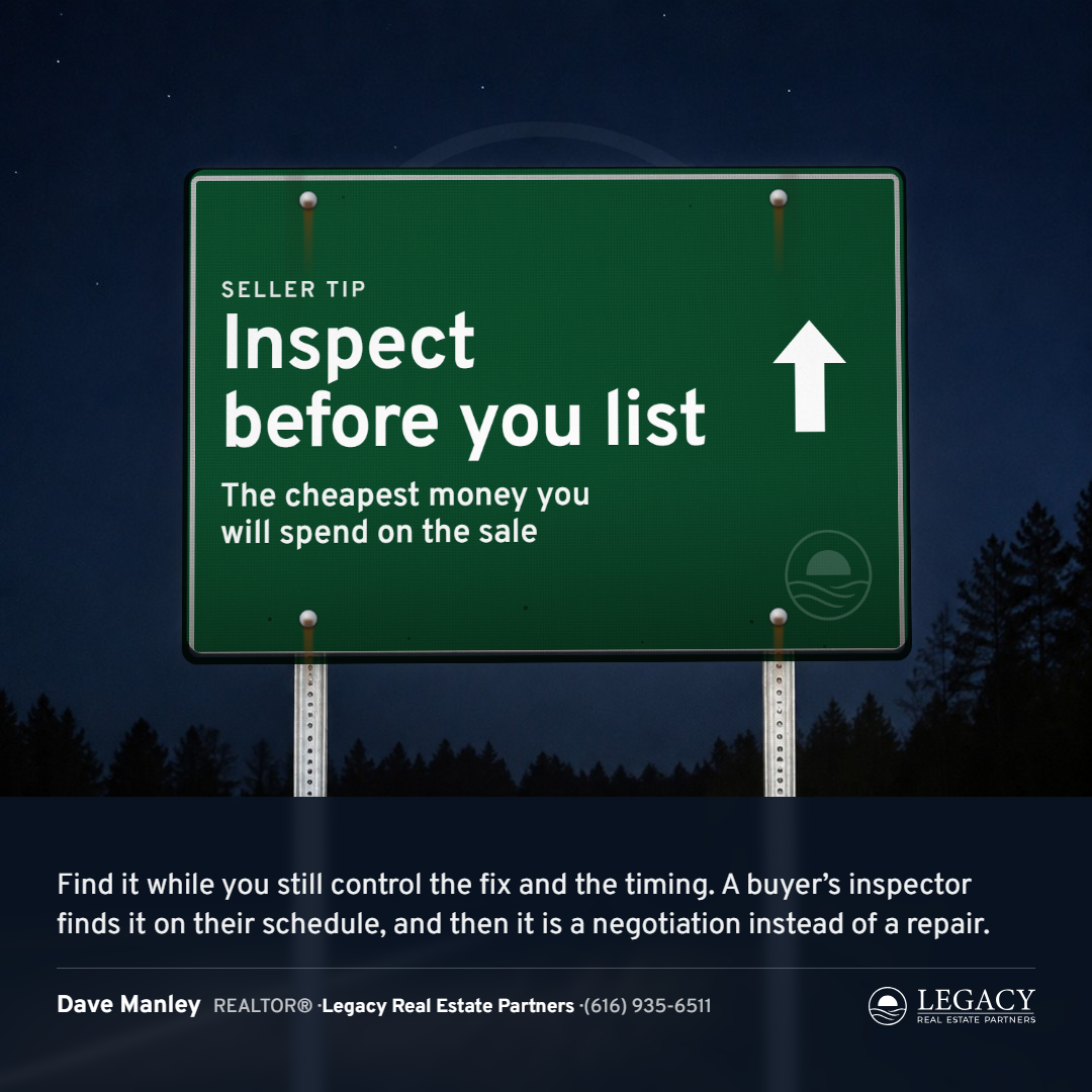
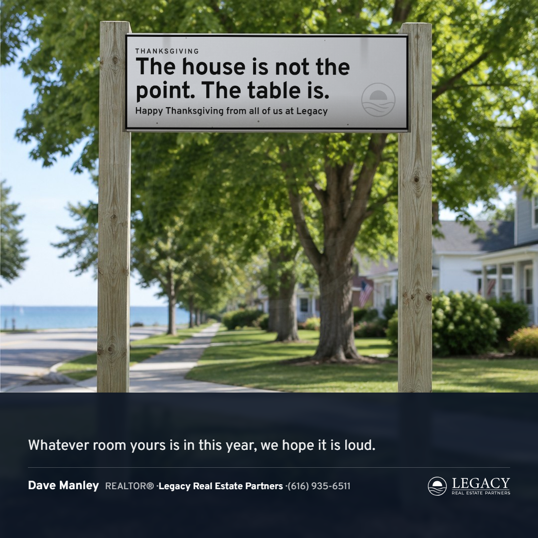
The one that had to be shot instead of drawn, and the hardest run in the library: six rounds and a dozen cuts inside them. A drawn sign read as a cartoon, so the style became photographic: a library of PLATES, blank signs on real posts against real skies generated for the purpose (hard afternoon sun with rust off the bolts, rain, winter with snow on the top edge, golden hour, night under headlights, a town panel on tall wood posts, and a real yellow warning diamond), outpainted to portrait and story. The sign face is set flat and mapped onto the plate's sign in true perspective from measured corners, then multiplied into the plate, so the color and the type take the plate's own light, sheeting and weather. The thin white line stays; the plate's white never shows. The sign family follows the job: green guide, blue distance rows, the yellow diamond, blue at night, the town sign, brown recreation. On the tall cards the paragraph rides a supplemental panel and the agent a plaque, both on the same posts, the sign's width and color, screwed at the posts on metal and not on wood, with weather on every panel. The face is Overpass. Rounds at 1 (drawn, rejected), 2 (the first plates), 3 (the face made real), 4 (the plate library), 5 (the formats), 6 (the last cuts).
Style 15: the Sampler, nine cards (Dave's pass 2026-09-16, with reservations)
A flat handmade object after the photograph: counted cross-stitch on Aida cloth. Every letter is stitches from a 5-by-7 stitch alphabet on the cloth's own count, six pixels to the cell (eight on story): the headline in big stitches two cells square, the label, the paragraph, the note and the agent's line in single stitches, each an X of thread with its sheen; a border of hearts round the edge; all of it centered. Nothing of the kit is on the cloth but the faint watermark; the agent's line reads the name and LEGACY with the phone under it. When a paragraph will not fit the cloth, the sampler says the line and the note. Dave's read: "kind of corny... I don't really like these just-text ones, but I know we need quite a few." One round: the set and the formats.





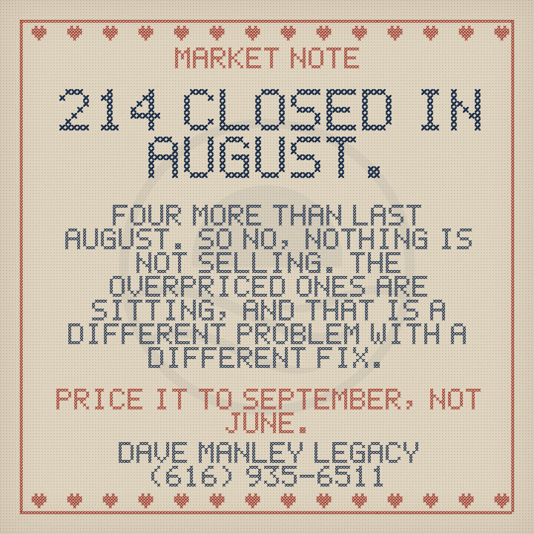
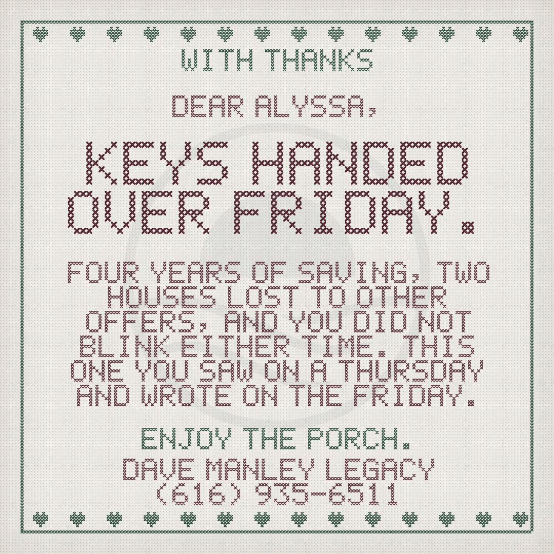
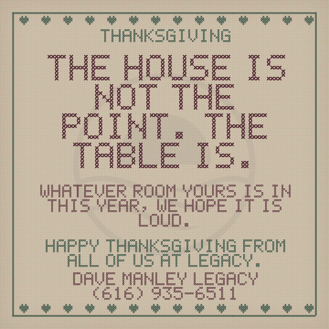

Style 16: the Cover, nine cards (Dave's pass 2026-09-16, "pretty neat")
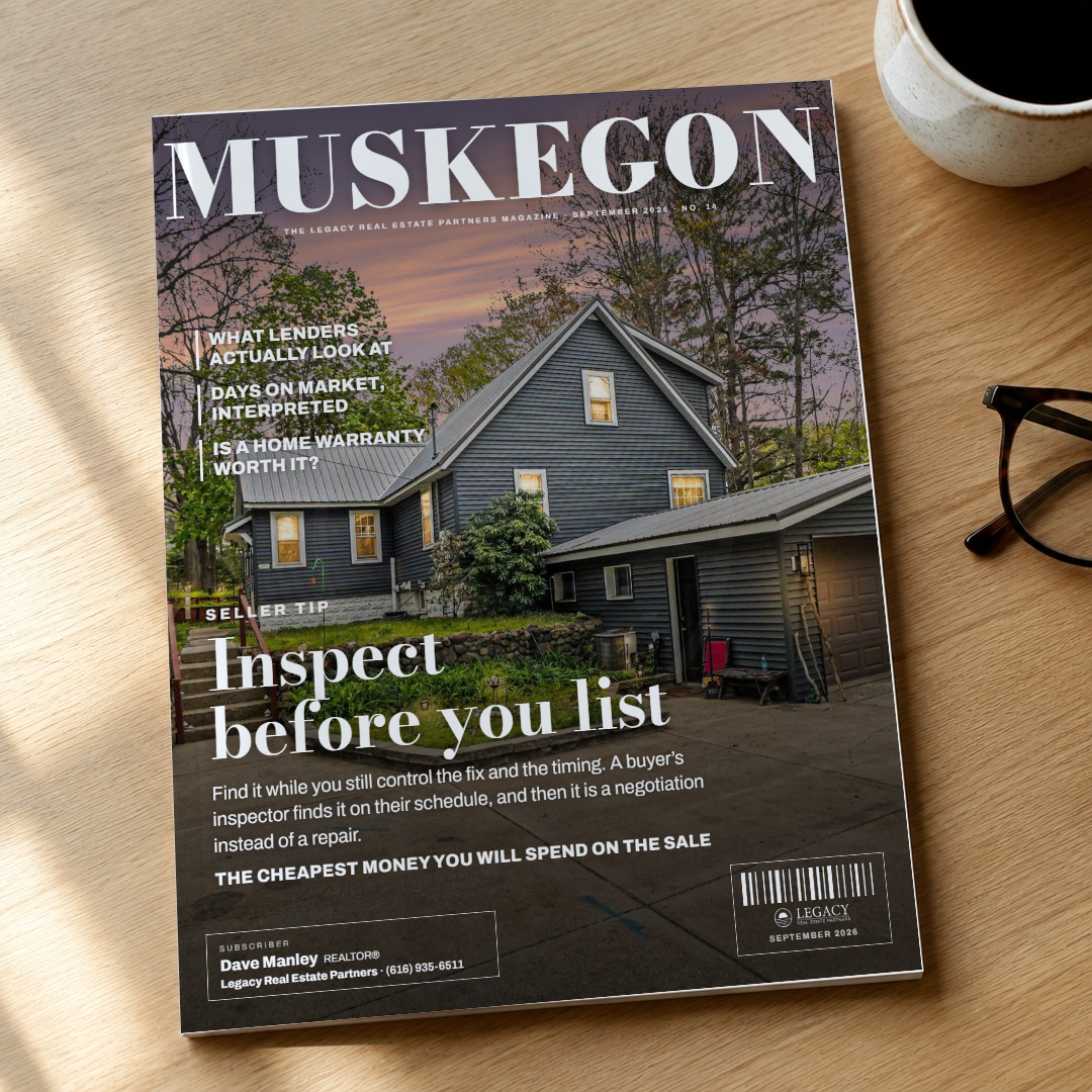
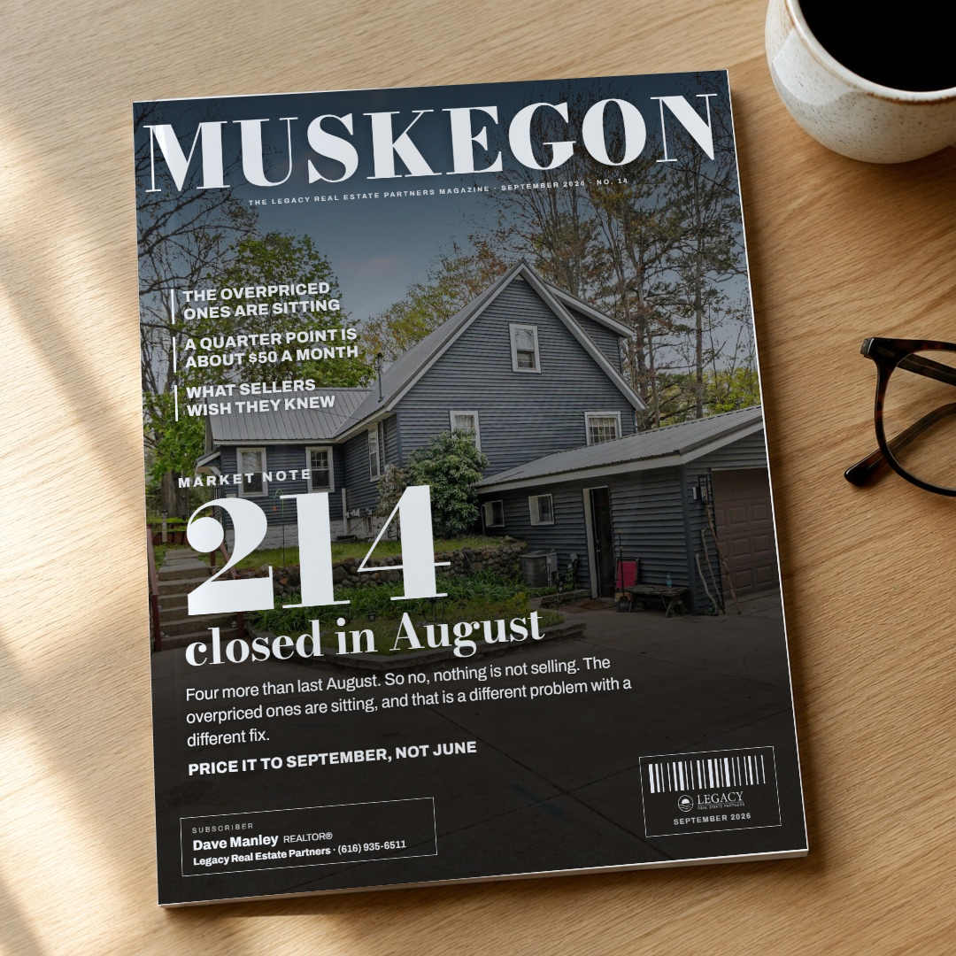
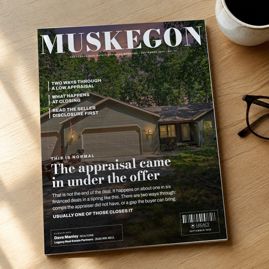
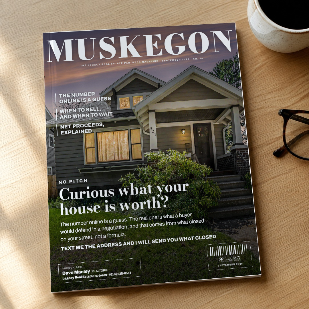
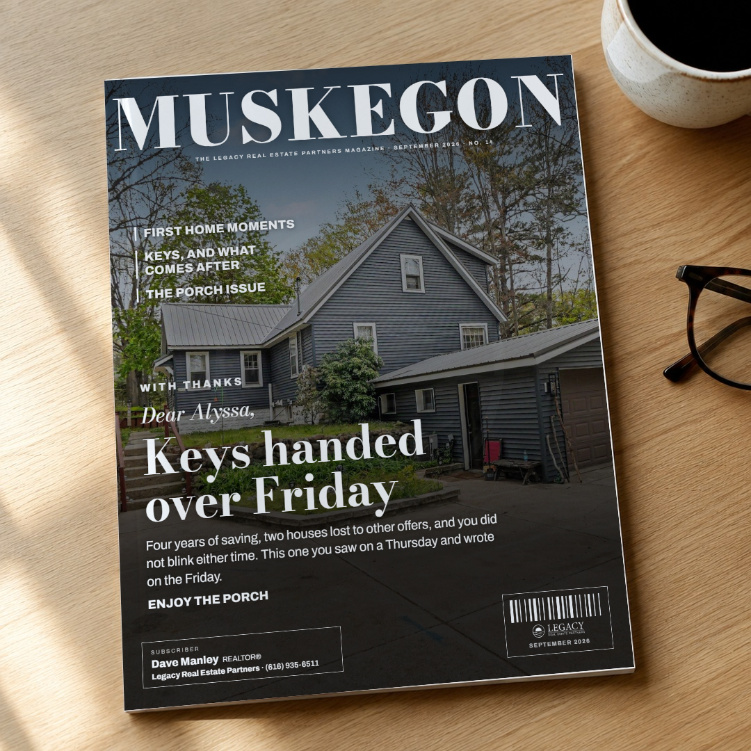
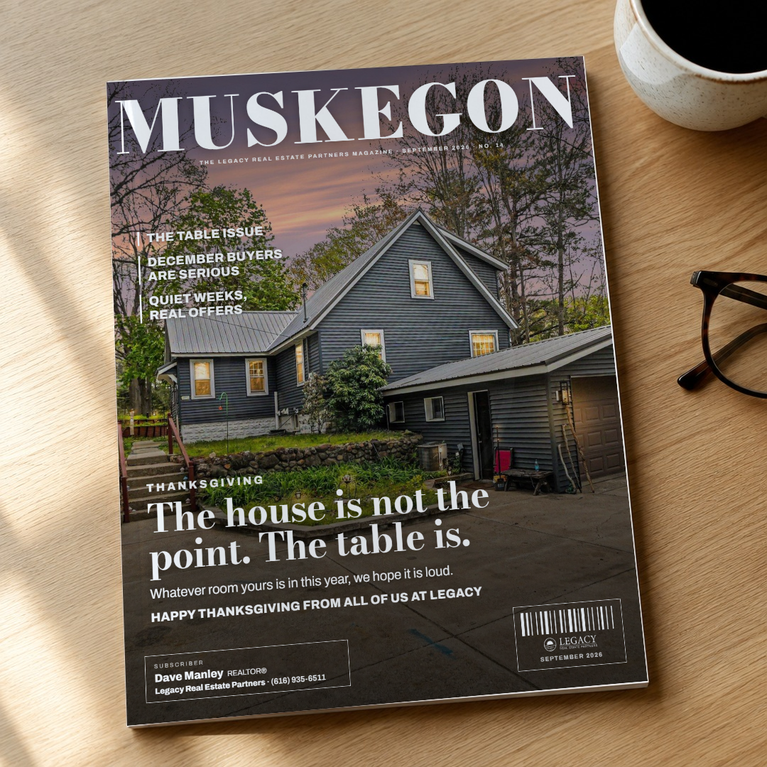
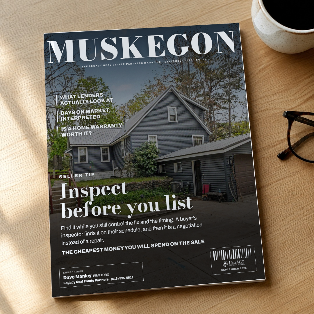
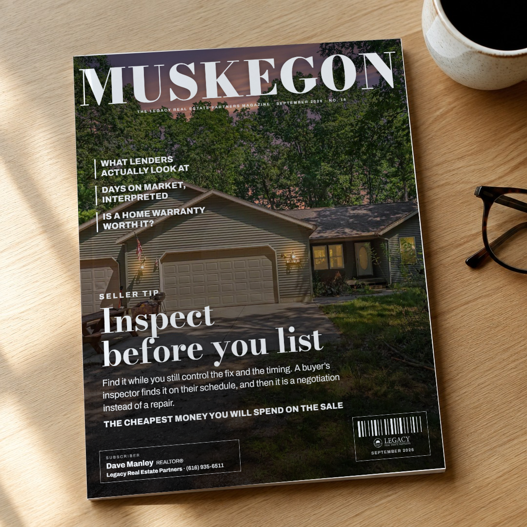
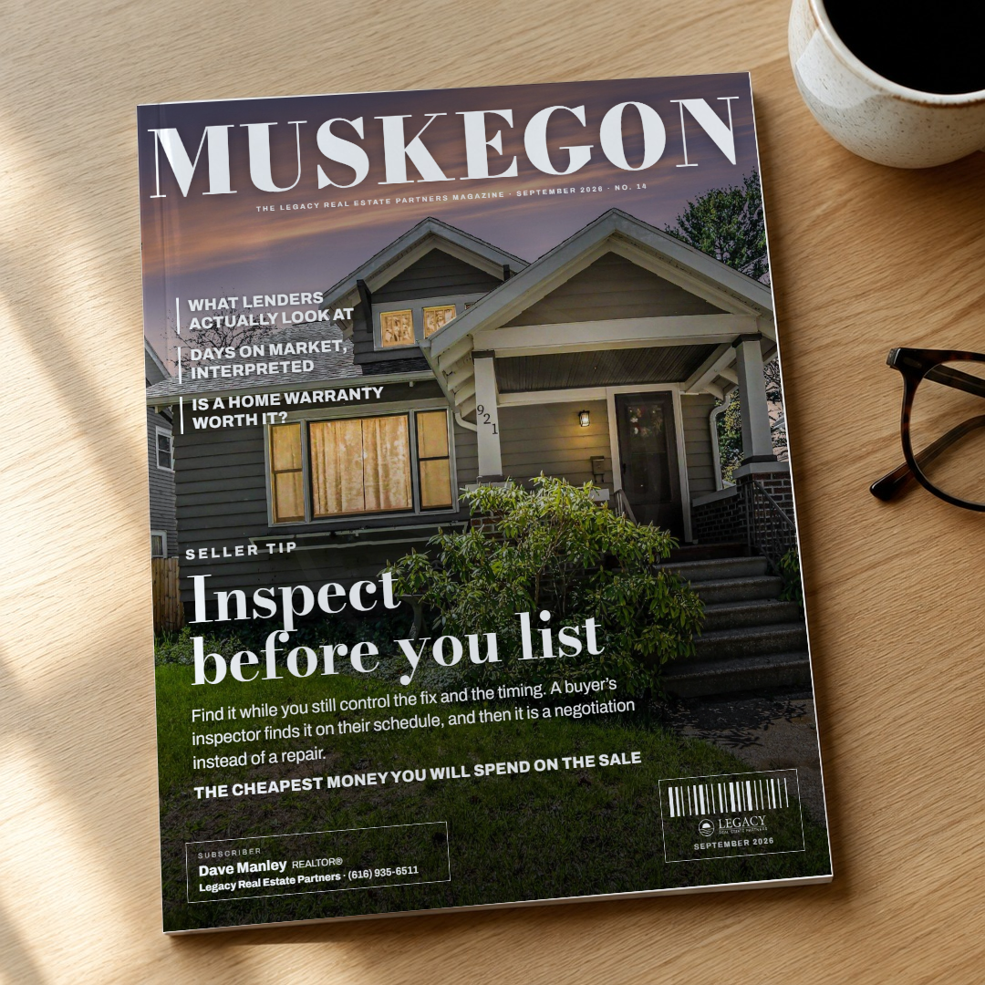
An object with a photograph in it: a magazine cover. The magazine is named for the county the way city magazines are, MUSKEGON in a Bodoni masthead fitted across the full width, the issue line under it, a real listing photo full-bleed. The job is the main cover line at the foot with its dek and the note; three more cover lines from the idea bank run down the left, the way a cover promises the rest of the issue. The agent is the subscriber label, the mailing sticker every delivered copy carries: name, REALTOR®, the firm bold, the phone, white type in a thin white frame; the barcode box beside it carries the white lockup. The square is the object itself, the issue lying on an oak desk, shot as a plate and the cover mapped onto it in perspective and multiplied into the sheen; portrait is the cover; story is the cover with more sky. Every photo is brought to the tone the dusk ones have, by measurement, so a bright daytime listing photo reads. Two rounds: the faces, the tone and the frames.
Style 17: the Timeline, nine cards (Dave's pass 2026-09-16, "I love the different variations")
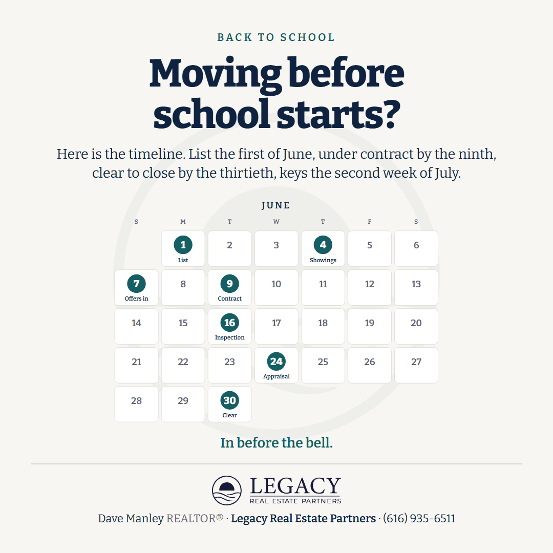
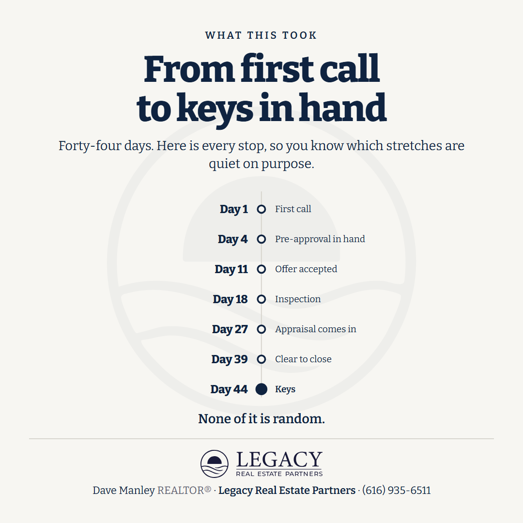
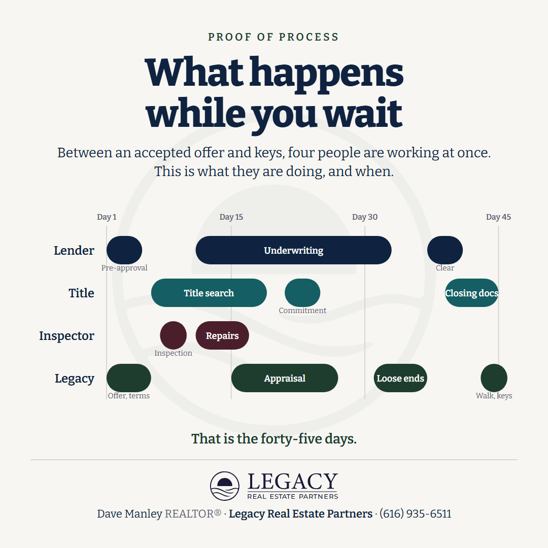
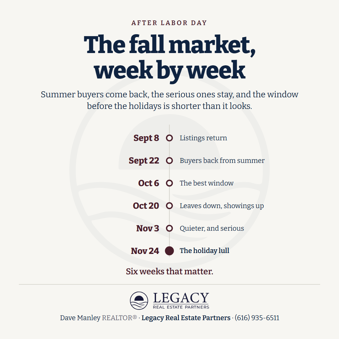
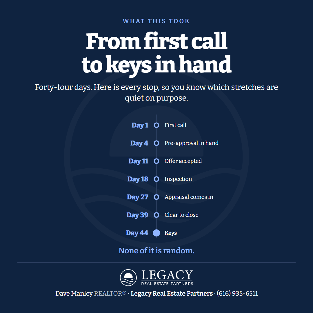
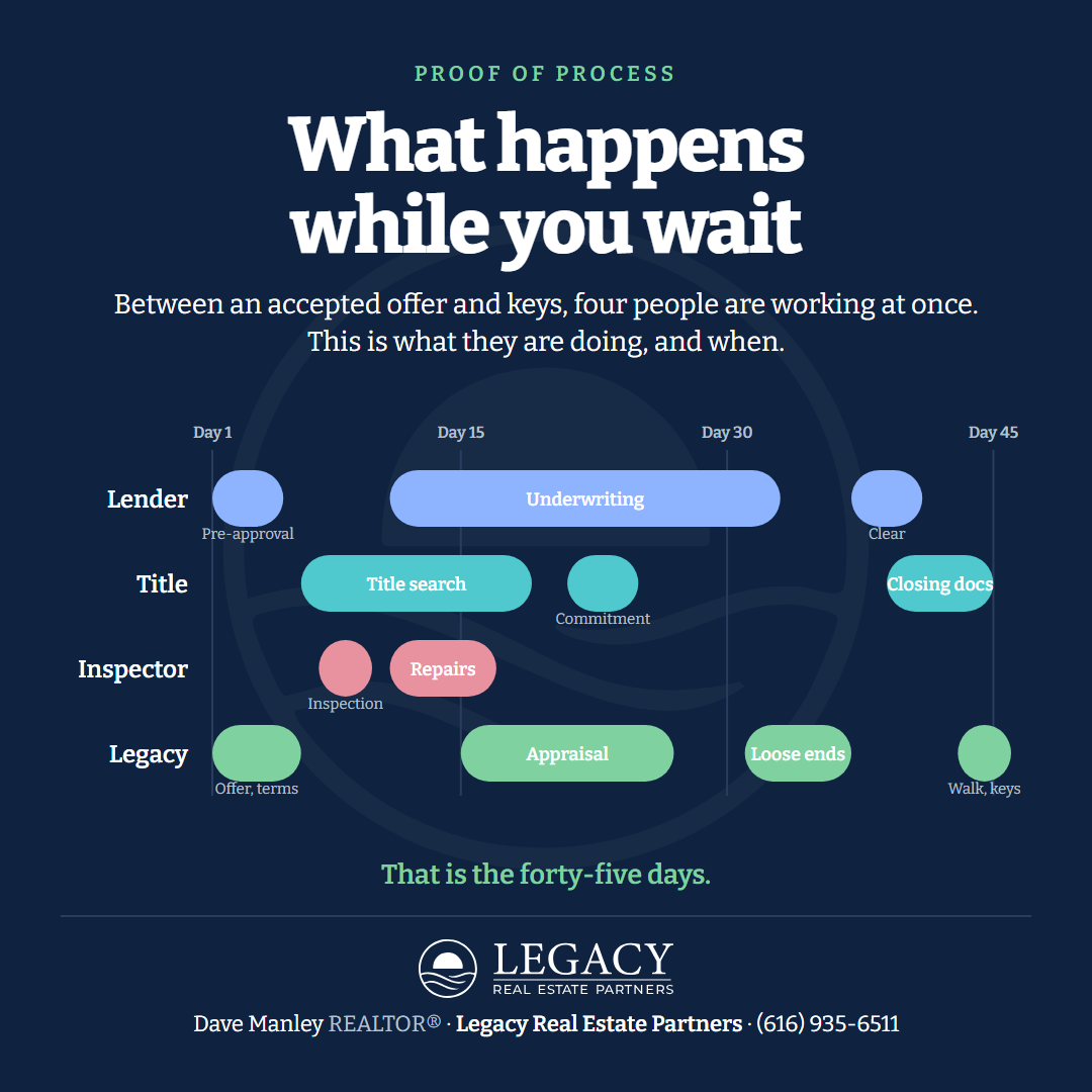
A diagram after two photographed objects: the job drawn as a timeline. Not one figure but five, each an object people read without a key: a month calendar with the days marked; a dated spine down the center; a dial, with days on market as a clock; parallel lanes, four people working at once between offer and keys; a year strip with the months that matter filled in. Every line centered: the label letterspaced in the line color, the headline, the sub, the figure, the takeaway, the lockup bigger at the foot with the agent line under it. The face is Bitter, a sturdy slab serif with open numerals, after a display serif whose numerals could not be read. The material is from the idea bank, not the six job lines. Three rounds: a subway line (rejected: read like the others, the dots did not explain themselves), the five expressions in Fraunces, the five expressions in Bitter with the formats and the neutral proof.



Style 18: the Receipt, nine cards (Dave's pass 2026-09-16, one round)
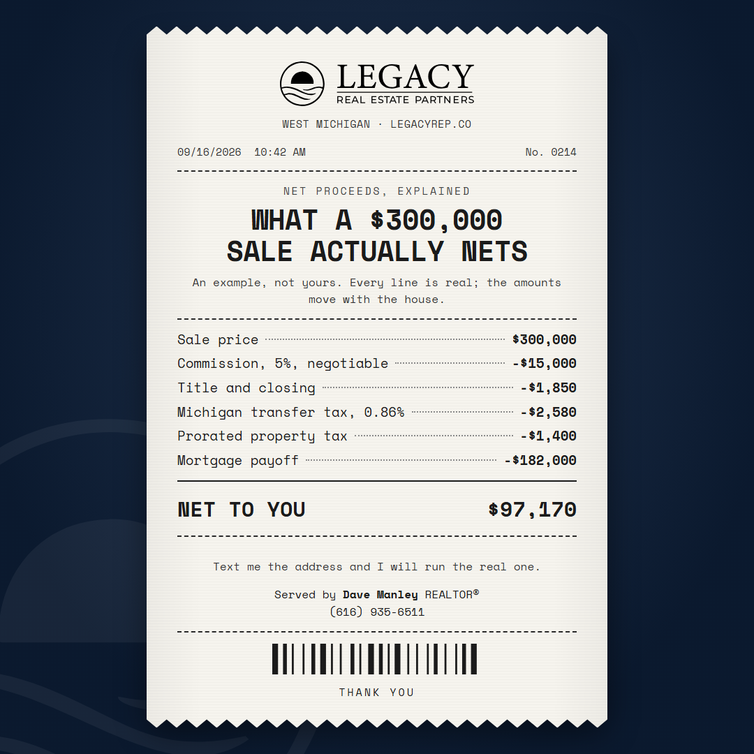
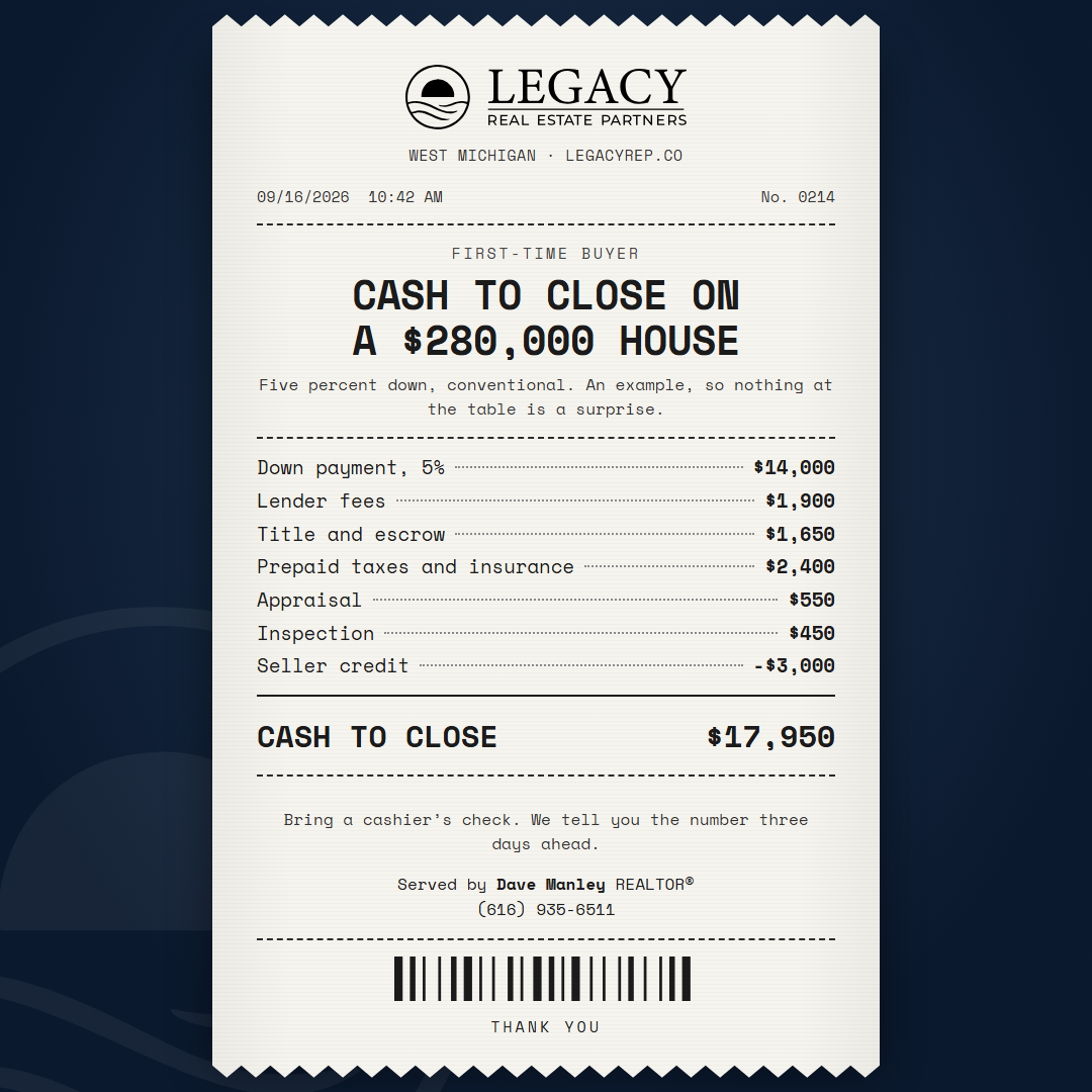
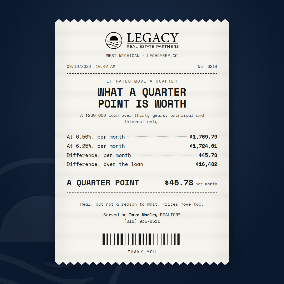
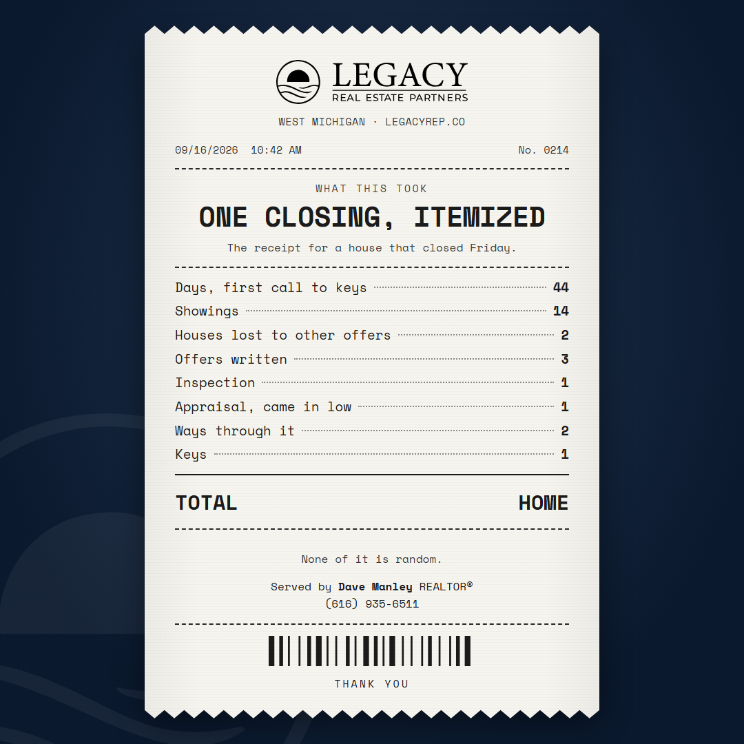
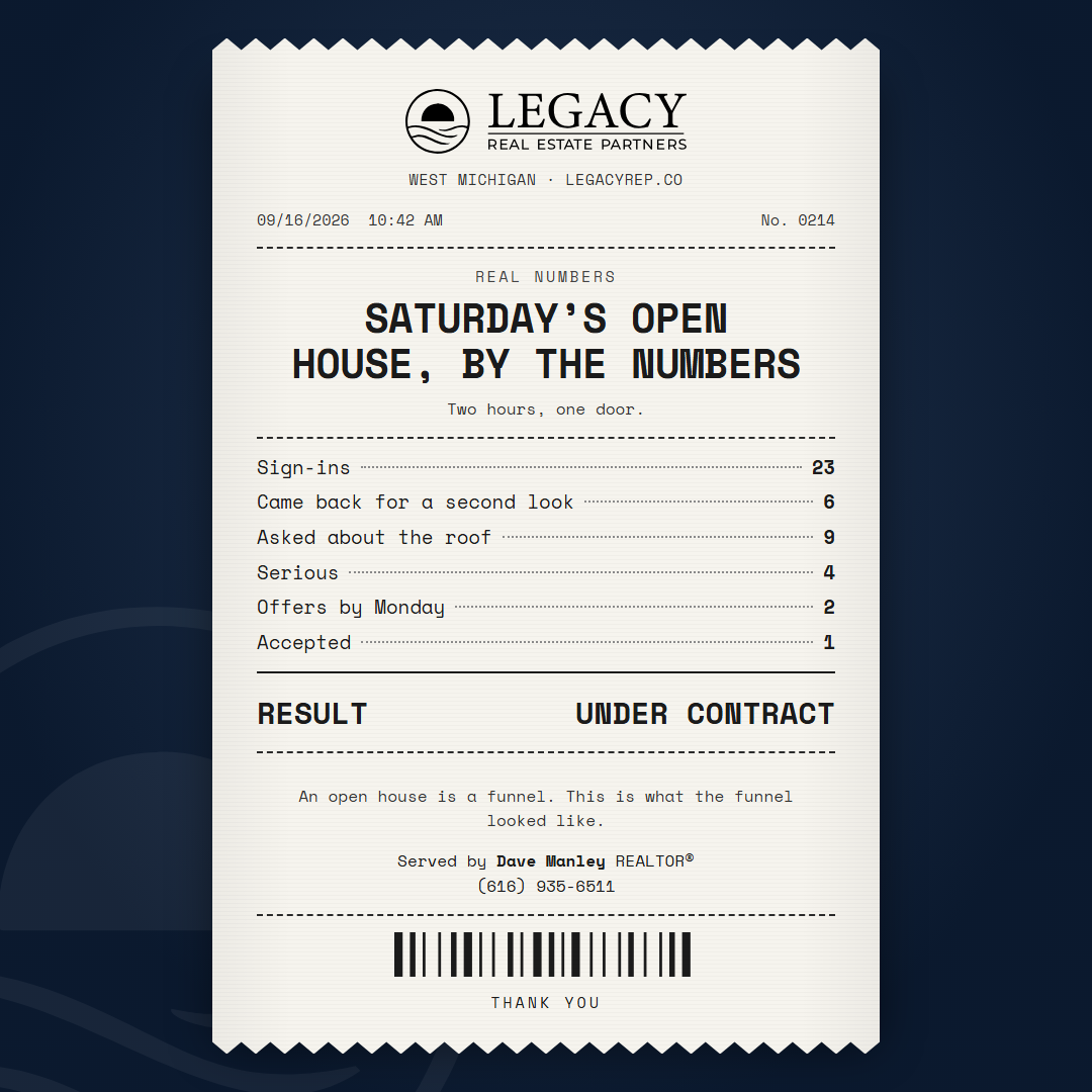
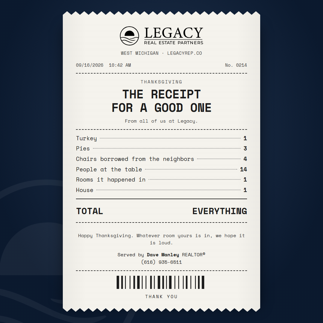
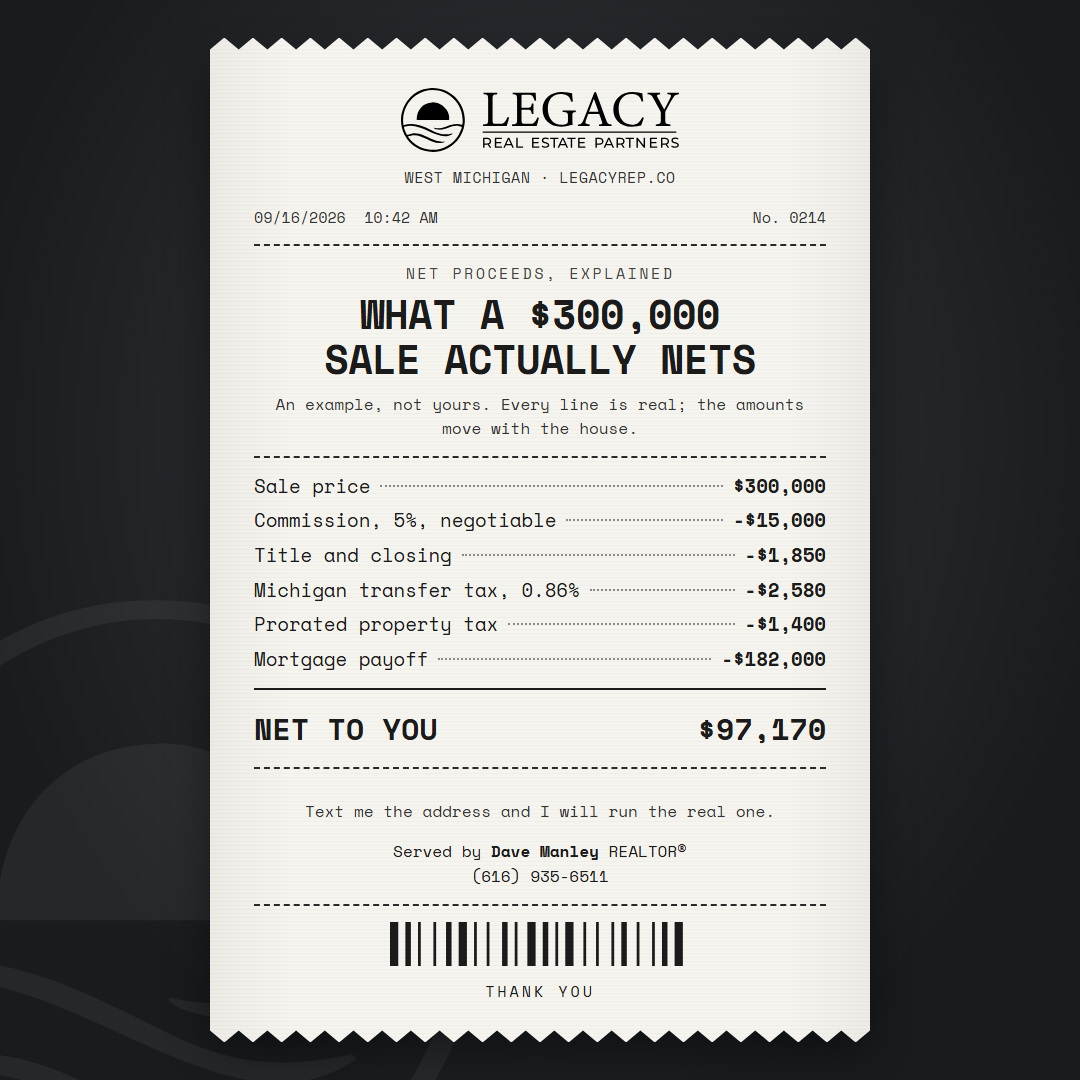
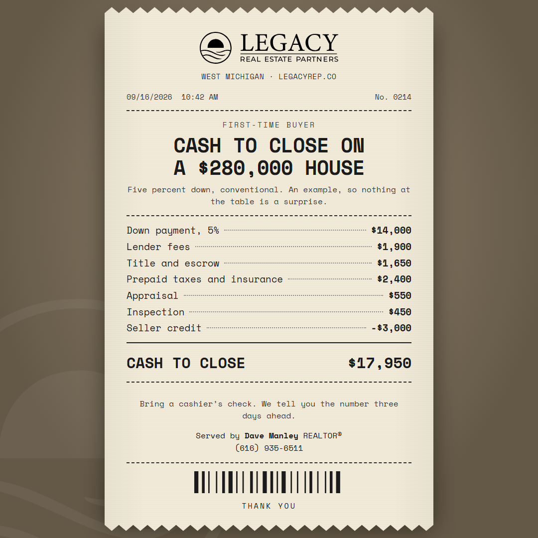
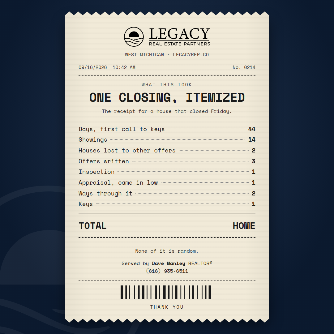
A printed object with numbers in it, after the Timeline's diagrams: a thermal receipt, the itemized strip everyone reads from the bottom line up. The card is the paper, centered on a dark ground: serrated top and bottom, the print faintly banded the way thermal print is, the lockup printed black at the head, the title as the largest print, the items with dotted leaders and the amounts on the right, a rule, the total in bold, a barcode, and the agent as the SERVED BY line. Everything centered except the items, which justify the way a receipt does. The first monospace in the library, Space Mono, so the numerals line up. The material is worked examples with real lines: net proceeds on a sale, cash to close on a purchase, what a quarter point costs; and counts whose totals are words: Home, Under contract, Everything. On the tall formats the same paper prints larger. One round: the set, the formats and the neutral proof.
Style 19: the Neon, nine cards (Dave's pass 2026-09-16, "we'll run with it")
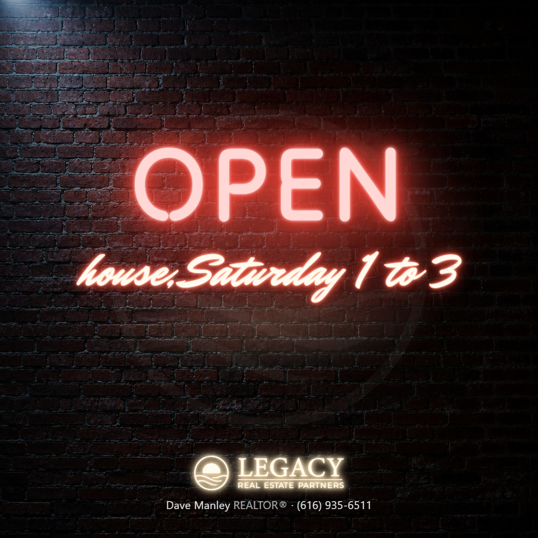
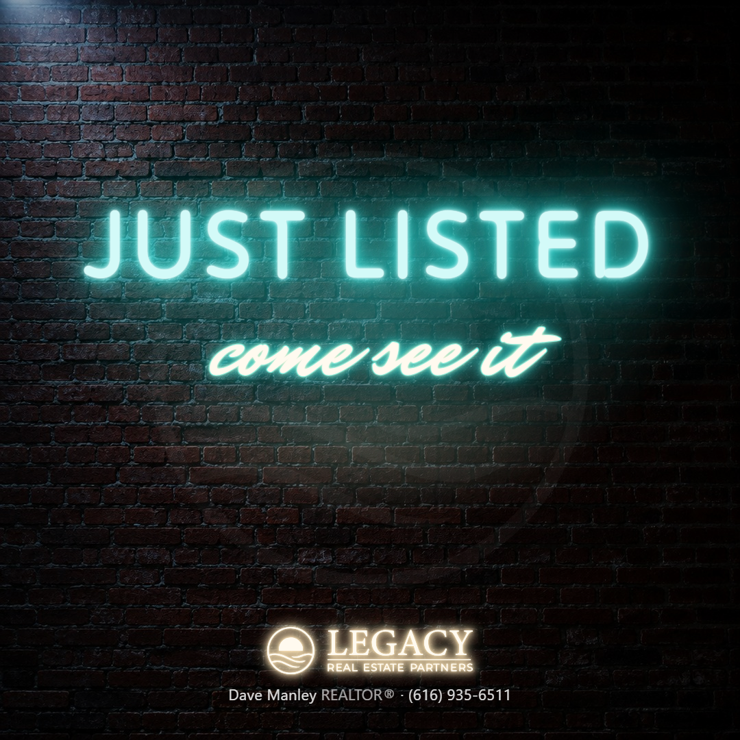
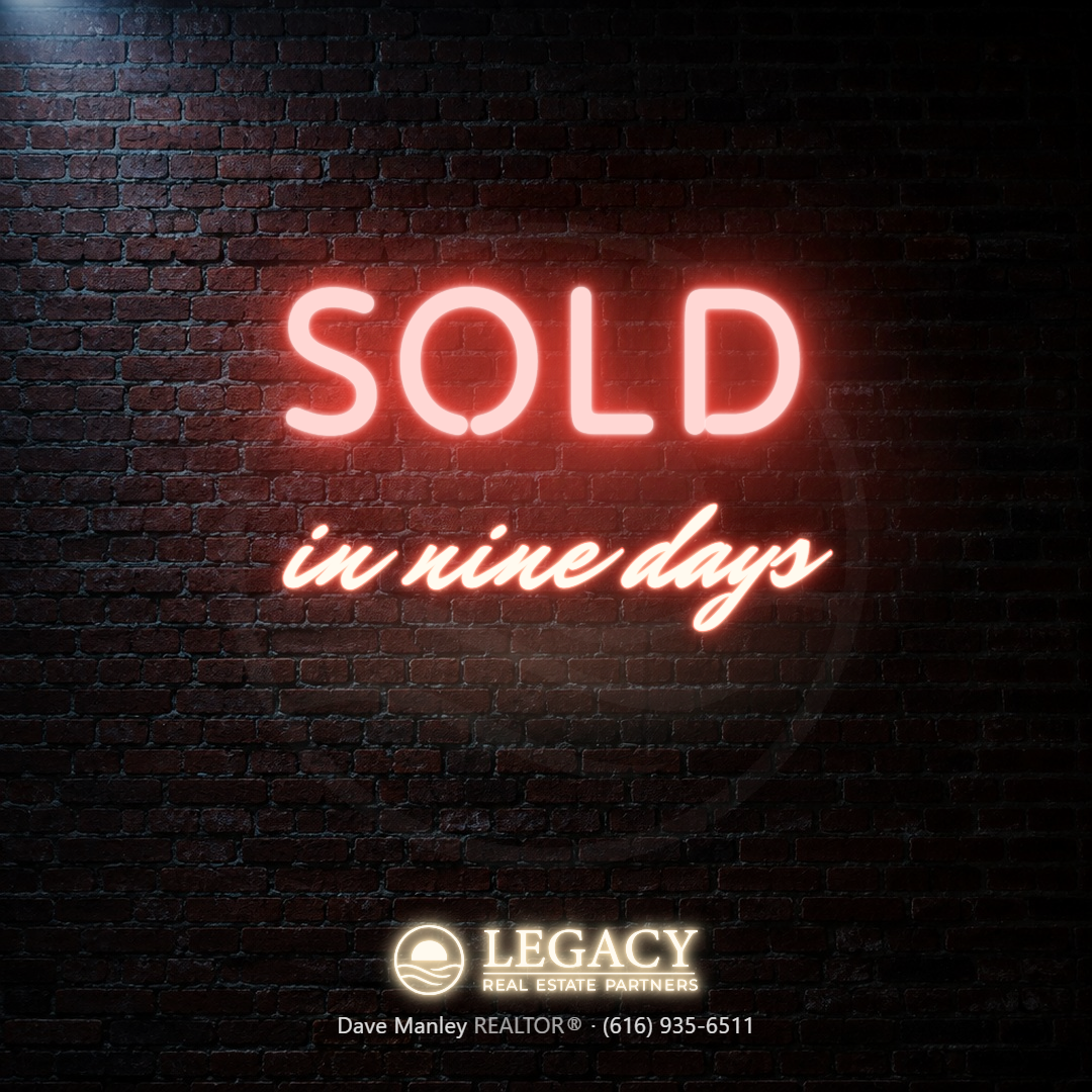
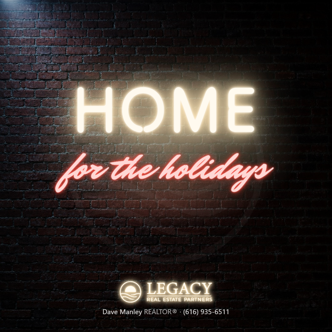
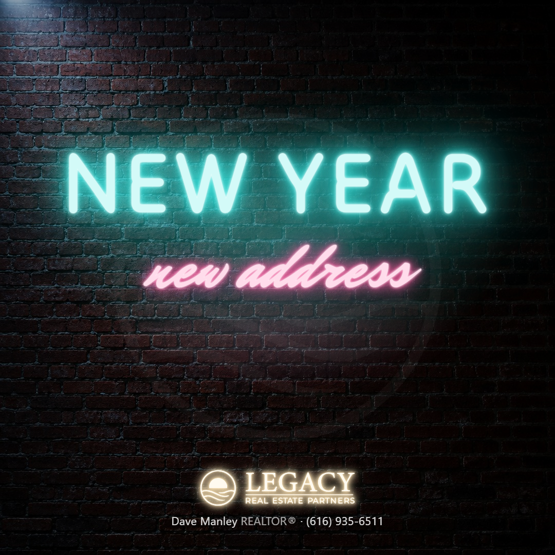
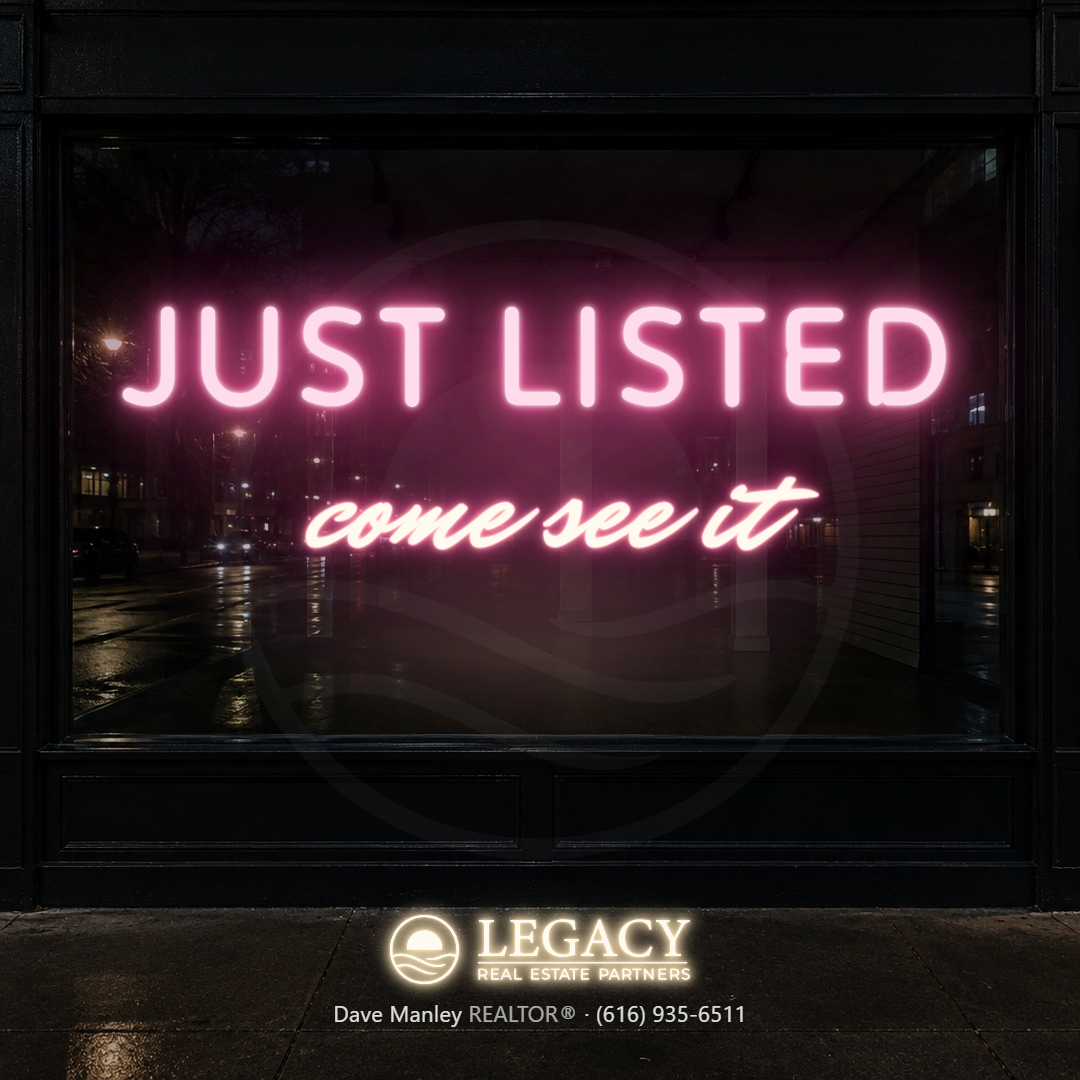
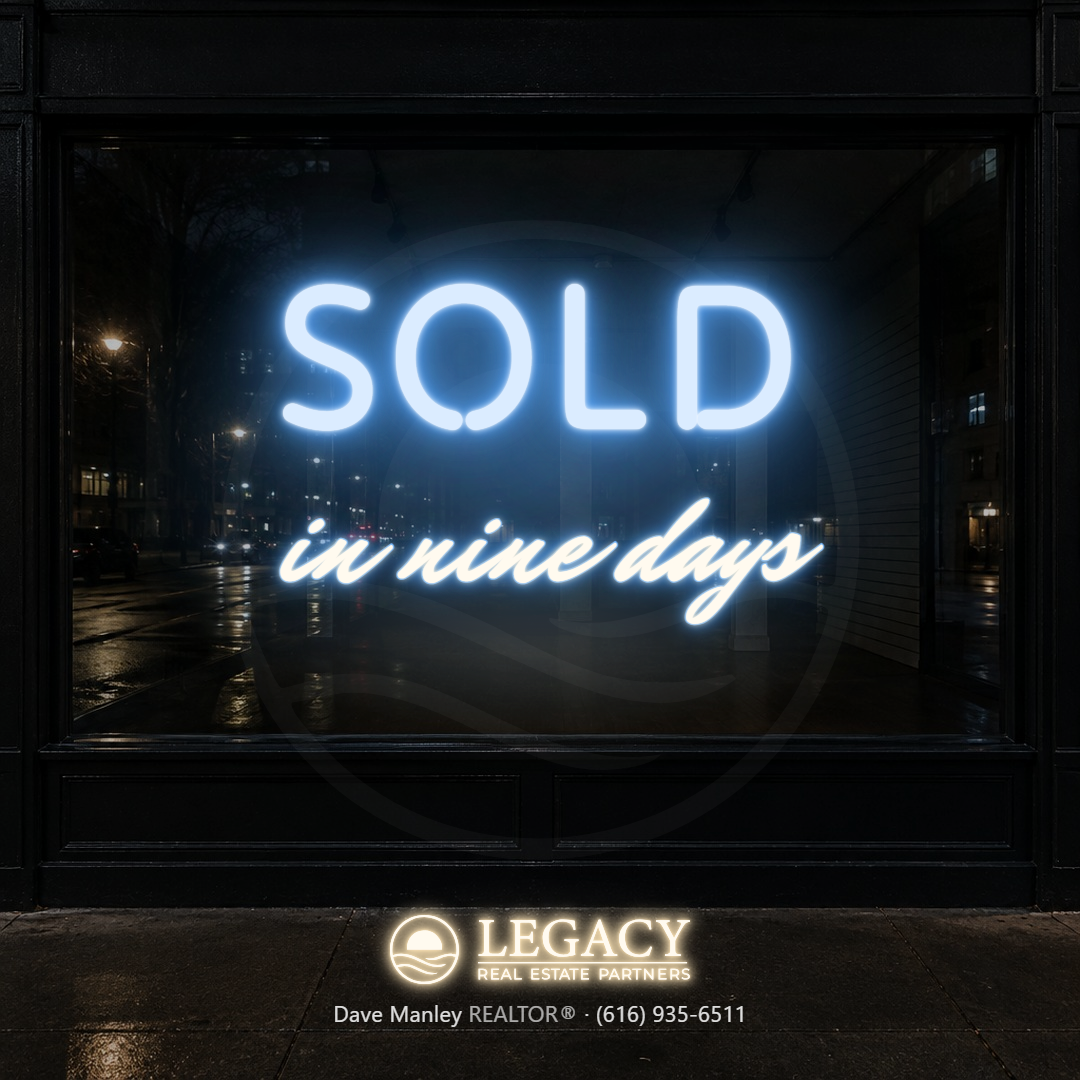
The register is light: a neon sign at night, photographed. The plates are real surfaces generated for the purpose, a brick wall at night, a dark storefront window, a painted wood wall inside a bar, outpainted for the tall formats. The words are lit tubes, a bright core with the color bleeding out of it in layers and the same color thrown back onto the wall as a halo. A sign says two or three words: a big word in Tilt Neon, a monoline face drawn for tubes, and a short line in Mr Dafoe, the diner script. Two colors on every sign, and a light script line carries a thin outline in the big word's color so it reads. The lockup is a small neon fixture over the agent line, channel letters at a quiet glow; the agent line is the name, REALTOR® and the phone as white vinyl. The colors are neon colors, not the palette; a tube cannot be navy. Three rounds: the walls, the logo as neon, the final, with the formats and the neutral proof.


Style 20: the File, nine cards (Dave's pass 2026-09-16)
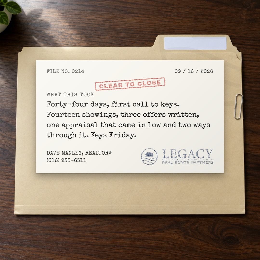
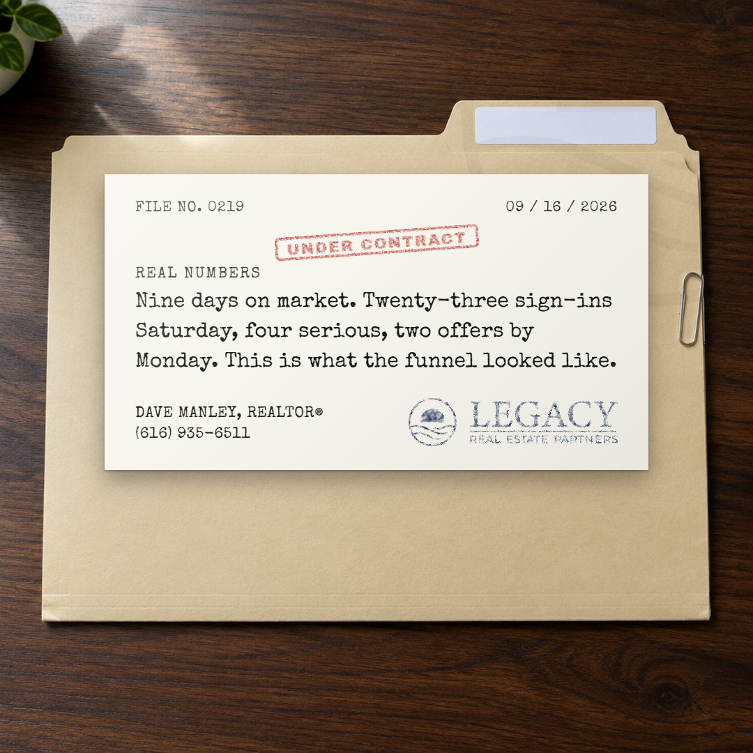
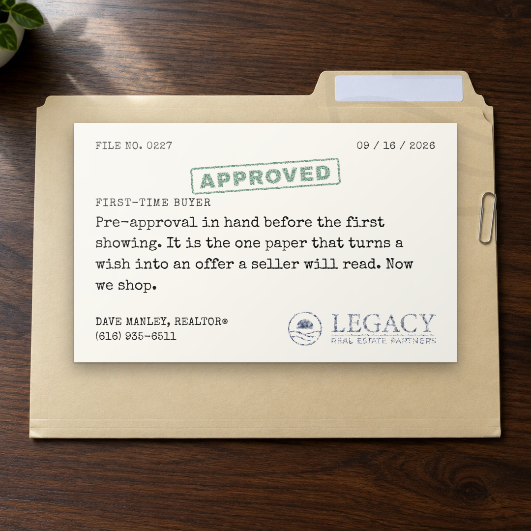
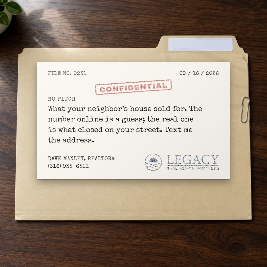
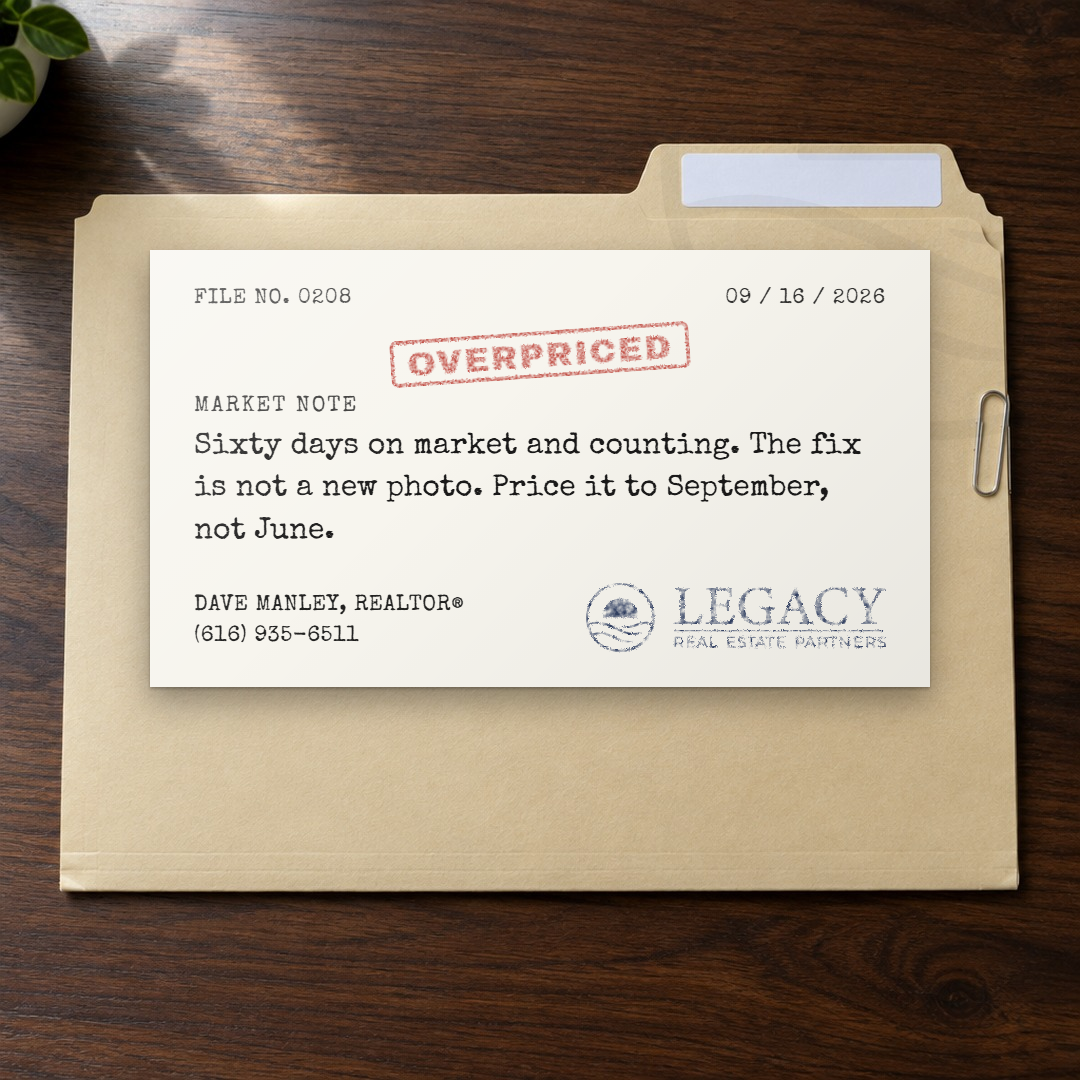
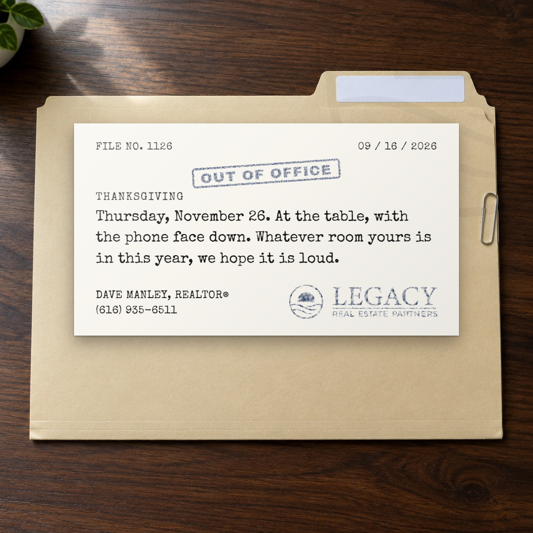
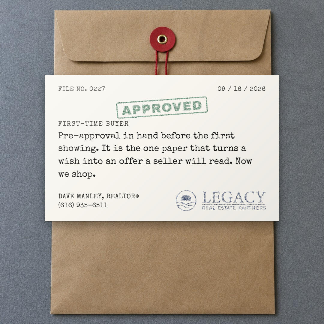
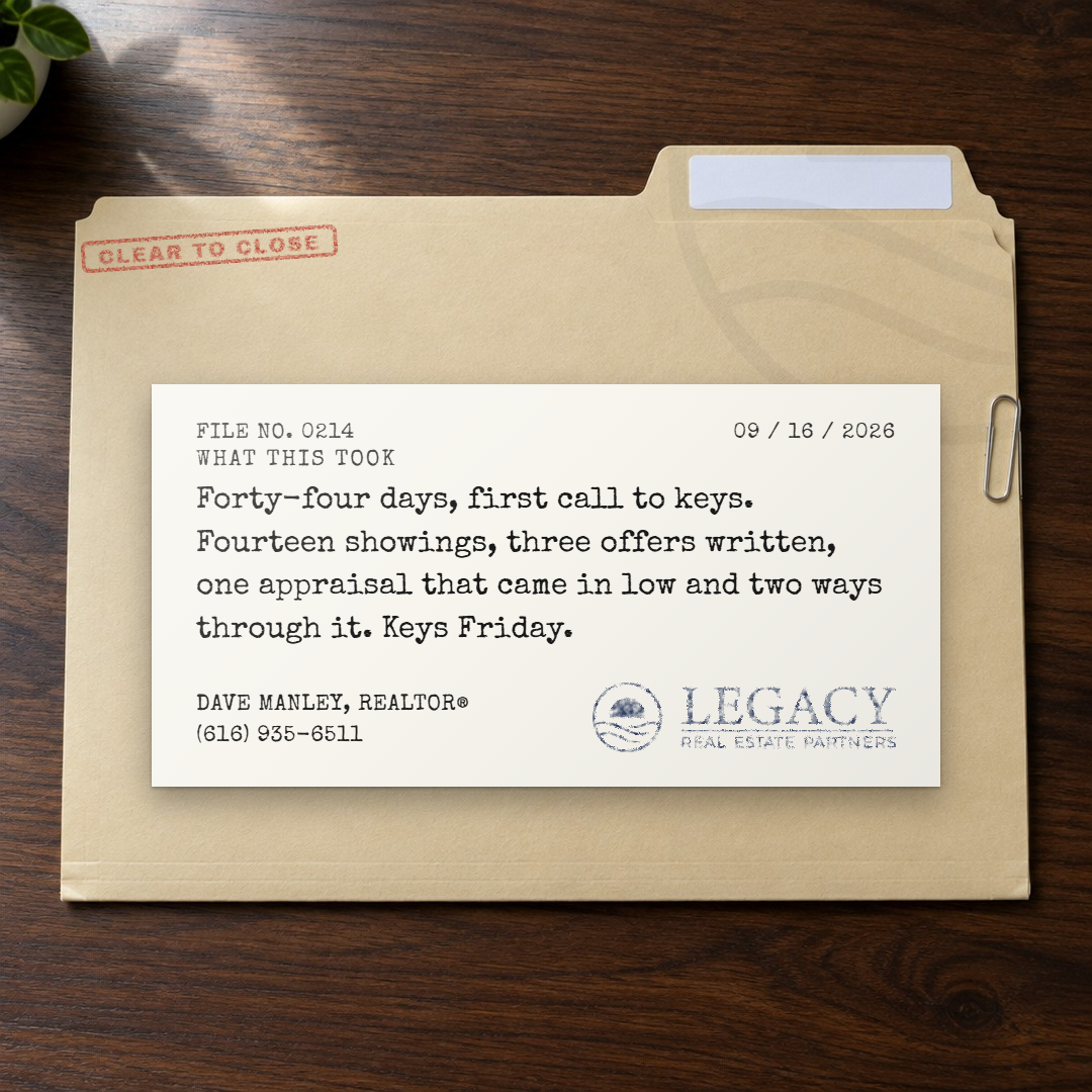
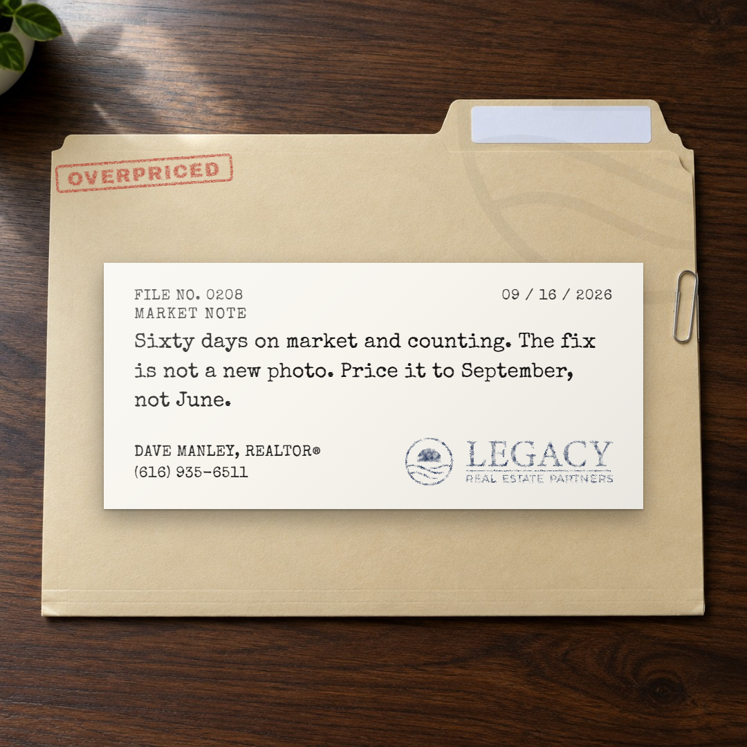
The register is the office. A manila folder or a kraft envelope photographed from above, a typed slip on it, and the headline as a rubber stamp in red, green or navy ink, the letters uneven where the pad was dry. The slip is the document, so the stamp lands on the slip and nowhere else, small, at four degrees, above the typing; the lockup is stamped in navy at the slip's foot and the agent is typed beside it. Two faces: Archivo Black for the stamp and Special Elite for the typing, both multiplied into the paper so they take the plate's light, the stamp roughened and eaten by a noise mask. Material from the idea bank, the kind a stamp can say: Clear to Close, Under Contract, Approved, Confidential, Overpriced, Out of Office. Three rounds: the stamp across everything (rejected), the stamp on the card, the final at half size, with the formats and the neutral proof.
The doctrine: thirty rules from twenty styles
Everything the twenty rounds settled, stated once, with the style that settled it. This is the pre-flight: a new style is run against it before Dave sees a round, and Brett's generator and picker read it. It lives in the engine as engine/reference/doctrine.json next to the fields.
The seed
- register-alternates. The register changes with every style: after a photographed object comes a diagram or a print or a hand; after a serif comes something that is not a serif. Never two of a kind in a row. (Lock Screen, Timeline)
- type-first. Pick the type first, and pick a face the library does not have. A new style is a new construction and a new face, never a recolor. (Survey (shelved), Transit)
- objects-lead. Objects and photographs lead; text-only constructions are volume. Build the text-only ones fast and close them in one round. (Sampler)
- no-cartoons. A drawn object reads as a cartoon. If the style is an object, photograph it: a generated plate, the face mapped or multiplied into it. (Sign)
- material-from-the-bank. Present a new style with idea-bank material, never the six job lines. The six are the engine's comparison set only. (Timeline)
- short-for-objects. Copy is sized to the surface: a sign says three words, a small panel one line, a slip a paragraph. Never a paragraph on a thing that would not carry one. (Sign, Neon, File)
The object
- one-surface. An applied mark (a stamp, a sticker, ink, a decal) lands on one surface and stays inside it. It never crosses an edge onto another object. (File)
- logo-in-the-medium. The lockup can be part of the object, in the object's medium (neon, ink, vinyl, stitched), when it is legible: small and quiet, never the brightest thing on the card. (Neon, File)
- no-firm-under-logo. The firm's name is not spelled out under its own logo. The agent line is the name, REALTOR and the phone. (Neon)
- tone-every-photo. Bright photographs kill type. Measure every photo's luminance and veil it to the dusk level before setting type on it; never trust the photo. (Cover)
- no-white-fills-on-photos. No white fills on a photograph: white type in a thin white frame. (Cover)
- nothing-crooked. Nothing is crooked unless the object is (a stamp at four degrees is real; a label at one degree is a mistake). (Cover, File)
- tall-objects-grow. A tall object gets bigger on a tall card; a wide one gets more sky or more wall. Never padded, never floating in a gap. (Receipt, Timeline)
- panels-match. Anything hung under a sign matches it: width, color, sheen, grime, hardware. Steel bolts with rust, never golden; none on wood. (Sign)
- colored-needs-colored. A colored face needs a colored plate; multiplying over white leaves a rim. (Sign)
- two-colors-half-glow. Two colors per lit sign; half the glow on whatever is not the headline; a light line over a dark wall gets an edge in the second color. (Neon)
The type
- plain-numerals. A face with quirky numerals is wrong for anything that carries numbers. Numerals are open and plain; a monospace lines them up on its own. (Timeline, Receipt)
- center-diagrams. Center the text on a diagram card and on a card that is one object; justify only what the object justifies (a receipt's items). (Timeline, Sampler, Receipt)
- headline-two-lines. The headline runs to one line, two if it must, fitted in-page by its untransformed size, and never an orphan word. (Broadside, Cover)
- fit-after-fonts. A fit that runs before the face loads measures the fallback. Wait for the fonts, then fit. (Cover (Brett), File)
- watermark-quiet. The kit mark as a watermark at three to five percent, large, in the type color, in a corner or centered behind nothing that matters. (Engraving, Sign)
- firm-bold-in-agent-line. Where the firm is spelled out, it is bold like the name. (Sign)
The diagram and the numbers
- readable-without-a-key. A diagram must be an object people already read (a calendar, a clock, a schedule, a receipt), never a notation that needs a key. (Timeline)
- show-the-parallel-work. What we do is more complicated than a line with stops; show the parallel work. (Timeline)
- worked-examples. A worked example is labeled an example, uses the real rates, marks the negotiable line negotiable, and computes the numbers rather than rounding them. A count card's total is a word. (Receipt)
- phone-is-real. Nothing goes on a screen that is not on a real phone; a chip is how a person taps. (Lock Screen)
The round
- change-only-what-was-named. In a revision round, only what Dave named changes. A note about one thing is not a license to touch another. (Sign)
- present-the-rulings. Every round ends with what to rule on, by name, and every card has a name. Rounds are short; a style is closed on the pass, not iterated for its own sake. (all)
- close-out. On the pass: the formats, the neutral proof under Terry, the reference page, the fields file, the handoff row, memory, both repos. Nothing is done until Brett can build it. (all)
- brett-measures. Brett measures against the rendered cards, not the description: fidelity-check and bar-check on every folder. A style is not selectable until its assets have a home. (Brett)
What comes next
Five archetypes are done in Style 1: Market Stat, Just Sold, Tip, Review, Open House. Thirty-six cards. Next: bring the original Market Stat set up to the rules the later rounds added, the outcome block on the review cards, real listing photos through the photo layouts, and the Story and portrait formats of the same cards. Each gets the same treatment: one archetype, several variations, each isolating one thing. When one is built it goes on the Done board next to these and is judged against them.