Style 5, the Tear. Round 4: the formats
Re-rendered 2026-09-11, late. Dave: no lone word on the last line of a paragraph. The lead of a note now breaks at the sentence, body paragraphs wrap so no line strands one word, and Tear headlines balance. Same cards, same words, better lines.
Updated 2026-09-11, afternoon. Dave: make the logos bigger where there is room. The lockup is 90 on portrait, the stacked mark 210 on story.
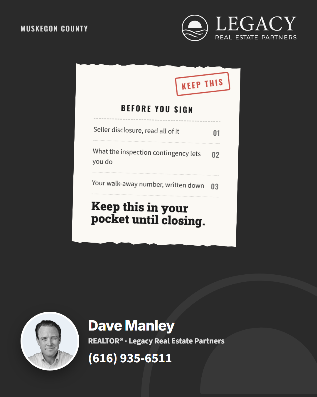
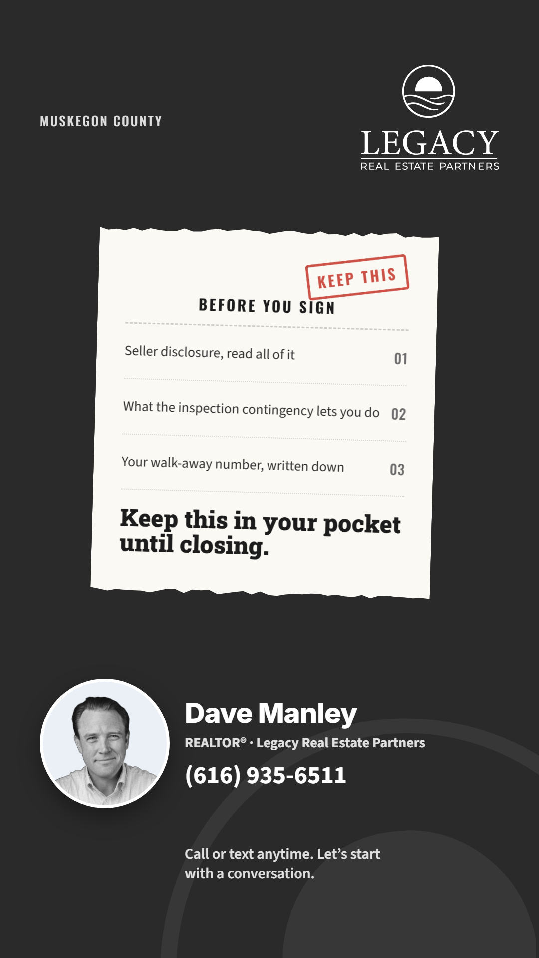
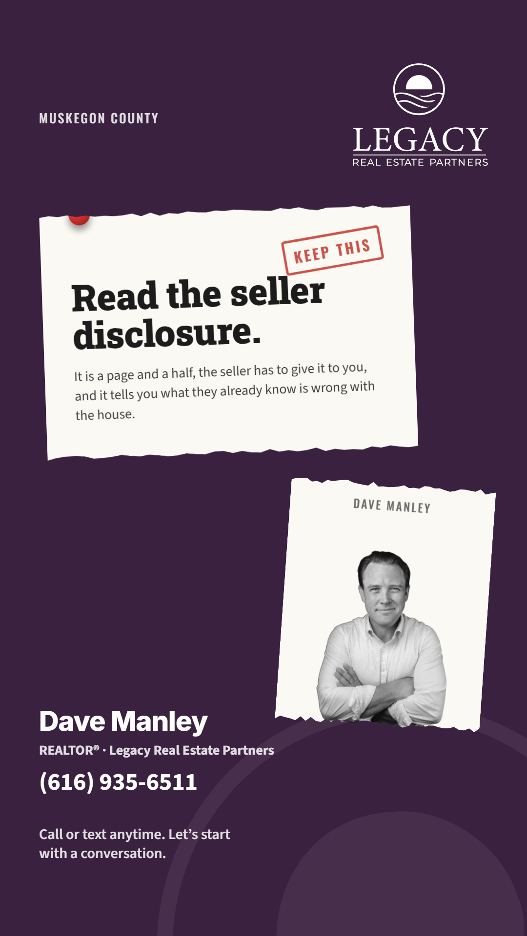
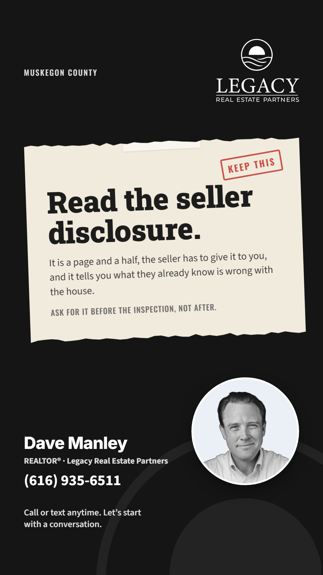
The approved Round 3 set, opened up for portrait (1080 by 1350) and laid out again for story (1080 by 1920). Nothing new in the design. The scrap gets wider and the type larger, the labels and the block sit inside the safe zones, the story carries the stacked mark and the call line under the phone, the way the Note and the Fold went.
What to look at. Portrait: the scrap rides higher, the ring at 280. Story: the stacked mark top right, the scrap at full width with the headline at 100, the block at bottom 280 with the call line under it. The receipt keeps its small ring beside the block, the two scraps keep the picture inside the second. Pass or note each by name and format.














Builder: reference-cards/style-5-tear/build-tear-r4.js, FORMAT=portrait|story. The square set is round-3-tear.