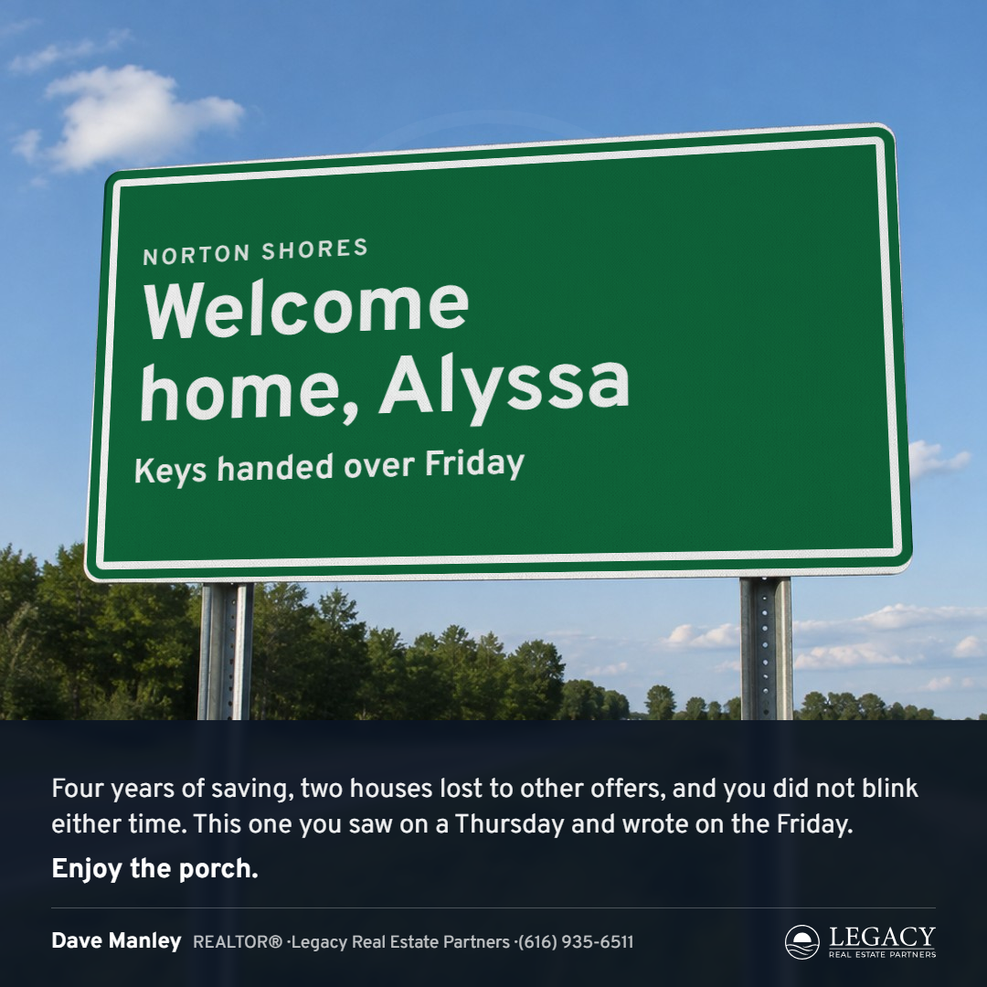
Style 14, the Sign. Round 2: the real ones
Round 1 read as a cartoon, and you said the only way this works is if the signs look real. So Round 2 is photographic. Three plates: blank white signs on real posts against real skies, a guide sign by day, a warning diamond, a guide sign at dusk. The sign face is set flat and mapped onto the plate's sign in true perspective from its four measured corners, then multiplied into the plate, so the color and the type take on the plate's own light, its sheeting texture and its glare: the white of the type is the sign's white, the green is that white times green. The paragraph and you ride on a caption bar at the foot of the photograph, the way a posted photo carries its caption. Nothing else is drawn into the scene.
What to rule on. Whether it looks real now. If it does, the plates become a small library (more skies, a town sign on a single post, a winter one) and every agent's sign comes off the same plates. If it does not, this one is shelved with the Survey. Pass or note by name.
Three plates, six families