Round 5: Open House
One archetype, seven variations, in the Style 1 language. The card has one job: get someone to show up. So the date and time lead, the address reads from across a room, and the home has a picture wherever a picture is possible. Dummy listing. Companion to What good looks like.
Revision 3, 2026-09-08. The ring on the photo card is centered on the watermark behind it. The split card carries the larger lockup and its lower block sits lower so the bottom margin matches. Earlier in revision 2: On the photo card: larger lockup, larger date, the calendar tile, a lighter wash so the house carries the card, and a smaller ring for the agent. On the split card: larger date and address plus the reason to come, so nothing sits empty under the invitation. On the centered card: the watermark centered behind the date, smaller and lighter. Everything from Rounds 2 through 4 is in: watermark in the card's own color on every card, agent never on the text, chips capped beside a cutout, breaks set in the copy, light circle inside a ring on dark cards, Inter as the second face.
The seven



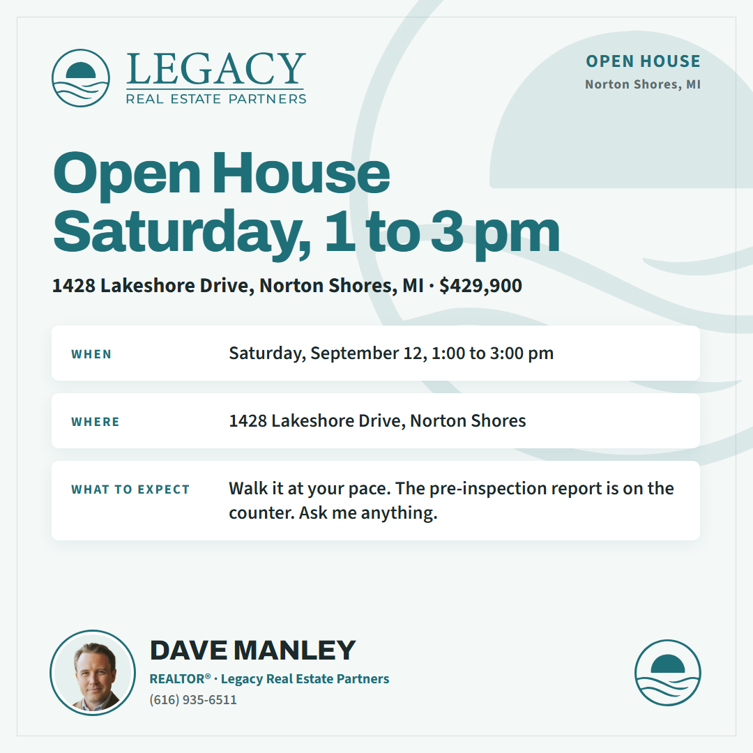
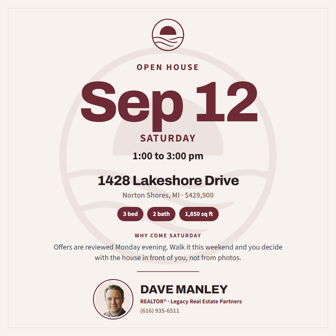

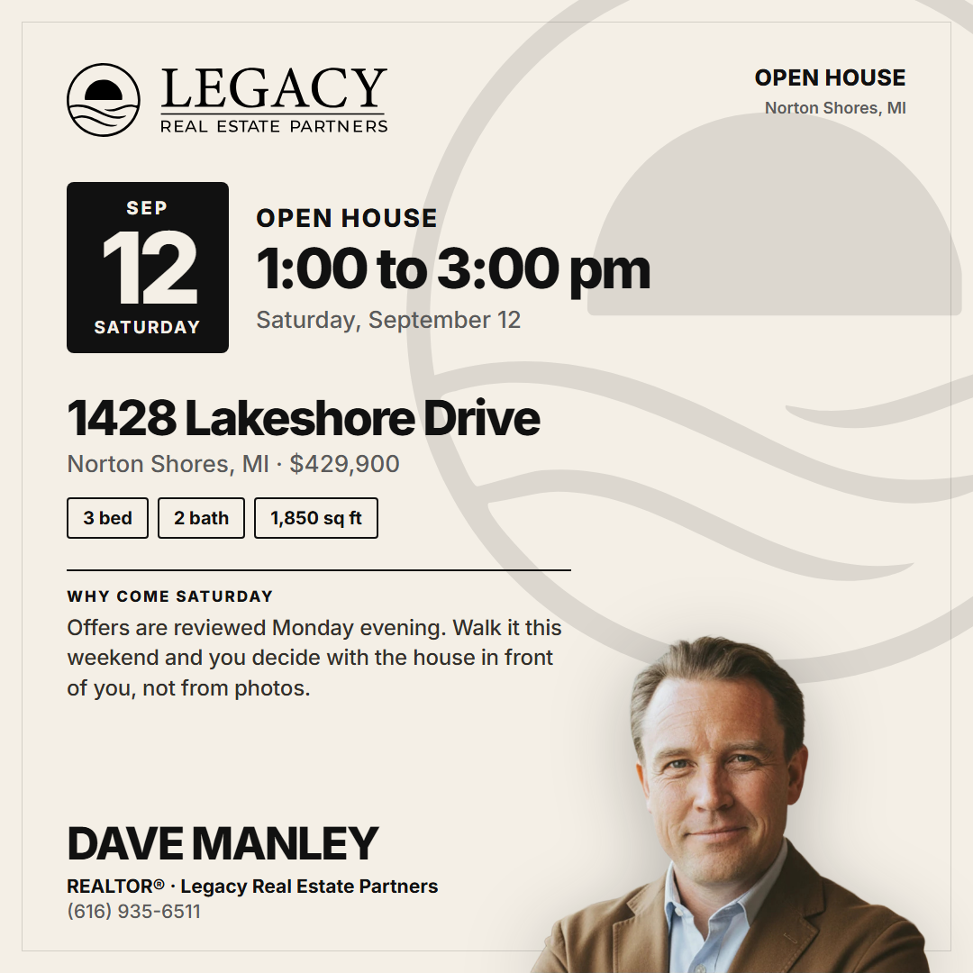
What makes an open house card pass
- Date and time lead. A calendar tile or the date itself is the first thing the eye lands on.
- The address is readable at feed size and repeated with the city and price.
- A reason to come, in plain language. "Offers are reviewed Monday evening" does more than "Don't miss it."
- Everything from the earlier rounds holds.